Why UX Determines Whether a Trader Stays on Your Marketplace?
Traders switch marketplaces if the interface lags even for a second. We've seen this on dozens of projects: proper UX increases purchase conversion by 30% and reduces churn. Our experience — 5 years in Web3, 30+ designed NFT platforms. We guarantee a design that retains and sells. Order a turnkey UX/UI design — from user research to an interactive prototype in Figma. We'll evaluate your project within 1 day.
Example: Blur beat OpenSea not because of tokenomics but due to UX — bidding pool, sweep function, real-time floor tracking. Speed for traders, beauty for collectors. Lesson: design must match the audience.
How to Design a Gallery That Doesn't Repel?
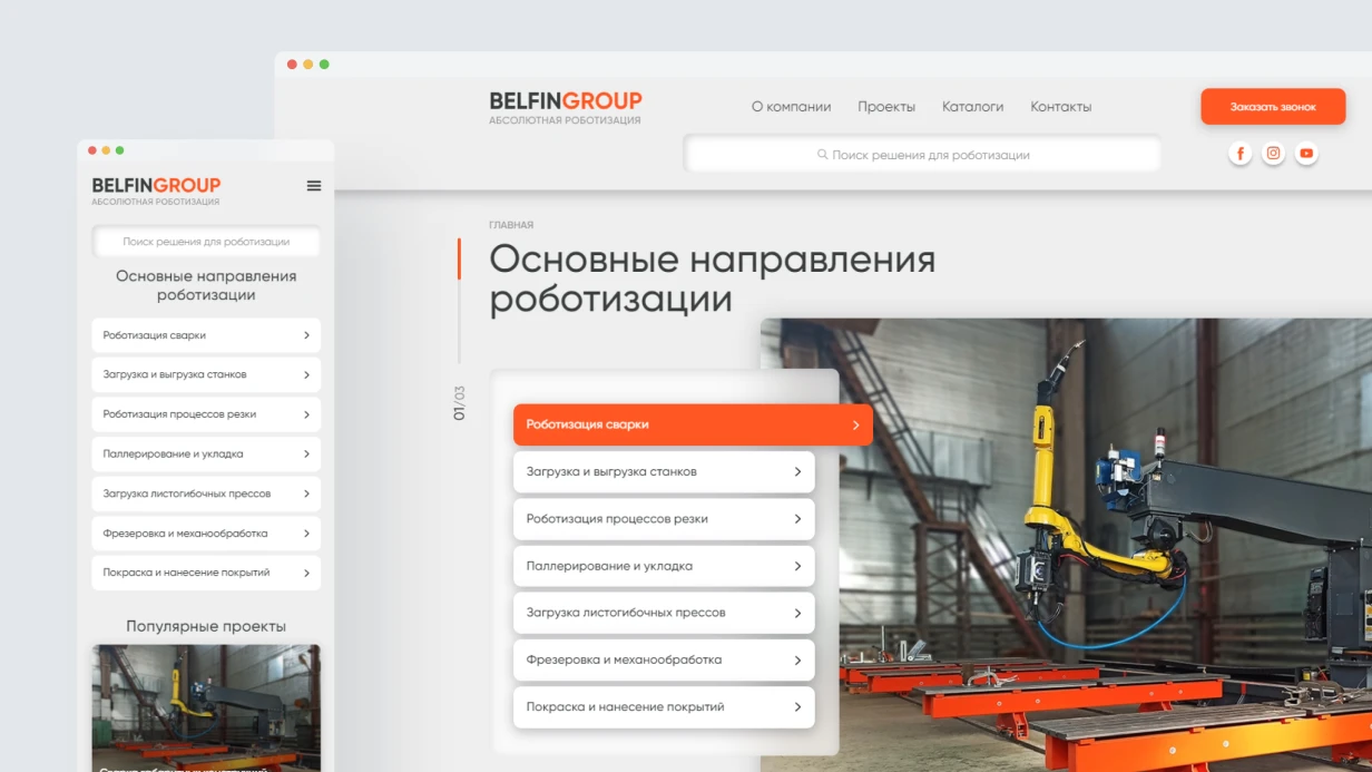
The gallery's main task is to allow quick evaluation of a collection without entering each token. Key metrics above the gallery: floor price, 24h volume, total sales, unique owners. Data updates in real time — otherwise the user leaves. NFT card grid: three display modes (large grid, small grid, list). Attribute filters — a frequent pain point: filtering by traits must work instantly (client-side filtering or debounce <200ms on the server).
Minimum on the card: image, name/ID, floor price, current price (if for sale), a 'Buy' button right on the card — critical for professional traders. Hover state: secondary actions — wishlist, copy link, quick bid.
Why Is the Token Page the Main Place for Conversion?
Structure: media on the left, trading panel on the right. Trading panel contains: current listings (sorted by price), sales history, offers. Trait rarity — show next to attributes: Background: Purple (3.2%) with rarity indicator. Provenance — table of transfer events with addresses and amounts, builds trust and allows spotting wash trading. Display addresses as ENS names using useEnsName — cheap and important for UX.
What Does the Minting Flow Include and How Not to Break It?
A separate pattern from trading. Progress indicator: Connect → Approve → Mint → Done. Each step explains what is happening. 'Sold Out' — not just a label, but a link to the secondary market with the current floor price.
Mobile Version: What Matters?
Main actions — browse and buy. Priority: fast gallery browsing, 2-column cards, simplified trading panel. Touch gestures: swipe, pinch-to-zoom, pull-to-refresh. Buttons at least 44px. Wallet connection via WalletConnect QR code and deep links.
Design System and Components
A marketplace requires a rich design system: cards, modals, price input forms with live conversion, toast notifications. Dark mode is mandatory — NFT audience expects a dark theme. Monospace font for addresses and prices, Inter for main content.
| Component |
Purpose |
| NFT card |
Quick purchase, hover actions |
| Trading panel |
Listings, offers, history |
| Modal window |
Confirmation, place bid, list for sale |
| Toast notifications |
Transaction status |
What's Included in NFT Marketplace Design Work?
| Stage |
What We Do |
Result |
| Analysis and research |
Competitor audit, user flows |
Report with recommendations |
| Wireframes and prototypes |
Low-fi schemes of all screens |
Interactive prototype |
| UI design |
All screens desktop + mobile |
Figma file |
| Design system |
Colors, typography, components, states |
Figma tokens + documentation |
| Interactive prototype |
Clickable prototype for testing |
Figma Prototype |
| Developer documentation |
Animation specs, handoff guide |
PDF / Notion page |
Typical UX Mistakes in NFT Marketplaces
- Slow attribute filtering — users leave after 3 seconds of waiting.
- No 'Buy' button on the card — extra click cuts conversion by 20%.
- Missing dark mode — ignoring audience expectations.
- Hidden transaction history — reduces trust in the platform.
Process and Timeline
| Stage |
Duration |
Result |
| Research & Wireframes |
3-5 days |
Low-fi prototype |
| UI design desktop + mobile |
5-7 days |
All screens in Figma |
| Design system |
2-3 days |
Tokens + components |
| Interactive prototype |
1-2 days |
Clickable prototype |
| Revisions based on testing |
2-3 days |
Final design |
Overall MVP timeline (gallery, token page, profile, mint flow) — 1-2 weeks. Full design with trading dashboard, mobile, and design system — 3-4 weeks. Cost is calculated after clarifying the number of screens and requirements.
What Do We Check in Usability Testing?
Three scenarios:
- A new user finds and buys their first NFT in under 3 minutes.
- A trader lists 10 NFTs for sale in under 5 minutes.
- A user finds an NFT with a specific trait in under 1 minute.
If none pass on the first try — the design must be reworked.
Results and Guarantees
We guarantee a design that increases conversion and retains users. Our cases confirm: proper UX reduces transaction time by 40% and increases platform trust. Contact us to discuss your project. Get a consultation from our UX architect.
Why does NFT marketplace development require a comprehensive approach?
We see that at first glance, an NFT contract looks simple: ERC-721, mint(), IPFS for metadata — that's it. In practice, it's this 'simplicity' that hides most problems — from bots buying out the entire mint in the first block to broken royalties on the secondary market. We often hear: Make a collection like others in a week — and a month later it turns out gas has tripled due to an unoptimized for loop, or OpenSea cannot see metadata after reveal. We know each of these pitfalls and build processes to avoid them.
Over 5 years of working with blockchains, we have implemented 40+ NFT projects, including marketplaces with dynamic attributes and cross-chain bridges. We have accumulated a library of proven templates — some of which we break down below.
Which standard to choose: ERC-721 or ERC-1155?
ERC-721 — each token is unique, one owner. Suitable for collections where each NFT has individual attributes and a direct owner → tokenId mapping.
ERC-1155 — multi-token standard: one contract holds both fungible and non-fungible tokens. It uses balanceOf(address, tokenId) instead of ownerOf(tokenId). A single transaction can transfer multiple different tokens via safeBatchTransferFrom. This saves gas on bulk operations — important for game items, tickets, edition collections. ERC-1155 is 2–3× more gas-efficient than ERC-721 for batch transfers.
| Criteria |
ERC-721 |
ERC-1155 |
| Token uniqueness |
Each token is unique |
One tokenId can have multiple copies |
| User balance |
Only ownerOf (one) |
balanceOf(address, tokenId) |
| Gas per transfer |
~25,000 gas |
~18,000 gas (batch even lower) |
| Batch operations |
No native support |
safeBatchTransferFrom |
| Ideal scenario |
Art collections, PFPs |
Games, tickets, editions |
Specific case: a game project with 50 types of items, each with a supply of 10,000. ERC-721 — 500,000 unique tokens, huge overhead on mappings. ERC-1155 — 50 tokenIds, balanceOf per player. Gas per transfer is 2–3 times lower, contract deployment is cheaper. For such tasks, we use OpenZeppelin ERC-1155 with custom modifications.
Metadata: on-chain vs IPFS vs centralized
The standard route is tokenURI() returning a link to a JSON with fields name, description, image, attributes. Three storage options:
- Centralized server — cheapest and most flexible. Risk: server goes down, company closes — NFT loses metadata. Not suitable for collections claiming long-term value.
- IPFS + Pinning — content-addressed storage, the link is bound to the content hash. Pinata or NFT.Storage provide pinning. Important: IPFS does not guarantee availability by itself — an active pinning service is needed. If it shuts down, data may disappear if no one keeps a copy.
- On-chain metadata — base64-encoded SVG or JSON directly in tokenURI. Maximum reliability, but expensive: for a collection of 10,000 tokens, gas costs may exceed $5,000. Suitable for generative art projects where visuals are generated from on-chain attributes (Nouns, Loot).
For most collections, we choose IPFS with Pinata for images + on-chain attributes for traits — a good balance. We validate files against a JSON Schema before upload; a typical mistake is unescaped quotes, causing marketplaces to display a blank screen.
Typical JSON metadata format
{
  "name": "Token #1",
  "description": "A unique NFT",
  "image": "ipfs://QmHash/image.png",
  "attributes": [{"trait_type": "Background", "value": "Red"}]
}
Dynamic NFT: metadata that changes
Dynamic NFT updates metadata in response to external events — match results, character levels, real-world data via Chainlink. Architecturally, it's a combination: the smart contract stores state → tokenURI() generates metadata from the state on-chain. Caching problem: OpenSea and other marketplaces aggressively cache. The standard invalidation mechanism is a MetadataUpdate(tokenId) event from ERC-4906. OpenSea listens to this event and clears the cache. Without it, updated metadata may not appear for weeks.
Chainlink Automation (formerly Keepers) for automatically updating state on the contract on a schedule or condition — a standard solution for dynamics.
How to protect mint from bots?
Allowlist via Merkle tree — standard. The list of addresses is hashed into a Merkle root, stored in the contract. During mint, the user provides a Merkle proof — the contract verifies without storing the full list. We use OpenZeppelin MerkleProof library.
Reveal mechanism — on mint, a placeholder is issued; real traits are revealed after the sale ends. Otherwise, bots can scan pending transactions and snipe rare traits via frontrunning. But reveal requires a commitment scheme — the random seed must be fixed before mint or use Chainlink VRF.
Chainlink VRF for fair randomization of traits. VRF request at mint → callback with verifiable random number → assign traits. This adds ~2 transactions and latency but guarantees fairness. Chainlink VRF v2.5.
Rate limiting — require(mintedPerWallet[msg.sender] < maxPerWallet). Does not protect against multi-wallets but raises attack cost. For premium projects, we often add proof-of-work directly in the contract (via EIP-2612 signatures).
Royalties: the real market state
ERC-2981 — on-chain royalty standard. The contract returns (recipient, amount) for any sale price via royaltyInfo(tokenId, salePrice). Marketplaces query this on each sale. Problem: adherence to royalties is voluntary for marketplaces. Blur launched with zero royalties, triggering a wave of other platforms. The situation has partially stabilized: OpenSea supports ERC-2981, Blur added optional ones. Royalty payments can represent 5–10% of secondary sale volume, so getting them right matters.
Attempts to enforce royalties on-chain by restricting transfers only to approved marketplaces (operator filtering) were proposed by OpenSea via OperatorFilterRegistry. This breaks composability — you cannot transfer an NFT through a custom contract. Most serious projects have abandoned this approach. For projects where royalties are critical, we build a custom marketplace within the ecosystem plus an incentive structure for users to trade there.
Lazy minting and gas-free mint
Gas-free mint via signature: the creator signs a voucher (tokenId, tokenURI, price, signature), the buyer provides the voucher in mint() — the contract verifies the signature via ECDSA.recover() and mints. Works on OpenSea via their Seaport protocol. Seaport is an optimized contract with minimal gas usage. Understanding its mechanics is important when integrating custom marketplace logic.
Stack for NFT projects
- Contracts: Solidity 0.8.x, OpenZeppelin ERC721Enumerable or ERC721A (Azuki) for gas-optimized batch mint, ERC1155 from OpenZeppelin
- VRF and automation: Chainlink VRF v2.5, Chainlink Automation
- Storage: Pinata (IPFS pinning), NFT.Storage, Arweave for permanent storage
- Marketplace: OpenSea Seaport protocol, custom integration
- Frontend: wagmi v2 + viem, RainbowKit for wallet connection, React + TypeScript
Development process
-
Mint mechanics design — allowlist, public sale, price curve (Dutch auction or fixed), limits per wallet
-
Contracts — with Foundry fuzz tests on mint limits, Merkle proof verification, royalty calculations
-
IPFS deployment — upload metadata and images before reveal, pin on at least two services
-
Reveal — if using Chainlink VRF, test on testnet mandatory: VRF subscription must be funded with LINK tokens
-
Marketplace integration — verify collection on OpenSea, configure royalties, test MetadataUpdate events
-
Deployment and monitoring — Tenderly for reentrancy detection, Etherscan API for contract verification, set up event alerts
Deliverables
- Source code of smart contracts (Solidity, Rust for Solana) with comments
- Test suite (Foundry/Hardhat) with ≥90% coverage
- Deployment documentation and integration instructions
- Access to pinning services (Pinata/Pinfluence)
- Metadata generation scripts (Python/JS)
- Support during marketplace verification
- 30 days of technical support after deployment
Timeline
| Task type |
Approximate timeline |
| Basic ERC-721 without reveal |
from 2 weeks |
| NFT collection with allowlist, reveal, VRF |
from 5 weeks |
| ERC-1155 with marketplace and royalties |
from 6 weeks |
| Dynamic NFT with external data |
from 8 weeks |
Cost is calculated individually after auditing your task. Send a brief with your project description — we will provide a transparent estimate within 3 business days. For regular clients, there is a flexible discount system on batch orders. If you need a gas-optimized contract, order a free gas analysis. Get a consultation on marketplace architecture — leave a request, and we will evaluate your project in three days.