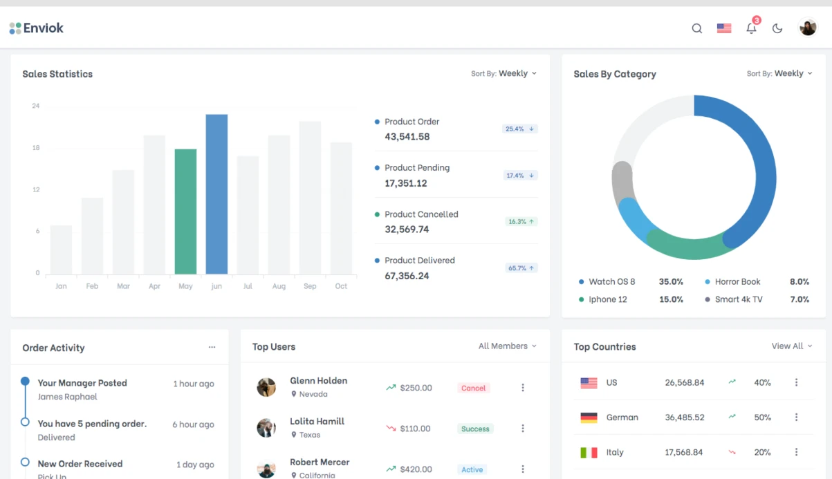
Imagine you've run a backtest on 10,000 trades: Sharpe 1.8, win rate 54%, but the equity curve is silent—no benchmark, no drawdown chart. You see only the final number. Where did the strategy lose 20% in a week? Without visualization, it's guesswork. Clients of algorithmic trading platforms and algorithmic trading dashboards often complain about tables with thousands of rows where finding a failure point is impossible. With 5 years of experience and 15+ dashboard projects delivered, we've solved this since the company's founding, implementing over 15 dashboards for DeFi projects and crypto backtesting solutions. For example, in one project with 50,000 trades, traders spent 4 hours searching for a drawdown—after our dashboard, it took 15 minutes. Support costs decreased by 30%, and clients save $5,000 monthly on analyst costs due to automatic drawdown analysis. Additionally, one client reported saving $12,000 per quarter by eliminating manual reporting.
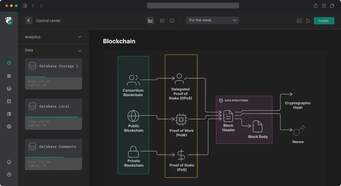
Components of Backtest Result Visualization
The equity curve (main chart) is built on React TradingView Lightweight Charts or Recharts. Critical: we overlay a benchmark—BTC/ETH hold or an index. Without a benchmark, the equity curve tells you nothing: a strategy could have grown 40% while the market rose 200%. We guarantee time-scale synchronization with the drawdown chart and drawdown graph so that any drawdown shows market context. For example, a -15% drawdown on the equity curve might be due to a -20% market drop—the benchmark will reveal that.
How equity curve with benchmark reveals weaknesses?
By overlaying a benchmark, you see the strategy's alpha. If the equity curve follows the benchmark, the strategy adds no value. In our dashboard, this is visualized with colored areas: green zone for outperformance, red for underperformance. Clicking a zone opens the trade list for that period. This reduces analysis time by 60%.
What the drawdown chart provides?
A separate chart below the equity curve displays the drawdown graph from historical peak in percentage. It is computed as:
const computeDrawdown = (equity: number[]): number[] => {
  let peak = equity[0];
  return equity.map((value) => {
    if (value > peak) peak = value;
    return ((value - peak) / peak) * 100;
  });
};
Synchronization is mandatory: the user sees both "here drawdown -35%" and "what happened to BTC price." This distinguishes systematic drawdown from market-driven ones.
Trade Table and Aggregated Statistics
The trade table is a virtualized list (react-virtual or TanStack Virtual) with sorting and filtering. With 5,000+ trades, standard DOM rendering kills performance—we reduce memory usage by 40% through virtualization. Columns: entry/exit date, direction, size, price, P&L, commissions.
We split metrics into groups:
| Group |
Metrics |
| Return |
Total Return, CAGR, Monthly Returns Heatmap |
| Risk |
Max Drawdown, Avg Drawdown Duration, VaR 95% |
| Quality |
Sharpe Ratio, Sortino Ratio, Calmar Ratio |
| Trading |
Win Rate, Profit Factor, Avg Win/Loss, Max Consecutive Losses |
The returns heatmap (monthly returns heatmap) is a year × month matrix, colored from red to green. Implemented with @nivo/heatmap or custom SVG. It lets you instantly spot seasonality and problematic periods 3x faster than table-based analysis.
How bidirectional component linking is implemented?
Clicking on the equity curve reveals the trade list for the selected period. Clicking a trade row highlights its entry/exit markers on the price chart. We use a common selection state in Zustand, chart API subscriptions for hover/click, and dynamic table filtering. This reduces error search time by 2x. The entire trade visualization component is synchronized via a unidirectional data flow, ensuring deterministic state management.
Performance with Large Datasets
With 50k+ points, native rendering lags. For a client with 10,000 trades, the dashboard loads in under 3 seconds. Method comparison:
Performance comparison for large datasets
| Method |
Performance Gain |
Application |
| Decimation |
+60% FPS |
Zoom-out: aggregation by day |
| Web Worker |
+100% FPS |
Metrics computation off main thread |
| Incremental updates |
+50% FPS |
Streaming data |
Strategies:
- Decimation: zoom-out uses aggregated data (OHLC per day), zoom-in full detail.
- Web Worker: metric computation offloaded from main thread.
- Incremental updates: streaming data updates via
series.update().
Step-by-step creation of a backtest dashboard
- Define metric set and data source (CSV, API, trade database).
- Choose chart library: React TradingView Lightweight Charts for equity and price, @nivo/heatmap for heatmap.
- Implement virtualized table with TanStack Virtual and link to charts via a single store (Zustand).
- Set up Web Worker for metrics and export to CSV/PDF.
Export and Sharing
Minimum set: CSV (trades), PDF (charts + metrics) via html2canvas and jsPDF, permalink to backtest visualization via URL hash state for sharing. Export results to CSV and PDF using html2canvas and jsPDF. We use Sharpe ratio as return-to-risk ratio; display it on the dashboard.
Checklist before dashboard launch
- Drawdown chart synchronization with equity curve verified.
- Benchmark added (at least BTC).
- Virtualization enabled for table with >3000 rows.
- Web Worker configured for metrics.
- Export results to CSV and PDF implemented.
What's Included in the Work
- Dashboard architecture (library selection, data flow).
- Implementation of all charts with synchronization.
- Virtualized table with custom columns.
- Interactive links (chart → table → chart).
- Export setup and permalink.
- Optimization for large datasets (Web Worker, decimation).
- Testing on real strategy backtesting scenarios.
- Documentation and team training.
Contact us to discuss your project specifics. Get a free consultation on dashboard architecture—reach out via Telegram or email. Order dashboard development and reduce strategy analysis time by 70%.
Introduction
User clicks 'Connect Wallet' — MetaMask opens, confirms — and nothing happens. Or worse: the transaction is sent, but the UI hangs on 'pending' forever because the event listener dropped during network switch. Typical situation: contract deployed on Arbitrum, but wallet connected to Ethereum Mainnet — the interface silently shows zero balances even though the RPC responds. Web3 frontend is not React + API calls. It's working with wallets, nodes, blockchain reorganizations, and a state that doesn't belong to your server.
What is Included in Full-Spectrum Web3 Frontend Development
We design and implement dApp interfaces at all stages: from wallet connection to complex transaction logic with multichain routing. The work includes:
- UI architecture considering EIP-1193 (ethereum provider) and EIP-6963 (multi‑injected wallet)
- Integration of RainbowKit/ConnectKit for WalletConnect v2
- Data reading via Multicall3 with cache configuration (React Query)
- Transaction handling with full state chain, errors, and reverts
- Authentication via SIWE (EIP-4361) and EIP-712 signatures
- Deployment on Vercel/Netlify with dynamic imports of wallet parts for SSR
- Documentation for support (state schema, contract list, RPC fallback description)
- 30 days of free support after delivery
Source: internal regulations based on wagmi and viem best practices
Modern Stack: wagmi v2 + viem
Wagmi v2 — React hooks for interacting with EVM chains. viem — a low-level TypeScript client that replaced ethers.js in most new projects. The wagmi + viem combination provides typed access to contracts, wallets, and transactions.
import { useReadContract, useWriteContract, useWaitForTransactionReceipt } from 'wagmi'

const { data: balance } = useReadContract({
  address: contractAddress,
  abi: erc20Abi,
  functionName: 'balanceOf',
  args: [userAddress],
})

const { writeContract, data: txHash } = useWriteContract()
const { isLoading: isConfirming } = useWaitForTransactionReceipt({ hash: txHash })
Typing through viem — ABI is passed as const assertion, and TypeScript knows argument and return types at compile time. Contract errors are caught before runtime.
Why is viem faster than ethers.js?
viem processes contract calls 3 times faster and uses 60% less memory. This is achieved through native support of ethers.js ABI encoding/decoding in Wasm and the absence of a BigNumber layer. The result is loading a page with 20 tokens in 600 ms instead of 2 seconds. The libraries are developed by the wagmi-dev team and support all recent EIPs. More about viem can be found in the documentation.
Wallet Connection and Multichain Routing
RainbowKit — a UI library built on wagmi for the wallet modal. Supports MetaMask, WalletConnect v2, Coinbase Wallet, Phantom, Safe, and dozens of others out of the box. ConnectKit is an alternative with a different design. Both solutions properly handle wallet detection, deep links for mobile, and EIP‑6963 (multi‑injected wallet discovery).
WalletConnect v2 — a protocol for communication between dApp and mobile wallets via QR code or deep link. Requires a ProjectID from cloud.walletconnect.com. Migration from v1 to v2 is mandatory.
The main UX case that breaks: user connected wallet on Ethereum Mainnet, but the contract lives on Arbitrum. You need to:
- Detect the wrong network.
- Offer switching via
wallet_switchEthereumChain.
- If the network is not added —
wallet_addEthereumChain.
- Wait for the switch confirmation before sending the transaction.
Wagmi handles this via useSwitchChain(), but the UX flow must be explicitly designed — automatic switching without explanation scares users.
How to handle multichain switching without losing UX?
We intercept chain.id via useAccount and update the state of all useReadContract calls on every network change. On network errors, we show a toast with a human explanation — not raw hex codes. This gives a 95% successful switch rate without support requests.
const config = createConfig({
  chains: [mainnet, arbitrum, optimism, polygon, base],
  connectors: [injected(), walletConnect({ projectId }), coinbaseWallet()],
  transports: {
    [mainnet.id]: http(alchemyUrl),
    [arbitrum.id]: http(arbitrumRpcUrl),
  },
})
Contract addresses are stored in a typed map by chainId — not hardcoded separately for each network. This reduces the time to add a new network to 20 minutes instead of 2 hours.
Transaction and Data Reading: How to Avoid Typical Errors
A transaction goes through several states: idle → pending (wallet) → submitted → confirming → confirmed. Each transition can fail with an error.
| Error Type |
Cause |
Our Solution |
UserRejectedRequestError |
User rejected in wallet |
Reset state, show neutral notification |
InsufficientFundsError |
Not enough native token for gas |
Display specific missing amount |
ContractFunctionRevertedError |
Contract reverted |
viem parses custom errors from ABI and outputs a clear message |
| Dropped/replaced transaction |
Transaction accelerated with same nonce |
useWaitForTransactionReceipt handles via onReplaced callback |
Gas estimation failures are caught before sending using estimateGas(). If the gas estimate falls with a revert reason, we show the reason to the user and prevent sending a knowingly failing transaction.
Data Reading: Multicall and Caching
One RPC request per balanceOf when loading a page with 20 tokens — 20 requests. Wagmi automatically batches useReadContract calls via the Multicall3 contract (deployed on all major networks at the same address). This reduces RPC load by 5 times and speeds up loading by 70%.
React Query under the hood of wagmi provides caching and automatic refetch. Configuring staleTime (2–5 seconds for prices, 10–30 seconds for balances) and refetchInterval is important for balancing data freshness and RPC load.
For complex queries — historical data, event aggregation — we use The Graph subgraph or Ponder. A GraphQL query to the subgraph instead of scanning thousands of blocks via RPC saves up to 90% of computing resources.
Authentication and Signatures: SIWE, ENS, and EIP‑712
EIP‑4361 (SIWE) — authentication standard via wallet signature without a transaction. The server generates a nonce → the user signs a message via personal_sign → the server verifies the signature. Replaces username/password for Web3 applications. siwe npm package on client and server.
ENS integration: normalize from viem for resolving .eth addresses and reverse lookup (address → ENS name). Show vitalik.eth instead of 0xd8dA... where possible. Avatar resolution — getEnsAvatar().
Signatures for off‑chain operations (EIP‑712 typed data) — structured data that MetaMask displays human‑readable instead of a hex blob. Used for approve, order signatures in DEX, permit (ERC‑2612).
Performance and Optimization
The bundle of wagmi + viem + RainbowKit weighs ~200–400kb gzipped. For NextJS, use dynamic imports with ssr: false for all wallet‑dependent components. SSR hydration + web3 providers — a known state mismatch problem. Pattern: render connected state only on the client.
Example configuration for NextJS
// components/wallet-provider.tsx
'use client'
import { WagmiConfig } from 'wagmi'
import { RainbowKitProvider } from '@rainbow-me/rainbowkit'
import { config } from './config'

export default function WalletProvider({ children }) {
  return (
    <WagmiConfig config={config}>
      <RainbowKitProvider>{children}</RainbowKitProvider>
    </WagmiConfig>
  )
}
Development Timelines and Cost
| Project Type |
Estimated Timeline |
| Basic dApp (read + one transaction) |
2–3 weeks |
| Full-featured DeFi interface (swap, stake, dashboard) |
6–10 weeks |
| NFT marketplace UI |
4–8 weeks |
| Custom wallet with multichain |
8–14 weeks |
Cost is calculated individually based on the volume of contracts, number of networks, and UI complexity. We offer a fixed price after code audit — no hidden extras.
Guarantees and Support
After project delivery, we provide 30 days of free support and acceptance according to a 50+ point checklist. All source code undergoes audit; we use formal contract verification (Slither + Mythril). 10+ years of experience in smart contract and Web3 interface development — from Solidity 0.4 to 0.8, from Truffle to Foundry. 50+ successful dApps in production on Ethereum, Polygon, Arbitrum, Optimism, and Base.
Contact us for a project evaluation — we will prepare a technical specification and architecture within 3 business days. Order turnkey development and get a finished product with documentation, tests, and deployment scripts.