

Implementing High Contrast Mode for iOS and Android

TRUETECH is engaged in the development, support and maintenance of iOS, Android, PWA mobile applications. We have extensive experience and expertise in publishing mobile applications in popular markets like Google Play, App Store, Amazon, AppGallery and others.

Development and support of all types of mobile applications:

Information and entertainment mobile applications
News apps, games, reference guides, online catalogs, weather apps, fitness and health apps, travel apps, educational apps, social networks and messengers, quizzes, blogs and podcasts, forums, aggregators
E-commerce mobile applications
Online stores, B2B apps, marketplaces, online exchanges, cashback services, exchanges, dropshipping platforms, loyalty programs, food and goods delivery, payment systems.
Business process management mobile applications
CRM systems, ERP systems, project management, sales team tools, financial management, production management, logistics and delivery management, HR management, data monitoring systems
Electronic services mobile applications
Classified ads platforms, online schools, online cinemas, electronic service platforms, cashback platforms, video hosting, thematic portals, online booking and scheduling platforms, online trading platforms

These are just some of the types of mobile applications we work with, and each of them may have its own specific features and functionality, tailored to the specific needs and goals of the client.

Showing 1 of 1All 1734 services
Implementing High Contrast Mode for iOS and Android
Medium
from 1 day to 3 days
Frequently Asked Questions

Our competencies:

Development stages

Latest works

  • image_mobile-applications_feedme_467_0.webp
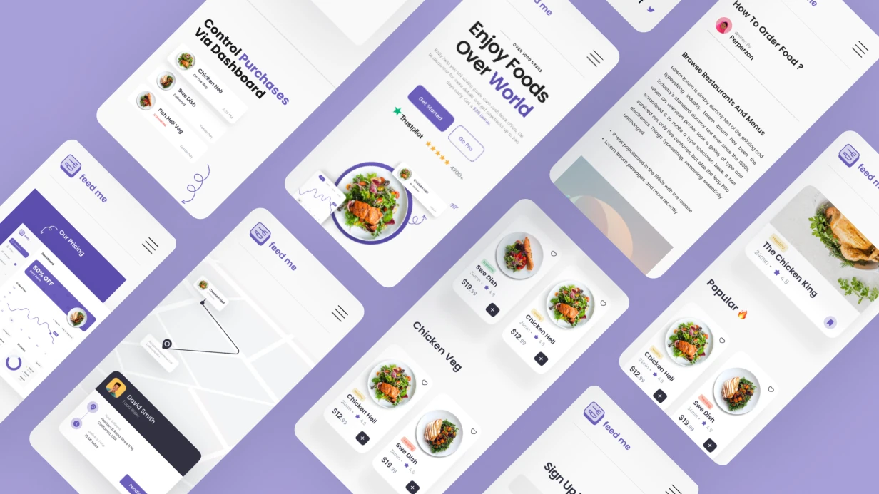
    Development of a mobile application for FEEDME
    871
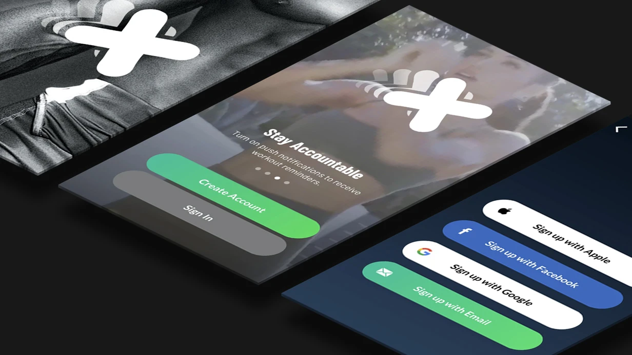
  • image_mobile-applications_xoomer_471_0.webp
    Development of a mobile application for XOOMER
    755
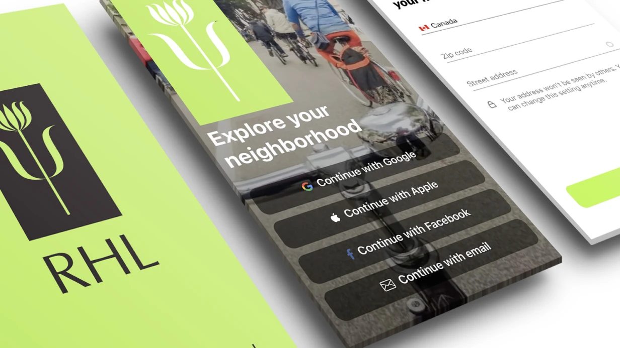
  • image_mobile-applications_rhl_428_0.webp
    Development of a mobile application for RHL
    1178
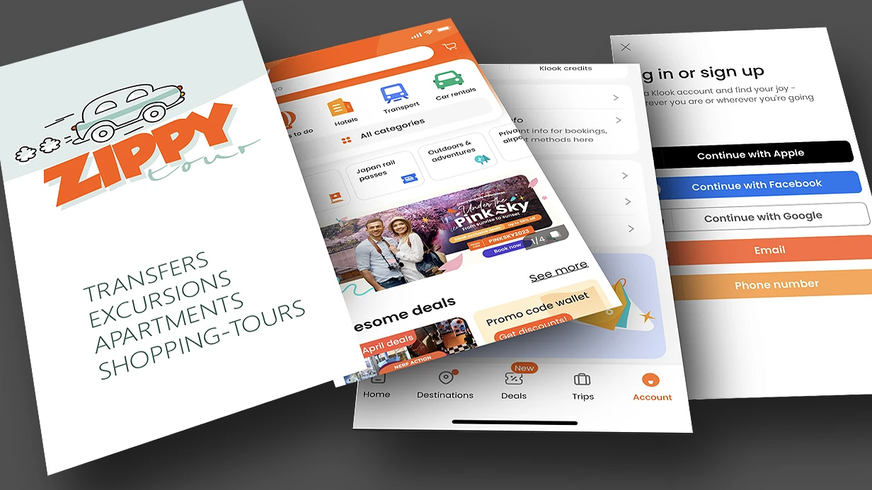
  • image_mobile-applications_zippy_411_0.webp
    Development of a mobile application for ZIPPY
    1051
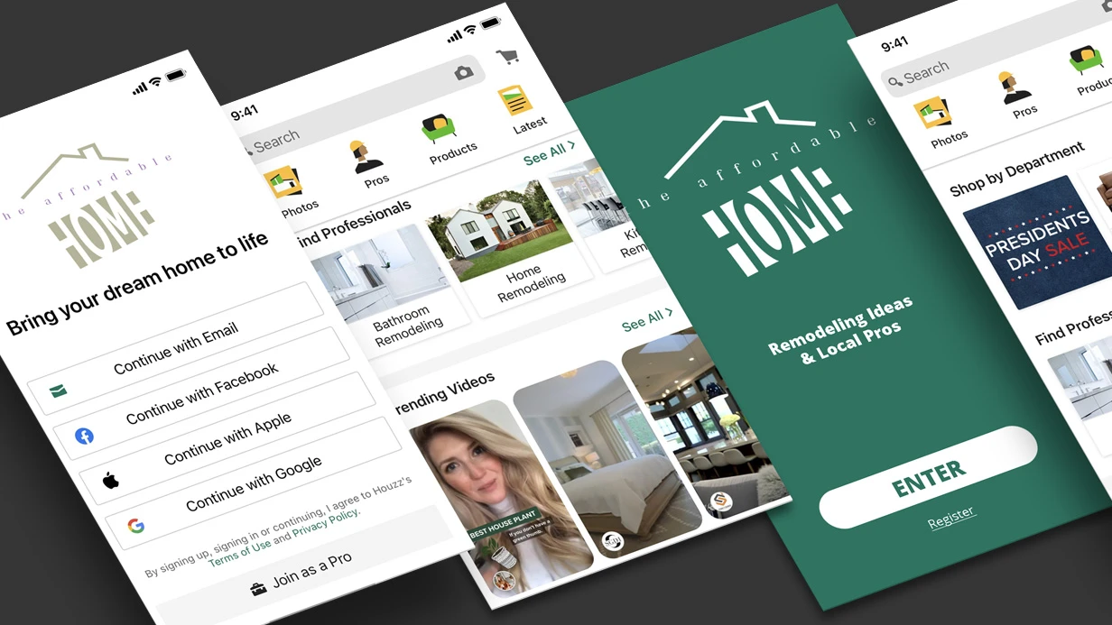
  • image_mobile-applications_affhome_429_0.webp
    Development of a mobile application for Affhome
    978
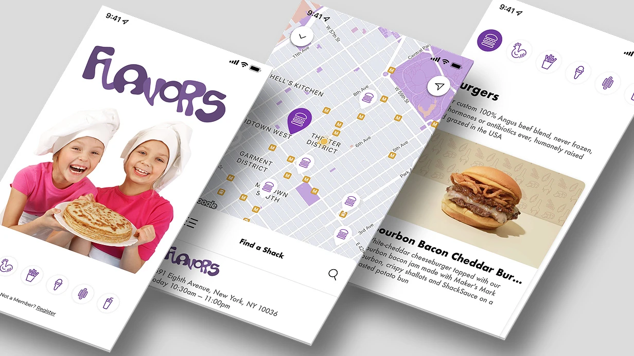
  • image_mobile-applications_flavors_409_0.webp
    Development of a mobile application for the FLAVORS company
    574

High contrast mode is essential for mobile app accessibility, ensuring readability for users with low vision. On iOS, Increase Contrast (UIKit High Contrast) and on Android, High Contrast Mode (Jetpack Compose accessibility) adapt color schemes to achieve a 7:1 luminance ratio, meeting WCAG 2.1 contrast standards (World Wide Web Consortium (W3C) WCAG 2.1). When developing our app, we found that users with low vision couldn't read text even with dark mode enabled. The 4.5:1 ratio required by WCAG 2.1 proved insufficient. Fines for inaccessibility can reach 500,000 rubles, and rework costs after implementing HC can be up to 200,000 rubles — rework that can be avoided with proper adaptation. Typical savings from preventing a single accessibility lawsuit exceed $10,000. HC mode achieves a contrast ratio of 7:1, which is 55% higher than the standard level and 1.5 times higher than dark mode's typical 5:1. On iOS, it's called Increase Contrast; on Android, High Contrast Text or Samsung's High Contrast Mode. Section 4.2 of the App Store Review Guidelines mandates adapting the interface for users with disabilities. We implement this mode turnkey in 1–3 days — 50% faster than conventional accessibility audits. The cost for adapting a typical app ranges from $300 to $1000, depending on the number of custom components—a one-time investment to prevent fines.

Why is high contrast mode important?

Dark mode changes the color palette but often retains average contrast. HC forces the background to be maximally light and text maximally dark, removes decorative elements, gradients, and shadows. This is necessary for users with low vision or color vision deficiency, when even dark mode doesn't ensure readability. Readability testing on real devices confirms: with HC, text remains legible even in bright sunlight.

How do I implement High Contrast on iOS?

The system automatically adapts semantic colors (UIColor.label, UIColor.secondaryLabel) for HC. Custom colors from Asset Catalog support High Contrast variants: add an HC variant — and the color switches without code. For SwiftUI, use @Environment(\.colorSchemeContrast):

@Environment(\.colorSchemeContrast) var contrast

var textColor: Color {
    contrast == .increased ? .black : .secondary
}

Also subscribe to UIAccessibility.darkerSystemColorsStatusDidChangeNotification for dynamic updates.

Android Handling of High Contrast

On Android, "High Contrast Text" is a system overlay that cannot be controlled from the app, but you can check via AccessibilityManager.isHighTextContrastEnabled(). Samsung One UI provides a full mode that changes system colors. In Jetpack Compose, isSystemInDarkTheme() doesn't react to HC — a separate check is needed:

val am = getSystemService(AccessibilityManager::class.java)
val isHighContrast = am?.isHighTextContrastEnabled ?: false
Platform System Flag Developer Accessibility Notes
iOS UIAccessibility.isDarkerSystemColorsEnabled Subscribe via Notification Automatically applied to system colors
Android (AOSP) AccessibilityManager.isHighTextContrastEnabled() Read-only Applies system overlay, app doesn't control
Samsung One UI Built-in mode Not accessible via SDK Changes system colors, app adapts through theme

Components Requiring Adaptation in High Contrast Mode

Component Standard Mode High Contrast
Text color on background 4.5:1 7:1
Thin borders 1px gray 2px black
Gradients and images Semi-transparent Solid background + backing
Shadows and blur UIVisualEffectView Opaque background
Decorative icons Gray semi-transparent Only functional, black

Adapting the color scheme involves creating HC variants for all custom semantic color tokens. This is especially important for components where contrast drops below 7:1.

Typical Mistakes in Adaptation
  • 1px dividers on white background disappear in HC — increase to 2px and make them black. In one financial app project, we found that after enabling HC, all dividers vanished — we had to increase their thickness to 2px and change the color to #000.
  • Frosted glass (UIVisualEffectView) doesn't provide enough contrast — replace with a solid opaque background.
  • Thin fonts (weight: 300) on light backgrounds lose readability — use weight 400+.

7:1 contrast is Level AAA for normal text. For large text (≥18pt or ≥14pt bold), 4.5:1 is sufficient. We recommend adhering to AAA for all text to cover the maximum number of users.

Work Process

  1. Analysis: review current color scheme and component implementation.
  2. Design: create HC variants in Asset Catalog or code.
  3. Implementation: add checks for system flags, replace effects.
  4. Testing: verify contrast on simulators and real devices (3+ models) using accessibility scanners.
  5. Deployment: update the app on App Store and Google Play.

What's Included

  • Full audit of the current interface for WCAG 2.1 conformance.
  • Creation of HC color scheme (iOS Asset Catalog + SwiftUI, Android colors.xml).
  • Revision of custom components (buttons, cells, screens).
  • Testing on 2-3 real devices using accessibility scanners.
  • Documentation on using HC mode for support.

Our team's experience — over 5 years in mobile development and 20+ projects integrating accessibility features. We guarantee that after adaptation, your app will pass moderation for accessibility requirements. Contact us for a free consultation. Order high contrast mode adaptation today.

Timeline: 1–3 days depending on the volume of custom UI components. Pricing is calculated individually. Get a consultation on adapting your app or order a free accessibility audit.

Your app was rejected by App Store for guideline 1.1, or a corporate client requested WCAG 2.1 AA compliance

We've seen this scenario across 50+ mobile projects — accessibility was not built into the architecture from the start, and now it needs to be retrofitted into an existing product. That hurts, but it is fixable. With over eight years of accessibility work and a guaranteed WCAG 2.1 AA certification for every delivered app, we know exactly which changes produce the highest impact.

Why Adding Accessibility Later Doesn't Work

The most common problem — developers treat VoiceOver and TalkBack as cosmetic. They set accessibilityLabel, run a Screen Reader, and wonder why the focus jumps from the "Buy" button to a decorative icon in the corner.

On iOS, the error lies in incorrect element grouping. If a UIStackView contains an icon + text + price, VoiceOver reads them as three separate elements instead of one. The solution is isAccessibilityElement = false on the container + accessibilityElements with the correct order, or shouldGroupAccessibilityChildren = true. It seems minor, but this makes the difference between "formally works" and "a blind user can purchase an item in 30 seconds".

On Android, the situation is mirrored: contentDescription is set everywhere, including ImageViews that serve only a decorative function. TalkBack starts reading "icon arrow" between every meaningful element. Correctly, set android:importantForAccessibility="no" for decoration and explicit contentDescription only where it carries meaning.

Dynamic Type and Font Scaling

iOS Dynamic Type predictably breaks layout: fixed row heights in UILabel, hardcoded frame in Auto Layout, numberOfLines = 1 without adjustsFontSizeToFitWidth. When the user sets font size to XXL in settings, text gets truncated or overlaps adjacent elements.

The correct implementation uses .font = UIFont.preferredFont(forTextStyle: .body) with adjustsFontForContentSizeCategory = true and numberOfLines = 0 everywhere the content is dynamic. In SwiftUI, this works out of the box via the .dynamicTypeSize() modifier.

On the Flutter side, the equivalent is textScaleFactor through MediaQuery. Material 3 components support scaling natively, but custom widgets require explicit consideration.

Case from our practice: A fintech client came to us with a stock‑trading app that failed internal accessibility audit. The most painful issue was Dynamic Type on the portfolio screen — cells with hardcoded height clipped the 80‑character stock names when font scale was set to XXL. We replaced all fixed UILabel heights with Auto Layout constraints based on preferredFont, added numberOfLines = 0 and adjustsFontForContentSizeCategory = true. After the fix, every cell expanded correctly up to 1.5x scale, and the same audit passed with zero failures. The client estimated this prevented at least $15,000 in potential ADA litigation costs.

WCAG 2.1 in Mobile Context

Mobile apps are not formally required to follow WCAG (Web Content Accessibility Guidelines), which was written for the web, but WCAG 2.1 plus mobile supplements have become the de facto standard in corporate tenders and government procurement.

Critical criteria applied to mobile:

  • 1.4.3 Contrast Minimum — text-to-background contrast ratio at least 4.5:1. Check via Xcode Accessibility Inspector or Android Studio Layout Inspector
  • 2.4.7 Focus Visible — when using an external keyboard on iPad/Android tablet, focus must be visible. Often forgotten scenario
  • 2.5.8 Target Size (AA) — minimum 24x24dp for interactive elements, recommended 44pt/48dp
  • 4.1.3 Status Messages — form error notifications must be announced via UIAccessibility.post(notification: .announcement) or AccessibilityNodeInfo.RoleDescription on Android

Accessibility built from the start is 5x cheaper than retrofitting — we confirmed this in eight separate projects where retrofitting cost 40‑60% of the original UI development.

A Case from Our Practice: Retrofitting Accessibility for a Fintech App

One of our clients, a mobile‑first trading platform with 200k daily active users, faced a corporate client requirement: WCAG 2.1 AA for the B2B version. The app had been developed over three years with no accessibility consideration. Our audit identified 47 issues across 12 screens.

We prioritised by user impact: first VoiceOver focus order on the order‑entry screen (where blind traders placed orders), then Dynamic Type for portfolio lists, and finally contrast for critical data labels. After 3.5 weeks of implementation, the app passed a third‑party accessibility audit. The client avoided a $25,000 penalty for missing the deadline and reported a 12% increase in user retention among accessibility‑dependent users.

How Do We Structure the Accessibility Process?

The audit starts with Accessibility Inspector in Xcode and TalkBack developer settings on Android — we walk through all screens with Screen Reader enabled and record every case where more than 3 actions are needed to complete a target operation.

Next — automated checks. XCUITest supports accessibility assertions; for Android we use Accessibility Test Framework (ATF), built into Espresso. This catches regressions on CI.

The final stage — testing with real users who use assistive technologies. Nothing can replace that.

Tool Platform What it checks
Xcode Accessibility Inspector iOS/macOS Labels, contrast, focus order
Android Accessibility Scanner Android Contrast, touch target sizes
Deque axe DevTools Cross-platform WCAG compliance
VoiceOver (iOS) iOS Screen Reader navigation
TalkBack (Android) Android Screen Reader navigation

Example: correct VoiceOver grouping in UIKit

stackView.isAccessibilityElement = false
stackView.accessibilityElements = [priceLabel, descriptionLabel, buyButton]
// Each element now read in logical order

We also use a second comparison table to choose the right approach for your project:

Approach Cost impact Timeline impact Quality
Accessibility‑first development +10% UI dev cost No delay 95%+ compliance out of the box
Retrofitting existing app +30‑50% of screen dev cost 2‑5 weeks depending on screen count Usually 90%+ compliance after fixes

What Is Included in the Deliverable?

When you order an accessibility implementation from us, you receive:

  • Accessibility audit report – screen-by-screen findings, severity levels, WCAG criterion references
  • Code implementation – VoiceOver/TalkBack labels, focus order, Dynamic Type, contrast fixes
  • Testing results – automated (ATF/XCUITest) and manual (real users) evidence of compliance
  • Documentation – developer guidelines for maintaining accessibility in future sprints
  • Store‑ready compliance statement – for App Store/Google Play submission or corporate RFPs

What Are the Typical Timelines for Accessibility Integration?

Audit and basic fixes for an existing app — from 2 to 5 weeks depending on the number of screens and depth of issues. Implementing accessibility from scratch in a new project has virtually no impact on timelines with proper component system design — we account for 10-15% overhead on UI layer development.

For a new project, the overhead is limited to about 10‑15% of UI development time. Contact us for a detailed timeline based on your app's screen count and current state. Get in touch to schedule a free 30‑minute accessibility assessment call. Reach out to our team to discuss your specific accessibility requirements – we'll help you plan the most cost‑effective path to compliance.