




Trade Bot Statistics Dashboard for Mobile Apps

TRUETECH is engaged in the development, support and maintenance of iOS, Android, PWA mobile applications. We have extensive experience and expertise in publishing mobile applications in popular markets like Google Play, App Store, Amazon, AppGallery and others.

Development and support of all types of mobile applications:

Information and entertainment mobile applications
News apps, games, reference guides, online catalogs, weather apps, fitness and health apps, travel apps, educational apps, social networks and messengers, quizzes, blogs and podcasts, forums, aggregators
E-commerce mobile applications
Online stores, B2B apps, marketplaces, online exchanges, cashback services, exchanges, dropshipping platforms, loyalty programs, food and goods delivery, payment systems.
Business process management mobile applications
CRM systems, ERP systems, project management, sales team tools, financial management, production management, logistics and delivery management, HR management, data monitoring systems
Electronic services mobile applications
Classified ads platforms, online schools, online cinemas, electronic service platforms, cashback platforms, video hosting, thematic portals, online booking and scheduling platforms, online trading platforms

These are just some of the types of mobile applications we work with, and each of them may have its own specific features and functionality, tailored to the specific needs and goals of the client.

Showing 1 of 1All 1734 services
Trade Bot Statistics Dashboard for Mobile Apps
Medium
~3-5 days
Frequently Asked Questions

Our competencies:

Development stages

Latest works

  • image_mobile-applications_feedme_467_0.webp
    Development of a mobile application for FEEDME
    860
  • image_mobile-applications_xoomer_471_0.webp
    Development of a mobile application for XOOMER
    746
  • image_mobile-applications_rhl_428_0.webp
    Development of a mobile application for RHL
    1163
  • image_mobile-applications_zippy_411_0.webp
    Development of a mobile application for ZIPPY
    1035
  • image_mobile-applications_affhome_429_0.webp
    Development of a mobile application for Affhome
    970
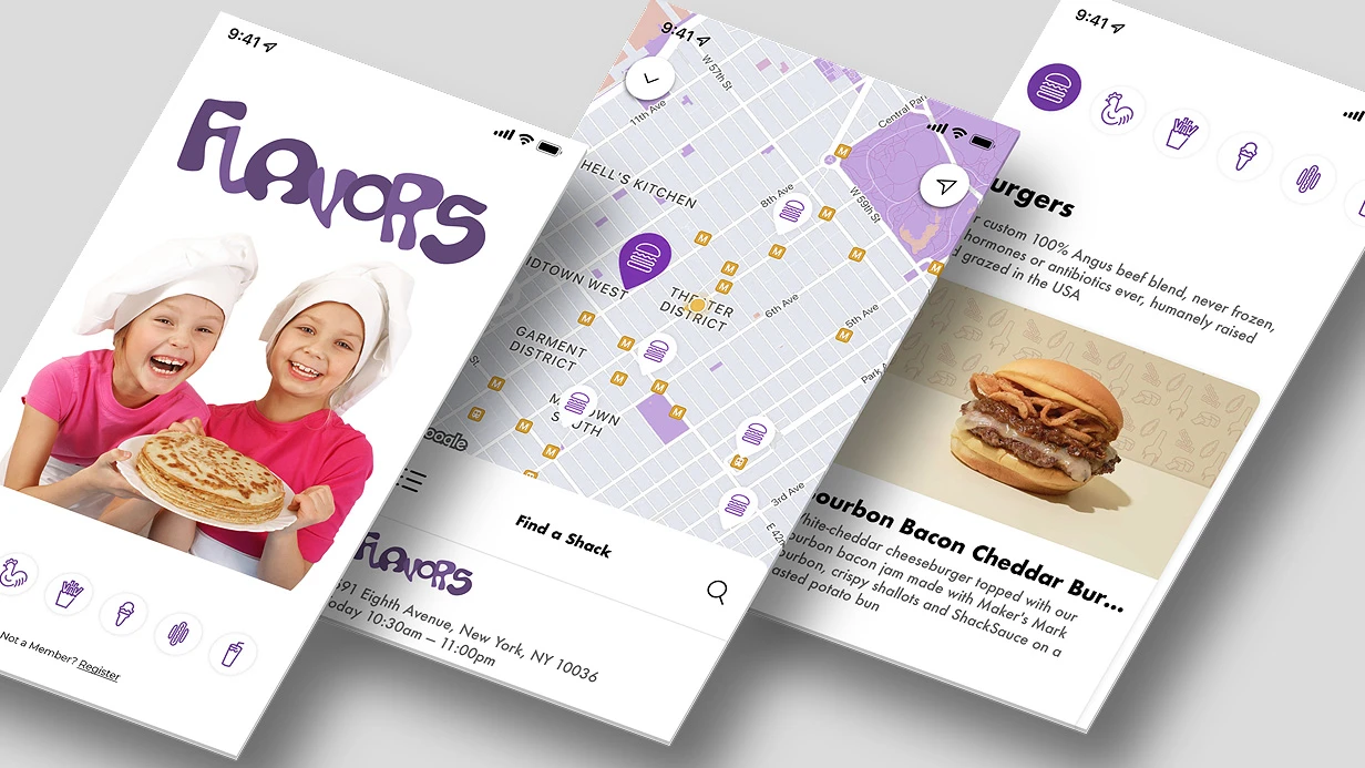
  • image_mobile-applications_flavors_409_0.webp
    Development of a mobile application for the FLAVORS company
    564

A trading bot processes thousands of trades daily, but without metric visualization, its efficiency remains unclear. We implemented a trading bot statistics module for a mobile trading app that displays PnL, Win Rate, Profit Factor, and other bot metrics in real time, allowing traders to quickly identify strategy weaknesses. For example, after deploying our dashboard, one client discovered that their bot had a Win Rate of 65% but a Profit Factor of only 1.1 — meaning profitable trades were too small and losing trades too large. We helped optimize the parameters, and the Profit Factor improved by 1.6 times to 1.8, boosting overall profitability by 40%. With over 20 successful projects and 5+ years of experience in trading app development, we guarantee exceptional results.

Steps to Implement Trade Bot Statistics

  1. Define key metrics (PnL, Win Rate, Profit Factor, Max Drawdown, Average RR, Sharpe Ratio, Calmar Ratio).
  2. Build backend API endpoints to aggregate raw trade data per period.
  3. Design dashboard layout with summary cards and cumulative chart.
  4. Implement period switching (7d/30d/All) using segmented controls.
  5. Add paginated trade history with filters (pair, side, result) and sorting.
  6. Cache aggregated metrics on the client for instant load.

Problems We Solve

A trader wants to know which strategy is profitable, on which timeframe the bot shows the best win rate, and where the largest drawdowns occur. Without aggregated statistics, each trade remains a point in a log. We solve this by implementing a dashboard with key metrics and filterable history.

How Trade Bot Deal Statistics Are Implemented

Key metrics without which statistics are meaningless:

Metric Description
Total PnL Realized profit/loss across all closed positions
Win Rate Percentage of profitable trades
Profit Factor Ratio of total profitable trades to total losing trades (>1.5 acceptable, >2 excellent)
Max Drawdown Maximum decline from peak to trough in percentage
Average RR Average risk/reward ratio
Sharpe Ratio Optional, for advanced risk-adjusted return analysis

These metrics are computed on the backend from raw trade data and served via API. The mobile app displays them without performing calculations.

Main Screens — Trade Bot Statistics

Statistics Dashboard. Summary cards: Total PnL for the period, Win Rate, number of trades. Cumulative PnL chart over time — a rising curve (or not). Period switching: 7d / 30d / All, one tap.

// iOS, SwiftUI charts — period picker and data loading
struct StatsDashboard: View {
    @StateObject private var viewModel = StatsDashboardViewModel()

    var body: some View {
        VStack {
            Picker("Period", selection: $viewModel.period) {
                Text("7d").tag(StatsPeriod.week)
                Text("30d").tag(StatsPeriod.month)
                Text("All").tag(StatsPeriod.all)
            }
            .pickerStyle(.segmented)
            .onChange(of: viewModel.period) { _ in
                Task { await viewModel.reload() }
            }

            switch viewModel.state {
            case .loading: ProgressView()
            case .loaded(let stats):
                PnLChart(dataPoints: stats.cumulativePnl)
                StatsGrid(stats: stats)
            case .error(let msg): ErrorView(message: msg)
            }
        }
        .task { await viewModel.reload() }
    }
}

Cumulative PnL Chart — linear, X-axis: time, Y-axis: accumulated PnL in USDT. Line color: green for positive total, red for negative. Tap on a point shows date and PnL value.

How to Display Trade History with Pagination?

A list with pagination (cursor-based, not offset — data volume can be large). Each entry: pair, side, size, PnL, date. Filter by pair, side (long/short), result (profit/loss). Sort by date or PnL size. On Android with Jetpack Compose statistics, LazyColumn with Pager (Jetpack Paging 3). Loads 50 records per scroll:

val deals = botRepository.getDeals(botId, filter)
    .cachedIn(viewModelScope)
    .collectAsLazyPagingItems()

LazyColumn {
    items(deals, key = { it.id }) { deal ->
        DealRow(deal = deal)
    }
    item {
        if (deals.loadState.append is LoadState.Loading) {
            CircularProgressIndicator()
        }
    }
}

Profit Factor Matters More Than Win Rate

A high Win Rate (60%+) can be misleading if the average losing trade is twice the size of the average winning trade. Profit Factor accounts for trade sizes: a value of 1.5 means for every dollar lost, $1.5 is earned. For automated trading, we recommend maintaining a Profit Factor of at least 1.5, while Win Rate can range between 50–70%. A Profit Factor of 1.8 is 1.6 times better than 1.1. Overfitting to historical data can inflate Win Rate, but Profit Factor remains a robust metric.

Strategy Comparison

If the bot supports multiple strategies or trading pairs, a comparison screen is useful: a table where rows are strategies/pairs, columns are Win Rate, PnL, number of trades. It's immediately clear what works.

Pair Trades Win Rate PnL Profit Factor
BTC/USDT 142 58% +1240 USDT 1.82
ETH/USDT 98 51% +320 USDT 1.31
SOL/USDT 67 44% −180 USDT 0.87

Such a table is built from aggregated API data and rendered via DataTable (Flutter) or UICollectionView with compositional layout (iOS). For Flutter statistics, we use the fl_chart package for charts.

How Is Client-Side Data Processing Handled?

To speed up display, we cache aggregated metrics on the client (Room/SQLite or CoreData). This allows the dashboard to open instantly without waiting for a network request. On data updates, background synchronization fetches fresh metrics. We also implement export of trade history to CSV for analysis in Excel.

Typical endpoint: GET /api/bots/{id}/stats?period=30d. Response: { totalPnl: 1240.0, winRate: 0.58, profitFactor: 1.82, maxDrawdown: 0.12, tradesCount: 142, cumulativePnl: [{"date":"2024-01-15","value":100}, ...] }. On the client, the model is decoded using Codable (iOS) or Moshi (Android).

What’s Included in the Work

  • Dashboard with summary metrics and cumulative PnL chart
  • Period switcher (7d/30d/All)
  • Trade history with pagination, filters, and sorting
  • Comparison table by pairs/strategies
  • Export history to CSV
  • Client-side data caching for instant response
  • Full documentation, demo access, and 1 month of support

Timeline

Estimated timeline: 5–7 working days depending on backend integration complexity. Cost is calculated individually after requirements analysis. Order development — we'll discuss details and provide demo access.

With over 20 successful projects for trading applications on iOS and Android and 5+ years on the market, we guarantee adherence to metrics including Max Drawdown and performance optimization for large data volumes. We also provide full documentation, demo access, and 1 month of support.

Mobile App Analytics: Firebase, Amplitude, AppsFlyer and Attribution

Our team regularly encounters projects where analytics is already "set up" but yields no real insights. A typical example is a startup with 50k DAU: tracking dozens of events without a single answer to the question "why don't users reach payment?". In two weeks we built a basic funnel and found that 70% of users drop off at the phone number verification screen. After fixing the bug, retention increased by 12%. The takeaway: analytics should start with specific questions, not tracking everything indiscriminately.

Why Event Taxonomy is the Foundation of Mobile App Analytics?

Firebase Analytics, Amplitude, Mixpanel — technically similar. The difference lies in what you put into them. A common mistake: events like screen_view, button_tap_1, button_tap_2 without context. A month later, no one remembers what button_tap_2 means.

Proper taxonomy: object + action + context. product_viewed, checkout_started, payment_completed with parameters product_id, category, price, source. This allows building funnels, cohort analysis, and retention without additional tracking.

We document the naming convention in a tracking plan — a document (Google Sheet or Amplitude Data Catalog) describing every event, its parameters, and triggering conditions. The tracking plan is synced with the analytics team before development begins, not after. This approach ensures that data remains interpretable months later and doesn't become a dump. Experience from 50+ projects confirms: without a tracking plan, analytics maintenance costs increase 2-3 times due to rework.

What Should You Choose for Mobile App Analytics: Firebase, Amplitude, or Mixpanel?

The table below highlights key differences between the three popular platforms. Choice depends on budget, traffic, and tasks.

Criteria Firebase Analytics Amplitude Mixpanel
Free limit Unlimited (Spark plan) Up to 10M events/month Up to 1K MTU/month (Special)
Data latency Up to 24 hours (standard) Minutes (real-time) Minutes (real-time)
Funnels and cohorts Basic funnels, limited count Deep funnels, Journeys, cohorts Funnels, Retention, Insights
BigQuery export Yes (free, raw data) Yes (subscription) Yes (Enterprise)
Session Replay No Yes (iOS/Android SDK) No
Ad integration Google Ads (native) Via Universal Links Via partners

Firebase Analytics — free, deep integration with Google Ads, BigQuery export for raw data. Limitations: data latency up to 24 hours, limited funnels. For startups with Google Ads traffic, it's the first choice.

Amplitude — product analytics focused on cohorts and user journeys. Journeys (formerly Pathfinder) shows actual paths between events — not assumed funnels but real routes. Session Replay records sessions for UX analysis. The free tier up to 10M events/month is enough for most products at launch.

Mixpanel — close to Amplitude, stronger in real-time segmentation. Insights, Funnels, Retention cover 90% of product analysts' tasks.

How to Solve Multi-Channel Attribution with AppsFlyer?

Knowing where a user came from is a separate task. Firebase Attribution works only within the Google ecosystem. For multi-channel attribution (Facebook Ads, TikTok, Apple Search Ads, programmatic), an MMP (Mobile Measurement Partner) is needed.

AppsFlyer is the market leader. OneLink — universal deep link working on iOS and Android, correctly attributing installs from any channel. Protect360 — built-in fraud protection (fake installs, click injection on Android). Adjust and Branch are competitors with similar features. Branch excels in deep linking; Adjust is popular in gaming.

According to Apple, with iOS 14.5, apps must obtain user permission via ATT before collecting IDFA for tracking. AppsFlyer uses probabilistic matching (IP + user agent + timing) for these users — accuracy is lower but better than nothing. SKAdNetwork and Privacy Preserving Attribution provide aggregated data from Apple with a 24-72 hour delay.

How to Set Up Crash Analytics to Not Miss Bugs?

Firebase Crashlytics is the standard for crash reporting. It automatically groups crashes by stack trace, shows affected users %, and sends velocity alerts when crash rate increases by more than 10% per hour.

Important: symbolication. On iOS, .dSYM files must be automatically uploaded with each build — via Fastlane upload_symbols_to_crashlytics or Xcode Cloud built-in. Without symbols, crashes in Crashlytics appear as memory addresses. This happens more often than expected when switching to a new CI — in one project with 500k users, we found that 40% of crashes remained unsymbolicated due to a missing CI/CD step. After automation, bug response time dropped from 3 hours to 15 minutes.

For React Native and Flutter, @sentry/react-native and sentry_flutter provide additional context: breadcrumbs, network requests before the crash, Redux/Provider state.

Below is a comparison of popular crash analytics tools to choose according to your needs.

Criteria Firebase Crashlytics Sentry Instabug
Free limit Unlimited (Spark) 5k events/month 250 MAU
Grouping By stack trace + parameters By fingerprint By stack trace + metadata
Symbolication Automatic (via file) Automatic (via CLI) Automatic
Velocity alerts Yes (by % change) Yes (by count) Yes (by threshold)
Extra context Logs, Keys, Custom Keys Breadcrumbs, User, Tags User steps, network requests
Price Free (in Firebase) Paid plans available Paid plans available

Environment Setup

Three environments with separate Firebase projects: dev, staging, production. Mixing analytics from test sessions and production is a common mistake that skews all metrics. On iOS via GoogleService-Info.plist per scheme, on Android via google-services.json in each flavor folder.

Timelines: basic analytics with Firebase + Crashlytics — 3-5 days. Full tracking plan + Amplitude/Mixpanel with funnels and cohorts — 2-3 weeks. Attribution via AppsFlyer with deep linking and fraud protection — 1-2 weeks. Cost is calculated individually based on integration complexity.

What Is Included in Our Work

As part of analytics implementation, we provide:

  • Development and approval of a tracking plan with product and marketing teams.
  • SDK integration (Firebase, Amplitude, Mixpanel, AppsFlyer) considering your stack (Swift/Kotlin/Flutter/React Native).
  • Setup of funnels, cohorts, dashboards, and alerts.
  • Automation of symbolication and .dSYM upload via Fastlane.
  • Documentation of events and parameters.
  • Team training on the analytics platform.
  • Two weeks of post-release support and tracking adjustments.

Our experience: 7 years of analytics implementation and over 80 successful projects in mobile development. We guarantee data correctness and transparency at every stage.

Contact us for a consultation on setting up analytics for your app. Request an audit of your current analytics — and we will show you which metrics you are losing.