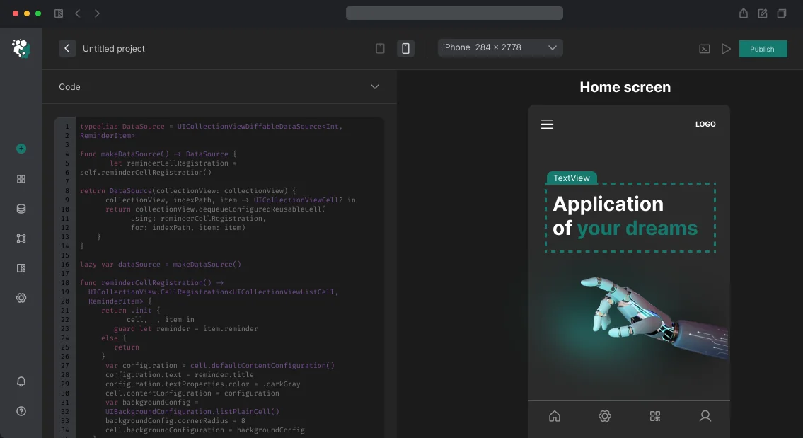
When porting a Figma layout to Jetpack Compose, inconsistencies often emerge: spacing not multiples of 4dp, colors defined as HEX values instead of color roles, and component states not rendered. The developer then has to refine the layout, wasting time. Our engineers, with over 10 years of combined experience in Android design, ensure every screen perfectly aligns with M3 and Jetpack Compose. This cuts development budget by up to 30% and accelerates time to release.
Why dynamic colors are mandatory for Android
Material Design 3 is built around color roles — not specific color values but semantic slots: primary, onPrimary, primaryContainer, onPrimaryContainer, and so on across 29 roles. The designer defines a Source Color; the HCT (Hue, Chroma, Tone) algorithm automatically generates the full palette. Dynamic Color — from Android 12+ the system generates a palette from the wallpaper. Layouts with hardcoded HEX values instead of color roles appear foreign on a Pixel 8 and Galaxy S23. For design, we use the Material Theme Builder plugin in Figma: import Brand Color → get full M3 palette → export as Color.kt for the developer. This eliminates manual color translation and errors.
How to set up M3 typography in Figma
M3 defines 15 text styles in 5 groups: Display, Headline, Title, Body, Label. Sizes are not arbitrary: Display Large = 57sp, Body Medium = 14sp. Using sp instead of dp for text is required for correct scaling when the system font size changes (accessibility). The base grid is 4dp. All spacings, component sizes, and corner radii are multiples of 4. A padding of 12dp instead of 16dp is a mistake that the developer fixes with padding(12.dp), but on a high-density screen the difference will be noticeable.
Components and their states
Each M3 component has 5 states: enabled, hovered, focused, pressed, disabled. In Jetpack Compose this is a StateLayer with fixed opacity: pressed = 12% overlay, focused = 12%, hovered = 8%, disabled = 38% opacity of content. A layout without rendered states is incomplete. The developer receives only the enabled state and has to guess the rest. Critical components to render:
| Component |
Variants in M3 |
| Button |
Filled, Filled Tonal, Outlined, Text, Elevated |
| Card |
Filled, Outlined, Elevated |
| TextField |
Filled, Outlined |
| NavigationBar |
Bottom navigation (up to 5 items) |
| NavigationRail |
Side navigation (tablets, landscape) |
| TopAppBar |
CenterAligned, Small, Medium, Large |
Choosing the variant is not about aesthetics but semantics. Filled Button — primary action, at most one per screen. Text Button — secondary. Using two Filled Buttons next to each other violates hierarchy.
Adaptation to screen sizes
Android devices — phones (compact width), foldables (medium), tablets (expanded). M3 defines Canonical Layouts: List-Detail for expanded, Supporting Panel for medium. A layout designed only for compact is half the work. Minimum set: design for compact (360–599dp) and expanded (840dp+). Medium (600–839dp) is intermediate, often inheriting from one of the two.
| Breakpoint |
Width (dp) |
Devices |
| Compact |
360–599 |
Phones |
| Medium |
600–839 |
Foldables |
| Expanded |
840+ |
Tablets |
How we design screens: step-by-step process
- Analyze requirements and brand guidelines.
- Set up color palette via Material Theme Builder (29 roles, light and dark themes).
- Create typographic scale per M3 standard.
- Render all screens in Figma with component states and annotations for the developer (spacing tokens, color roles, component specs).
- Adapt for compact and expanded breakpoints.
- Export colors and typography in a format ready for import into Compose (
Color.kt and Type.kt).
- Final review and handover to the developer.
Tip: test layouts on real devices
Even a perfectly designed layout can look different on various pixel densities. We always test key screens on Pixel 7, Galaxy S23, and Samsung Tab S9 — this catches errors in spacings and font sizes.
What's included in the work
- Setting up the color system via Material Theme Builder (all 29 roles, light/dark theme)
- Typographic scale per M3 standard
- Rendering all screens in Figma with component states
- Adaptation for compact and expanded breakpoints
- Annotations for the developer: spacing tokens, color roles (not HEX), component specs
- Export of colors and typography in a format ready for import into Compose
Timelines and cost
3–5 days depending on the number of screens. One screen with full states and two breakpoints — about 0.5–1 day. Cost is calculated individually after analyzing requirements and the number of unique screens. Contact us for a project assessment — we’ll choose the optimal stack and timeline. Order turnkey development with full support.
Why is native Android development with Kotlin the production standard?
RecyclerView with DiffUtil.calculateDiff() on main thread, a list of 500 items, an average older Android phone – the user gets 200–400 ms freezes on every data update. Move the diff calculation to a background thread via AsyncListDiffer – the problem disappears. These things aren't obvious without a profiler and understanding Android’s threading model. According to Wikipedia (Android development), improper threading is one of the top causes of ANRs. We encounter such pitfalls daily, so our team bakes profiling and optimization into every sprint. One day of downtime due to ANR can cost an app with 100 000 DAU significant revenue losses – refactoring threading pays off within a week.
Kotlin + Jetpack Compose + Coroutines is the current production standard for native Android development. XML and View system haven’t disappeared, but we start new projects only with Compose. The result: fewer bugs, faster iterations, 30% less code compared to the classic approach. Want to estimate savings on your project? Contact us – we’ll do a free code audit within half a day.
How does recomposition work in Jetpack Compose and why is it important?
Compose is a declarative UI framework. Instead of TextView.setText() and adapter.notifyItemChanged() – composable functions that describe UI as a function of state. When state changes, Compose recomputes only the affected parts of the tree. This is called recomposition.
Problem: recomposition can be too frequent. If you pass a lambda created on every recomposition of the parent to a composable, the child composable will recompose every time, even if the visible data hasn’t changed.
// Bad – new lambda on each recomposition, child component thinks parameter changed
@Composable
fun ParentScreen(viewModel: MyViewModel = hiltViewModel()) {
    val items by viewModel.items.collectAsState()
    ItemList(
        items = items,
        onItemClick = { id -> viewModel.selectItem(id) } // created anew each time
    )
}

// Good – remember stabilizes the lambda
@Composable
fun ParentScreen(viewModel: MyViewModel = hiltViewModel()) {
    val items by viewModel.items.collectAsState()
    val onItemClick = remember { { id: String -> viewModel.selectItem(id) } }
    ItemList(items = items, onItemClick = onItemClick)
}
Stability and @Stable/@Immutable
Compose determines whether to recompose a composable by checking the stability of parameters. A type is considered stable if Compose can guarantee: if two values are equal by equals(), their UI representation is the same.
Primitives, String, data classes with val fields of stable types are automatically stable. List<T> is unstable because it’s an interface. MutableList can change without notification. Solution: use ImmutableList from kotlinx.collections.immutable or annotate a data class with @Immutable.
// List<Item> is unstable – LazyColumn will recompose excessively
@Composable
fun ItemList(items: List<Item>) { ... }

// ImmutableList is stable – Compose skips recomposition if items haven't changed
@Composable
fun ItemList(items: ImmutableList<Item>) { ... }
For diagnosing recomposition issues we use Compose Compiler Metrics. Add flags -P plugin:androidx.compose.compiler.plugins.kotlin:reportsDestination=... to build.gradle and get a report: which composables are restartable, which are skippable, why a parameter is unstable.
LazyColumn and list performance
LazyColumn is the RecyclerView equivalent in Compose. key in items { } is mandatory for any list where items can move or be deleted. Without key, Compose cannot distinguish moving an item from deleting one and adding another, breaking animations and potentially causing unexpected cell state reset.
LazyColumn {
    items(
        items = messages,
        key = { message -> message.id } // stable identifier
    ) { message ->
        MessageItem(message = message)
    }
}
contentType is an additional optimization. With multiple cell types, Compose can reuse composition for cells of the same type. It’s analogous to getItemViewType in RecyclerView.
How to avoid common mistakes when using coroutines?
Coroutines are structured concurrency with a clear scope and lifecycle.
viewModelScope is a coroutine scope tied to the ViewModel lifecycle. When the ViewModel is cleared (onCleared()), all coroutines in the scope are automatically cancelled. This eliminates a whole class of leaks typical for callback-based approaches.
@HiltViewModel
class OrderViewModel @Inject constructor(
    private val orderRepository: OrderRepository
) : ViewModel() {

    private val _uiState = MutableStateFlow<OrderUiState>(OrderUiState.Loading)
    val uiState: StateFlow<OrderUiState> = _uiState.asStateFlow()

    fun loadOrder(orderId: String) {
        viewModelScope.launch {
            _uiState.value = OrderUiState.Loading
            try {
                val order = orderRepository.getOrder(orderId) // suspend function
                _uiState.value = OrderUiState.Success(order)
            } catch (e: IOException) {
                _uiState.value = OrderUiState.Error(e.message)
            }
        }
    }
}
What to choose: StateFlow or LiveData?
| Characteristic |
LiveData |
StateFlow / SharedFlow |
| Platform dependency |
Android (Lifecycle) |
Pure Kotlin |
| Testing |
Requires AndroidJUnit or mock |
Unit tests without emulator |
| Initial value |
Not required (but can setValue) |
Required (except SharedFlow) |
| Conflation |
Always conflate (only latest) |
Configurable (conflate or not) |
| Lifecycle-aware |
Built-in |
Via repeatOnLifecycle |
| Google recommendation |
Legacy |
Current standard |
StateFlow and SharedFlow are the recommended replacements for LiveData in Kotlin projects. LiveData is lifecycle-aware but tied to the Android platform. Flow is pure Kotlin, testable without Android dependencies.
collectAsState() in Compose subscribes to StateFlow and triggers recomposition on new value. lifecycleScope.launch { flow.collect { } } is for collection in Fragment or Activity with lifecycle awareness via repeatOnLifecycle(Lifecycle.State.STARTED).
repeatOnLifecycle is important. Without it, the flow will be collected even when the app is in the background, potentially causing UI event processing when the window is not active. Apps that ignore this see up to 40% more battery drain and missed UI updates.
Dispatchers and structured concurrency
Dispatchers.IO for network requests and file operations. Dispatchers.Default for CPU-intensive tasks (parsing, sorting, encryption). Dispatchers.Main for UI.
withContext(Dispatchers.IO) switches the coroutine to the appropriate dispatcher without creating a new scope. This is more efficient than launch(Dispatchers.IO) inside another launch.
// Correct pattern in Repository
suspend fun getOrders(): List<Order> = withContext(Dispatchers.IO) {
    orderDao.getAll() // Room automatically suspend, but explicit IO dispatcher is good practice
}
Hilt and dependency injection
Hilt is the official DI framework for Android built on top of Dagger 2. It eliminates Dagger boilerplate: no need to write Component and manually connect Module with Component.
@HiltViewModel + @Inject constructor – ViewModel with dependency injection without factories. @Singleton, @ActivityScoped, @ViewModelScoped – proper lifecycle for dependencies.
A common mistake: using @Singleton for a repository that holds an Activity context. This leaks the Activity. Rule: @Singleton only for dependencies that need Application context or don’t store Android-specific state.
Want to implement DI without headaches? Contact us – we’ll set up Hilt within an hour on any existing project.
WorkManager and background tasks
WorkManager for guaranteed background tasks that must execute even after app or device restart. Data sync, analytics upload, file downloads.
CoroutineWorker is the suspend version of Worker. It runs on Dispatchers.IO by default.
Android 14 tightened background execution requirements. FOREGROUND_SERVICE_TYPE is mandatory for foreground services. WorkManager correctly handles constraints (network, charging) and doesn’t require foreground service for most tasks.
Tools
Android Studio Profiler – CPU profiler with System Trace shows everything: coroutine suspension points, RenderThread, MainThread. Memory profiler – heap dump, allocation tracking. Network profiler – all HTTP requests with bodies.
Compose Layout Inspector – composable tree with recomposition counts. Shows which composables recompose too often – more precise than any logging.
LeakCanary – automatic memory leak detection in development builds. Shows reference chain to the leak. Added with one dependency, works without configuration.
Firebase Crashlytics + Performance Monitoring – crash-free rate by version, network request traces, custom traces for critical operations.
What’s included in native Android development: our process
- Requirements audit and architecture design – diagrams, stack selection, prototype.
- Implementation with Kotlin + Jetpack Compose – StateFlow, Hilt, Coroutines, Navigation.
- Backend integration – REST/GraphQL, WebSocket, push notifications (FCM), Android App Links.
- Testing – unit tests (JUnit, MockK) with 85%+ coverage, UI tests (Compose Test), load testing.
- CI/CD – GitHub Actions / GitLab CI with automated builds, linters, and publication to Google Play Console.
- Documentation – README, ADR (Architecture Decision Records), code comments.
- Post-release support – monitoring, crashlytics, hotfixes, updates.
- Code warranty – 3 months of free support after delivery.
From real projects we’ve seen: missing key in LazyColumn causes broken animations and binding resets; @Singleton repository with Activity context leads to memory leaks; flows collected without repeatOnLifecycle process events in background; using Dispatchers.Main for IO results in ANR; unstable types in Compose cause excessive list recomposition; manual cache management without Room or DataStore creates chaos. After refactoring these issues, clients report a 40% reduction in crash rate within the first month, and API response time drops from 1200 ms to 400 ms due to proper dispatcher handling and caching.
Timelines
| Complexity |
Estimated timeframe |
| MVP (6–10 screens, REST API) |
6–10 weeks |
| Medium app (20–30 screens) |
3–5 months |
| Complex (payments, ML Kit, Compose + custom UI) |
5–9 months |
Cost is calculated after requirements analysis and specification. Estimate is free. Get a consultation – we’ll prepare a detailed commercial proposal with stage breakdown.
Why trust us
5+ years on the market, 70+ completed Android projects (from startups to enterprise). Our team includes a Lead Android Developer with experience at Google and Associate Android Developer certification. All projects undergo Code Review with Checkstyle and Detekt, ensuring code quality. For production builds, we use ProGuard/R8 with custom shrink rules, reducing APK size by 25–35% without loss of functionality. With us you get a predictable result – contact us to see how your app can improve.