

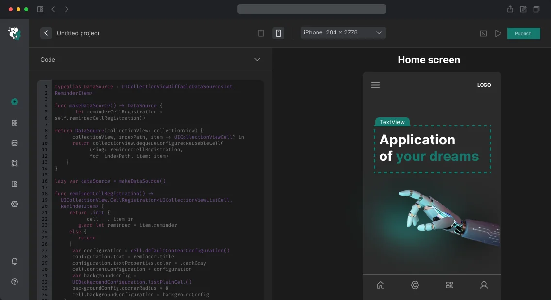
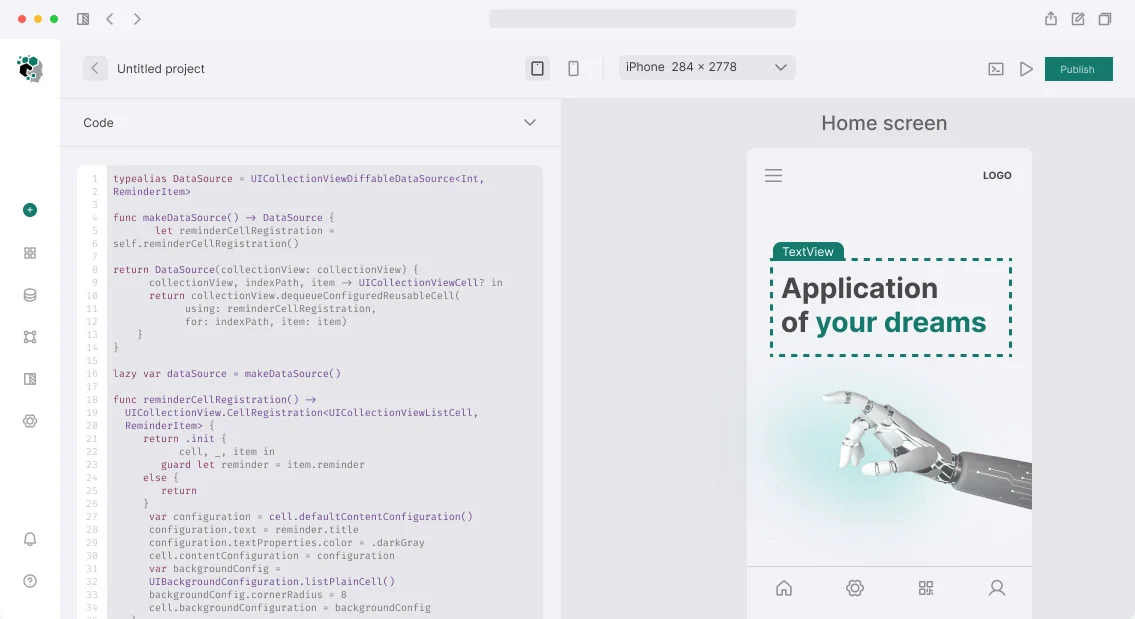
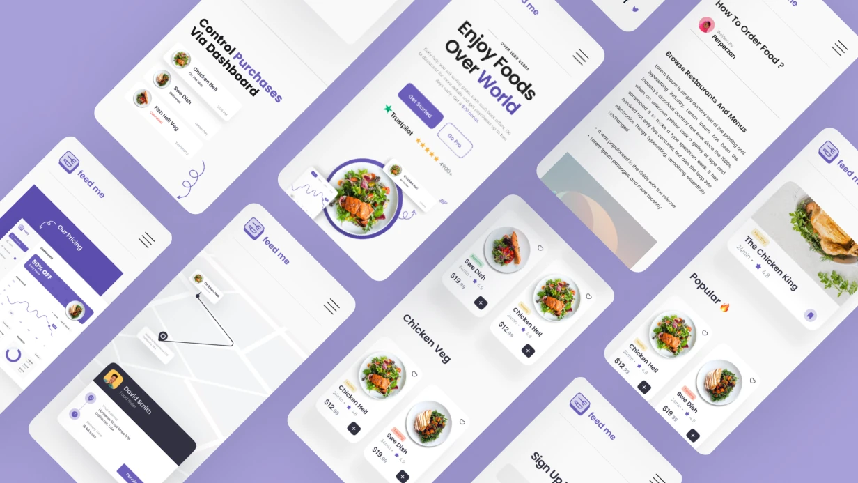
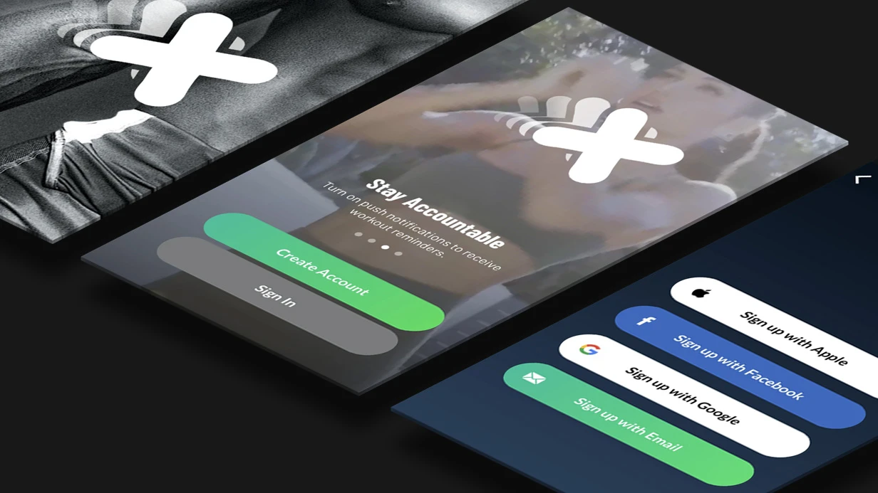
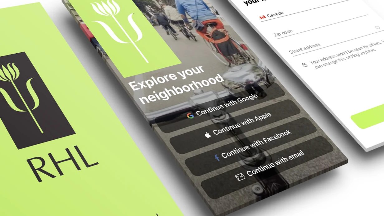
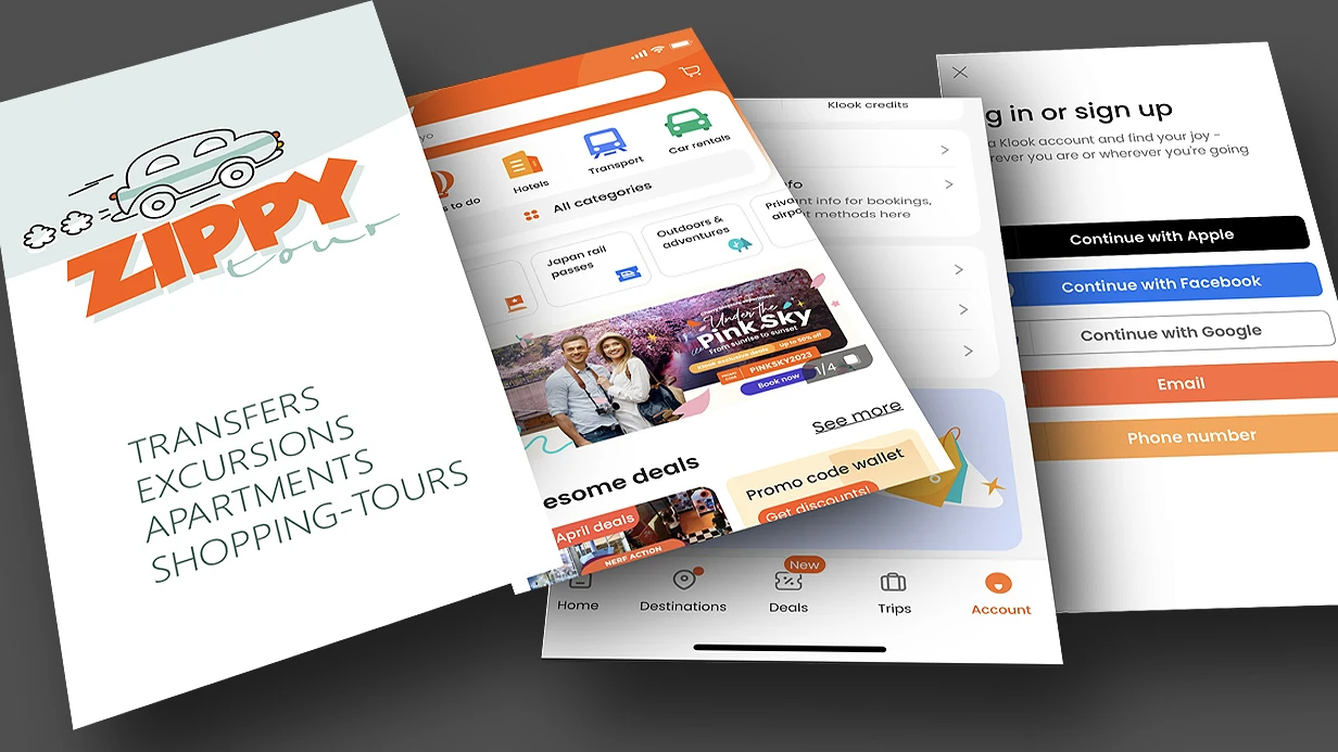
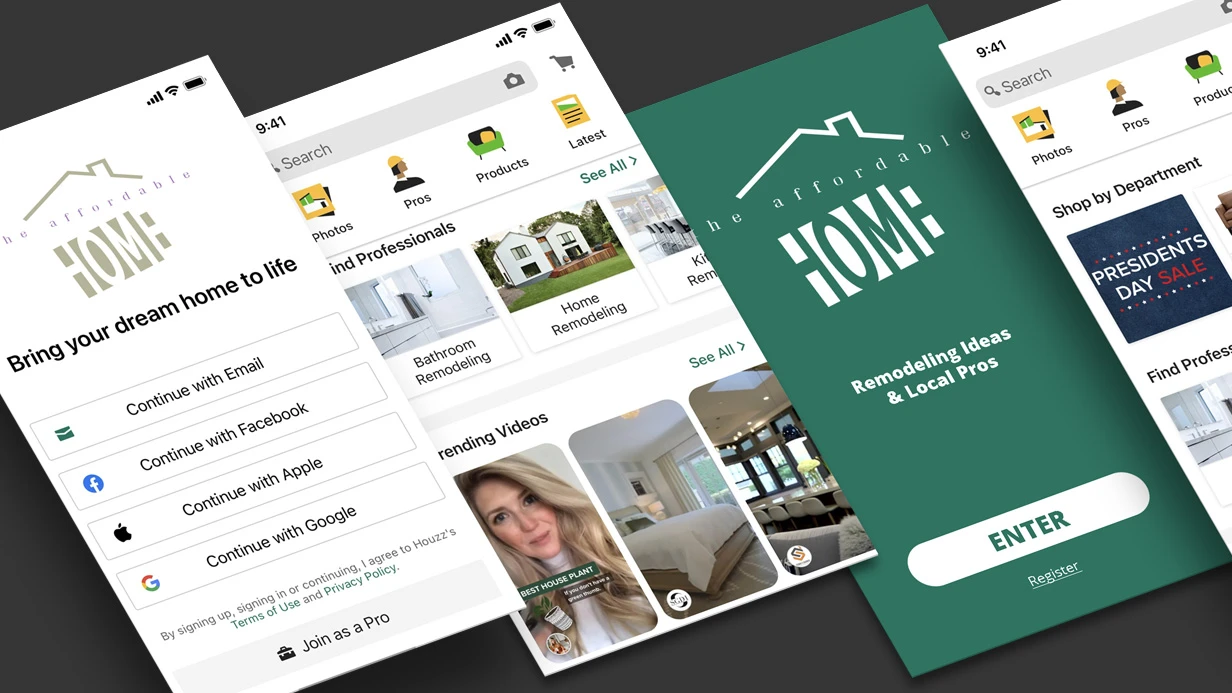
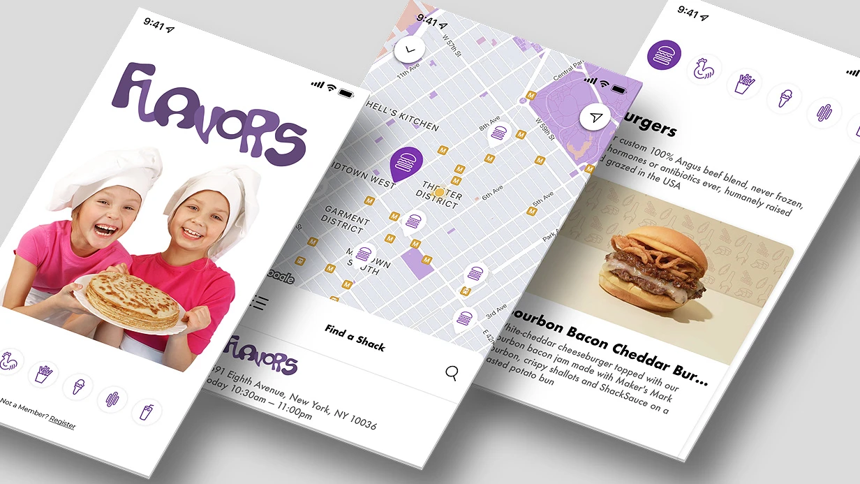
A button without visual feedback feels broken — users tap again, and the app processes a double tap. Micro-animations for mobile app interface elements solve this by making the UI responsive and intuitive. Based on our project experience — 5+ years on the market, 20+ implementations — quality micro-animations boost engagement by 30–40% and reduce erroneous taps by 20%.
Why micro-animations matter for the user
Users don't think about animation until it stops working. When a button 'sticks' or a toggle triggers without visual confirmation, trust in the app drops. Micro-animations solve specific tasks: confirming an action, drawing attention to a status change, smooth transitions between states. As recommended by Apple Human Interface Guidelines, use spring animations for interactive elements to convey physicality and predictability.
How to choose the right animation for a UI element
Choice depends on the element type and context. For buttons, the primary animation is scale on press (0.92–0.96) with a return spring. For icons, symbolic effects (bounce, pulse, variable color) or Lottie. For screen transitions — slide, fade, scale with custom curves. Below are comparison tables:
| Platform | Tool | Performance | Learning Curve | Customization Ease |
|---|---|---|---|---|
| iOS (UIKit) | UIView.animate | Excellent (GPU) | Medium | High |
| iOS (SwiftUI) | withAnimation + symbolEffect | Excellent (Metal) | Low | Medium |
| Android (Compose) | animateFloatAsState | Excellent (GPU) | Medium | High |
| Cross-platform | Lottie | Good (with .lottie compression) | Low | Limited |
| Element | Recommended Animation | Duration (ms) | Spring Parameters |
|---|---|---|---|
| Button | scale (0.94) + spring | 120–300 | damping 0.6, velocity 8 |
| Icon | symbolEffect (bounce) | 200 | — |
| Badge | scaleIn + fadeIn | 150 | damping 0.5 |
| Toggle | slide + color transition | 200 | stiffness 300 |
Implementation on iOS: from UIKit to SwiftUI
UIKit: scale + haptics = proper tap
Minimal feedback implementation on UIButton:
class SpringButton: UIButton { override func touchesBegan(_ touches: Set<UITouch>, with event: UIEvent?) { super.touchesBegan(touches, with: event) UIImpactFeedbackGenerator(style: .light).impactOccurred() UIView.animate( withDuration: 0.12, delay: 0, usingSpringWithDamping: 0.6, initialSpringVelocity: 8, options: [.allowUserInteraction] ) { self.transform = CGAffineTransform(scaleX: 0.94, y: 0.94) } } override func touchesEnded(_ touches: Set<UITouch>, with event: UIEvent?) { super.touchesEnded(touches, with: event) UIView.animate( withDuration: 0.3, delay: 0, usingSpringWithDamping: 0.45, initialSpringVelocity: 6, options: [.allowUserInteraction] ) { self.transform = .identity } } } The .allowUserInteraction flag is mandatory. Without it, the button won't respond to taps while animating, creating a 'sticky' feel.
SwiftUI: symbolic animations and keyframes
SF Symbols 5 (iOS 17+) provide symbolEffect(_:) — ready-made animations for system icons:
Image(systemName: "heart.fill") .symbolEffect(.bounce, value: isLiked) .symbolEffect(.variableColor.iterative.reversing, isActive: isLoading) .bounce — one spring bounce when isLiked changes. No need to write animation manually. For complex multi-step micro-animations — KeyframeAnimator:
KeyframeAnimator(initialValue: CheckmarkState()) { value in Circle() .scaleEffect(value.scale) .opacity(value.opacity) } keyframes: { _ in KeyframeTrack(\.scale) { LinearKeyframe(0.0, duration: 0.05) SpringKeyframe(1.2, duration: 0.2, spring: .bouncy) SpringKeyframe(1.0, duration: 0.15) } KeyframeTrack(\.opacity) { LinearKeyframe(0.0, duration: 0.05) LinearKeyframe(1.0, duration: 0.1) } } This pattern animates a checkmark after a success action — scale+opacity simultaneously with different curves.
Android: Jetpack Compose and AnimatedVisibility
In Compose, micro-animations are built with animateFloatAsState, animateColorAsState, and updateTransition:
val scale by animateFloatAsState( targetValue = if (isPressed) 0.93f else 1f, animationSpec = spring( dampingRatio = Spring.DampingRatioMediumBouncy, stiffness = Spring.StiffnessHigh ), label = "button_scale" ) Box(modifier = Modifier .scale(scale) .clickable( interactionSource = interactionSource, indication = null // remove ripple, replace with spring ) { onClick() } ) indication = null removes the standard ripple. This is debatable: Material Design 3 expects ripple as default. Remove it only when you have a complete replacement.
AnimatedVisibility with custom enter/exit for element appearance:
AnimatedVisibility( visible = showBadge, enter = scaleIn( animationSpec = spring(Spring.DampingRatioLowBouncy), transformOrigin = TransformOrigin(1f, 0f) ) + fadeIn(), exit = scaleOut(transformOrigin = TransformOrigin(1f, 0f)) + fadeOut() ) { Badge { Text(count.toString()) } } TransformOrigin(1f, 0f) — animation from the top-right corner, like notification badges.
Lottie for icons with states
When a designer wants a complex icon — like, favorite, toggle with custom track — Lottie is easier than writing it programmatically. The animator exports JSON via Bodymovin from After Effects, integrated via lottie-ios or lottie-android. Lottie's problem: files can be heavy. 200 KB JSON for a favorite icon is too much. Optimize using dotLottie format (.lottie — ZIP archive) or remove unneeded layers in the editor. More about the format can be found in the Wikipedia article on Lottie.
Common mistakes
- Animating
backgroundColordirectly via UIView — this is a Core Animation CATransaction without GPU acceleration for color. Correct: change viaUIView.animateor useCABasicAnimationon the layer'sbackgroundColor. - Forgetting about reduceMotion. On iOS check
UIAccessibility.isReduceMotionEnabled, on Android checkSettings.Global.TRANSITION_ANIMATION_SCALE. Users with vestibular disorders disable animations. Respect this: if reduceMotion is active, replace complex animations with a simple fade or disable them entirely.
How to check animation performance?
Use Xcode Instruments (iOS) or Android Profiler to measure frame time. Ensure animations don't cause layout redraws. For Lottie, verify frame rate doesn't drop below 60 FPS. If it does, compress JSON or reduce layer count.Process
- Collect UI inventory: all interactive elements in the app (average 10–15).
- Align with designer: which elements animate, what feeling to convey (confidence, lightness, urgency).
- Develop animation library — reusable components for each type.
- Add haptic feedback where appropriate.
- Test with reduceMotion and optimize performance.
- Integrate into project and test on real devices.
What the work includes
- Audit of current interactive UI elements
- Agreement on animation scenarios with the designer
- Development of reusable component library (iOS/Android)
- Integration of haptic feedback
- Testing on physical devices
- Documentation and design guidelines
- Post-launch support
Timeline and budget
A micro-animation library for 10–15 UI elements takes 2–3 working days. If Lottie animations from scratch (JSON creation by an animator) are needed, that's a separate phase of 1–3 days. We provide project evaluation for free and offer optimal timelines.
Contact us for an assessment — we'll help make your interface responsive and enjoyable for users. Order micro-animations turnkey and get a consultation from our engineer.