

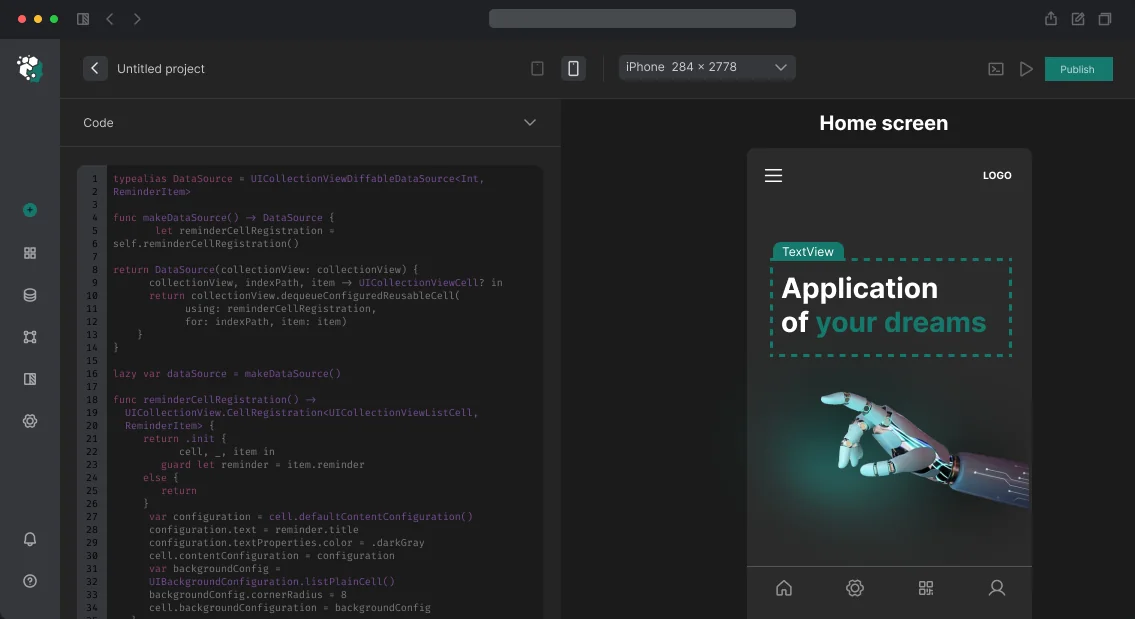
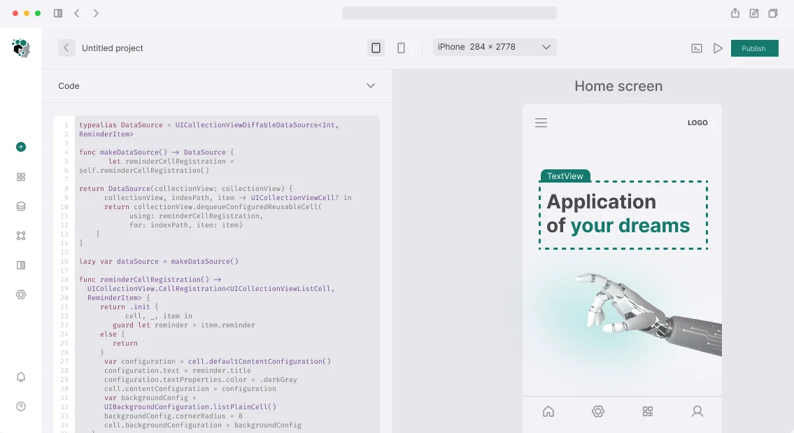
After updating iOS to dark theme, half the buttons become unreadable, and on Android the app crashes when switching themes? That's a familiar situation if colors are hardcoded. We implement dark mode with automatic switching, semantic tokens, and WCAG AA contrast. Our experience shows that proper implementation increases user retention by 20–30%, while mistakes in dark theme ruin the app experience.
How not to do it: inversion and hardcoded colors
The first and most costly mistake is using hardcoded colors instead of semantic tokens. Color.white, #FFFFFF, UIColor(red:1 green:1 blue:1 alpha:1) — all of these break when switching themes. Fixing later means rewriting all UI components.
The correct approach is semantic tokens: background.primary, text.secondary, surface.elevated, accent.default. On iOS that's UIColor.systemBackground, UIColor.label, UIColor.secondaryLabel and custom colors via Asset Catalog with Light and Dark variants. On Android — Material Design 3 with colorScheme through MaterialTheme.colorScheme.surface, onSurface, surfaceVariant. In Flutter: ThemeData.light() and ThemeData.dark() with a full set of ColorScheme, switching via MaterialApp(themeMode: ...). In React Native: useColorScheme() hook from core + Appearance.getColorScheme() for initialization.
Why semantic tokens are the only correct approach?
Semantic tokens allow you to change the theme centrally without editing each screen. Compare: with hardcode, changing the background color requires finding and replacing 50+ occurrences. With tokens, you change the value of one variable. That's 5 times faster and eliminates errors. According to Apple HIG, using system colors and semantic tokens is mandatory for passing review (Section 4.2).
| Approach |
Time to change color |
Error risk |
Flexibility |
| Hardcode |
30–60 minutes (50+ edits) |
High |
Low |
| Semantic tokens |
2–5 minutes |
Low |
High |
What rules to follow for the dark palette?
Dark theme is not just a dark background. Here are the main rules that are most often violated.
Elevation through lightening, not shadows
In Material Design 3, surfaces at different z-index levels in dark theme differ by brightness: the higher, the lighter. surface → surfaceContainer → surfaceContainerHigh. Shadows are almost invisible in dark theme — they are replaced by tonal separation.
Text contrast
WCAG AA requires at least 4.5:1 for normal text. White #FFFFFF on dark #121212 = 18.1:1 — too high, straining eyes. Optimal #E0E0E0 on #121212 = 14.7:1. Google recommends #FFFFFF with 87% opacity for primary text.
| Text type |
Minimum contrast (WCAG AA) |
Target in dark theme |
| Normal text |
4.5:1 |
14:1 |
| Large text (>=18pt) |
3:1 |
7:1 |
| Accent elements |
3:1 |
Adapted |
Accent color
Many accent colors in dark theme need slight desaturation and lightening. Bright blue #2196F3 on dark background vibrates and causes discomfort. #90CAF9 is the correct version for dark mode.
Images and illustrations
Photos don't change. Illustrations with white background are a problem. Solution: SVG illustrations with transparent background and adaptive colors via currentColor.
Dynamic switching
iOS since version 13 supports traitCollectionDidChange — the system automatically notifies about theme change. SwiftUI redraws with @Environment(\.colorScheme). UIKit requires explicit override func traitCollectionDidChange. Android: AppCompatDelegate.setDefaultNightMode() for programmatic switching. DayNight theme in styles.xml. Activity restarts on theme change — need to save state via ViewModel or onSaveInstanceState.
Important edge case: the user changes the theme in system settings while the app is in the background. When brought to the foreground, the app must apply the new theme without noticeable flickering. On Android this is recreate() activity or configChanges: uiMode in manifest with manual handling.
Testing dark theme
Three levels: Figma (all components with light/dark variants via Figma Variables), simulator/emulator (switching via quick settings), physical device in OLED mode (iPhone 12+, Samsung Galaxy) — check for "pure" black, absence of halo effect around light elements. Tools: Xcode Accessibility Inspector for contrast checking, Android Accessibility Scanner. Check all screens, all modals, all alerts — they often use system colors and break first.
What's included in the work
- Audit of existing codebase (finding all hardcoded colors)
- Converting colors to semantic tokens
- Creating dark palette in design system (Figma Variables + code)
- Implementing dynamic theme switching
- Testing contrast and readability (WCAG AA)
- Documentation on token usage and support during release
Estimated timelines
| Application |
Timeline |
| New, tokens from scratch |
2–3 days |
| Existing, needs color refactoring |
3–5 days |
| Complex, many custom components |
5–7 days |
The cost is calculated individually after project audit. If you want to implement dark mode with quality guarantee, contact us — we'll evaluate your project for free. Over 5 years of experience and 50+ implemented projects in mobile development. Order dark mode implementation and get a consultation.
Additional implementation details
When transitioning to semantic tokens, don't forget about system elements: status bar, keyboard, system alerts. On iOS use `UIStatusBarStyle`, on Android — `View.SYSTEM_UI_FLAG_LIGHT_STATUS_BAR`. For keyboard in iOS 13+ there is `overrideUserInterfaceStyle`.
UX/UI Design for Mobile Apps: Why a Figma Layout Doesn't Guarantee a Ready Interface
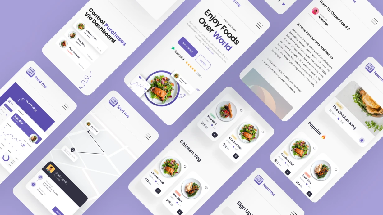
A designer sends a layout—beautiful, with gradients and custom components. The developer opens it and realizes: the button is 36pt, the tap target is 20pt. On an iPhone SE, it's physically impossible to press with a thumb. The bottom sheet covers content when the keyboard appears. Navigation is built against the native iOS model. Apple will reject the app, or users will leave within a week—depending on how lucky you get with the review.
We have been designing mobile UX/UI for over 5 years and have seen hundreds of such situations. During this time, we have designed and helped launch 30+ mobile apps—from fintech products to social networks. You don't need to guess whether the design will pass App Review or Google Play—we embed platform requirements from the first screen. We'll assess your project in one day, contact us.
Mobile UX/UI is not an adaptation of web design. It is a separate discipline with specific platform constraints: safe area, touch gestures, UIViewController lifecycle, Activity state management.
Why Can't You Ignore Human Interface Guidelines and Material Design 3?
Apple HIG and Google Material Design 3 are not aesthetic recommendations. They are documented user expectations formed by years of using system applications. Expectations confirmed by user experience research on mobile platforms (User experience design).
HIG defines: minimum tap target 44×44 pt, safe area insets for notch and Dynamic Island, standard gestures (swipe back on iOS, back gesture on Android 10+). Ignoring safe area is a common mistake. safeAreaLayoutGuide in UIKit and safeAreaPadding in SwiftUI exist precisely for this. A designer who doesn't set safe area margins in Figma guarantees a bug during development.
Material Design 3 introduced Dynamic Color—the color scheme is generated from the user's wallpaper via MaterialTheme.colorScheme in Jetpack Compose. An app that ignores dynamic colors on Android 12+ looks out of place. This is not critical for niche products but is noticeable in mass-market apps.
The most painful platform guideline inconsistencies we encounter on projects:
- Custom navigation on top of system navigation. iOS users expect swipe back from any point on the left edge of the screen. A custom
NavigationController without interactive gesture breaks this. Android users expect the system back button—a custom back button in the left corner does not fully replace it.
- Modal windows instead of navigation push. Bottom sheets are appropriate for actions, not for navigating content.
- Missing haptic feedback.
UIImpactFeedbackGenerator on iOS is not decoration but part of the interface response. Buttons, swipes, and confirmation actions without tactile feedback feel broken.
Table: Comparison of iOS and Android UX/UI Requirements
| Parameter |
iOS (HIG) |
Android (Material Design 3) |
| Minimum tap target |
44×44 pt |
48×48 dp |
| Safe area |
safeAreaLayoutGuide / safeAreaPadding |
Insets in WindowInsets |
| Back gesture |
Swipe from left edge |
System back gesture (Android 10+) |
| Color scheme |
System dark/light |
Dynamic Color from wallpaper |
| Typography |
San Francisco (Dynamic Type) |
Roboto (Material Type Scale) |
| Haptic feedback |
UIImpactFeedbackGenerator |
HapticFeedbackConstants (Compose) |
How to Get the Most Out of Figma?
The Figma Variables API has changed the workflow. Design tokens—colors, typography, radii, spacing—are stored as variables and exported directly to code via figma-tokens or style-dictionary. This eliminates manual value transfer and desynchronization between design and implementation. Practice shows: Figma Variables speeds up asset handoff to development by 2–3 times compared to static frames, and using design tokens reduces code transfer errors by 60%.
Auto Layout with wrap and spacing between elements allows building components that behave like flex containers. A developer opens a component and sees not a static artifact but a description of behavior at different content sizes.
Component Properties—variants, boolean toggles, instance swaps—enable building a full design system right in Figma. A button with 4 states (default, hover, pressed, disabled), 3 sizes, and 2 icon variants is one component, not 24 frames.
Figma Prototype with Variables allows creating an interactive prototype with real state: showing how the screen changes with different variable values. This is no longer just a "clickable layout" but a full UX testing tool.
How to Benefit from Prototyping and UX Testing Before Development?
The most expensive mistake in a mobile product is to develop a feature, release it, and discover that users don't understand how it works. A Figma prototype at the testing stage costs zero development hours. Redoing a finished screen costs days. Testing a prototype before development begins reduces the number of fixes by 80%.
For usability testing, we use Maze (task testing on a prototype—the user goes through a scenario, we get heatmaps and mis-click rates) or direct sessions via UserTesting. Key metrics are task completion rate and time on task, not "like/dislike."
A/B testing on mobile is harder than on web: the App Store doesn't allow UI changes without an app update. Therefore, it's important to test hypotheses on a prototype before release, not through production experiments. According to research, fixing a bug found on a prototype costs 10 times less than after production release. And average task completion time increases by 40% after proper UX optimization during prototyping.
Why Are Animations Critical for Interface Perception?
Animations in mobile apps are feedback. An element doesn't appear instantly—it transitions to the desired state over 200–350 ms. This gives the brain context to understand what happened.
- iOS:
withAnimation in SwiftUI, UIViewPropertyAnimator in UIKit for interactive animations with interruption capabilities. Spring animations with dampingRatio are the basis of most Apple system transitions.
- Android:
AnimatedVisibility, animateContentSize, Crossfade in Compose. MotionLayout for complex scenes with multiple transformations.
- Flutter:
AnimationController + Tween, Hero animations between screens, Lottie for After Effects exports. Lottie is especially effective for onboarding illustrations and empty states.
The key constraint is 16 ms per frame (60 fps) or 8 ms (120 fps on ProMotion devices). Animations must run on the GPU via CALayer/RenderThread, not on the CPU via layoutSubviews. Profiling via Core Animation instrument in Xcode is a mandatory step before releasing animated screens.
Why Is Accessibility Not an Optional Feature?
VoiceOver on iOS and TalkBack on Android are used by up to 15% of users—this statistic is confirmed by accessibility research described in Accessibility (Wikipedia). In absolute numbers for a large app, this is thousands of people. Additionally, App Store rejections due to accessibility occur, though rarely.
Minimum checklist:
- All interactive elements have
accessibilityLabel
- Text contrast ratio at least 4.5:1 (WCAG AA)
- Dynamic Type is supported—the interface doesn't break at maximum font size
- VoiceOver focus flows through the screen in a logical order
SwiftUI automatically generates an accessibility tree from component semantics. UIKit requires manual setup of accessibilityTraits, accessibilityHint, and grouping via shouldGroupAccessibilityChildren.
What Does the Work Include?
The UX/UI design deliverables include:
| Deliverable |
Description |
| User flows and wireframes |
Screen structure and user paths |
| Design system |
Design tokens, components, Style Dictionary for export |
| UI layouts (Figma) |
All screens following platform guidelines |
| Interactive prototype |
Prototype with variables and animations |
| Development specification |
Zeplin / Figma Dev Mode with dimensions, margins, states |
| Maintenance guide |
Recommendations for adding new screens and components |
What Is the Process and Timeline?
Design goes through stages: research and competitive analysis → user flows and wireframes → design system → UI layouts → prototype → testing → handoff to development.
Timeline estimates:
| Scope |
Timeline |
| Redesign of 3–5 screens |
1–2 weeks |
| MVP (10–15 screens) |
3–5 weeks |
| Full product (30+ screens) |
6–10 weeks |
The project scope and timeline are determined after analyzing your requirements—number of screens, component complexity, whether a design system is needed or we work with an existing one. Get a consultation for your project—contact us for a preliminary assessment. Order a complete mobile app design—we'll assess your project in one day and propose the optimal work scope.