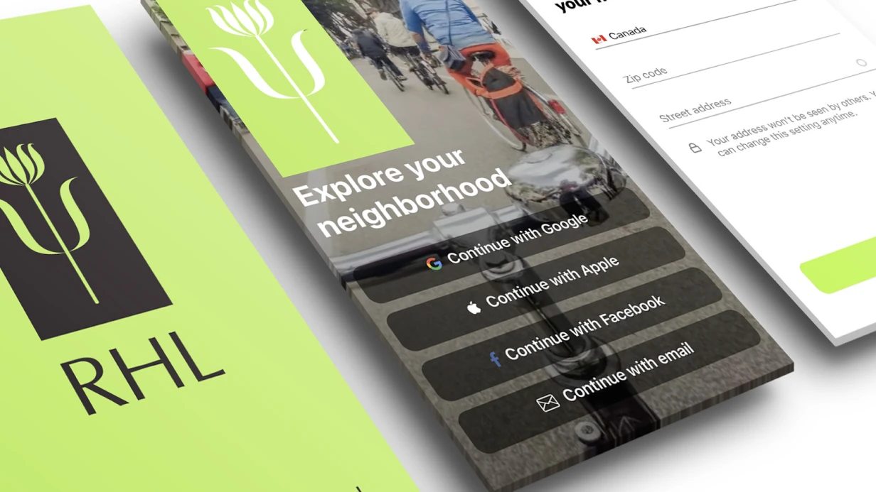
Mobile App Interactive Prototypes in Figma
Interactive prototype in Figma is not a replacement for development. It's a tool for testing hypotheses, client agreement, and user testing without a single line of code. Difference between static mockups and clickable prototype becomes obvious at first usability test: what seemed clear in pictures breaks when real user tries to go through scenario.
Figma prototyping capabilities
Figma Prototyping in 2024–2025 is a full-featured tool for imitating native behavior. Key capabilities we use:
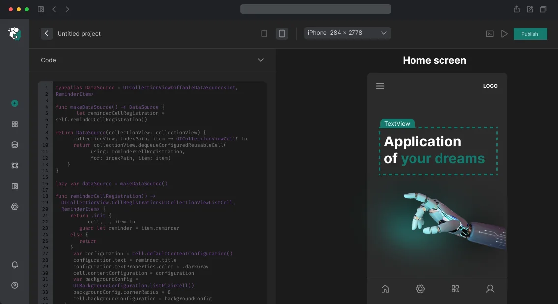
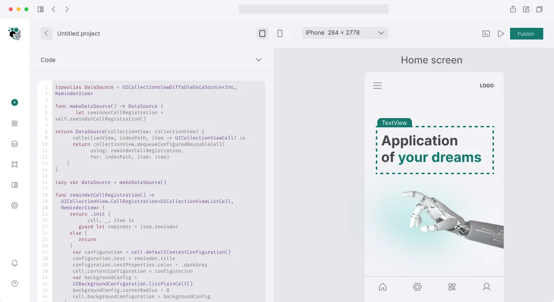
Smart Animate — smooth transitions between component states without external tools. Allows imitating expand/collapse, card transition to detail screen, bottom sheet appearance animation. Works correctly with proper layer naming — layers with same names animate between frames.
Interactive Components — components with internal states. Checkbox, toggle, accordion, stepper — all work right in prototype without frame duplication. Significantly reduces screen count in file while maintaining realism.
Variables and Conditions — with Figma Variables you can implement: counters (add item to cart), theme switching (light/dark), conditional element visibility (if user authorized). This moves prototype from "clickable pictures" level to "working flow".
Overlay and Advanced Interactions — Bottom Sheet, Modal Dialog, Dropdown Menu with proper appearance and close animation. Configure Open overlay with smart animate and positioning bottom center to imitate native Bottom Sheet.
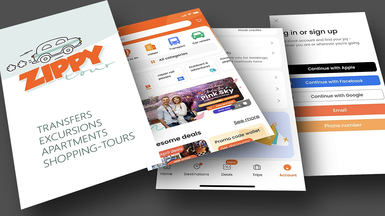
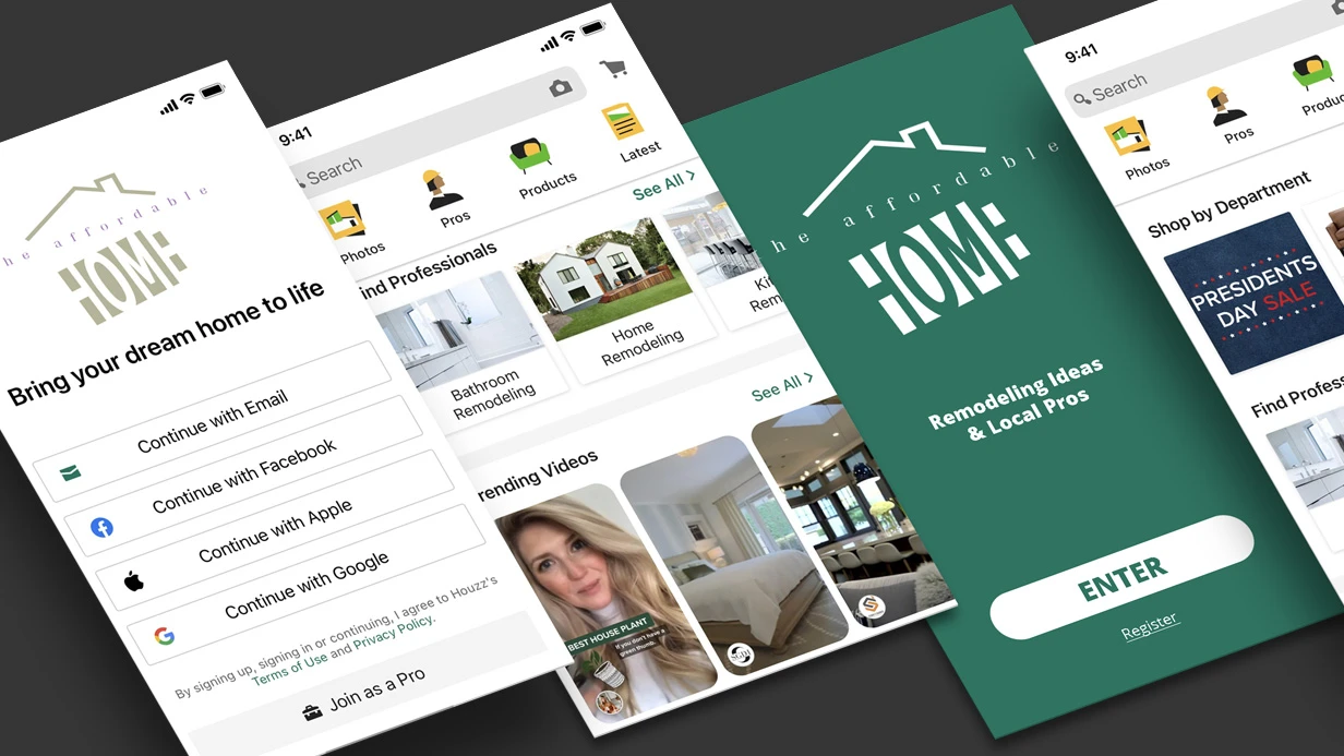
What we build in prototype
Don't make all 50 screens clickable. Prioritize critical user journeys:
- Onboarding → Registration → Home screen
- Search / Catalog → Product card → Add to cart → Order checkout
- Profile → Edit → Save → Confirmation
Other screens — static, linked for context. Prototype should be realistic enough for testing but not eat up a week on secondary flow animations.
Setup for testing on real devices
Figma Mirror (iOS/Android) or opening Prototype link in Safari on iPhone — mandatory step before any test. Prototype on desktop looks different from 6-inch screen in hands. Touch target sizes that seemed normal at 1:1 preview turn out too small — important to catch before usability session.
Set frames to specific devices: iPhone 15 Pro (393×852), iPhone SE 3rd gen (375×667), Samsung Galaxy S24 (360×780). For Android prototypes — enable system navigation display (gesture bar or 3-button nav) in frame settings.
Handoff to developers
Figma Dev Mode is standard for handoff: sizes, padding, colors from tokens, asset export. But developer needs prototype not for measurements, but for understanding behavior: which transitions, which animations, what happens on swipe. Dev Mode shows static specs; prototype shows dynamics.
Add prototype annotations: nonstandardbehavior description, links to native components (UISheetPresentationController, Material Bottom Sheet), animation timings.
Timeline
Interactive prototype for 3–5 key flows (15–25 screens with animations) — 2–3 working days. More complex prototypes with Variables and conditional logic — discussed separately.
Cost calculated individually after analyzing requirements.