Mobile App Product Card Screen Design
The product card is the screen where the user decides "buy or not." Conversion here directly depends on how quickly and without cognitive load a person finds what they need: price, "add to cart" button, photos, key specs. A poorly designed screen is not "ugly," it is money the client loses every day.
Image Gallery: The Most Painful Spot
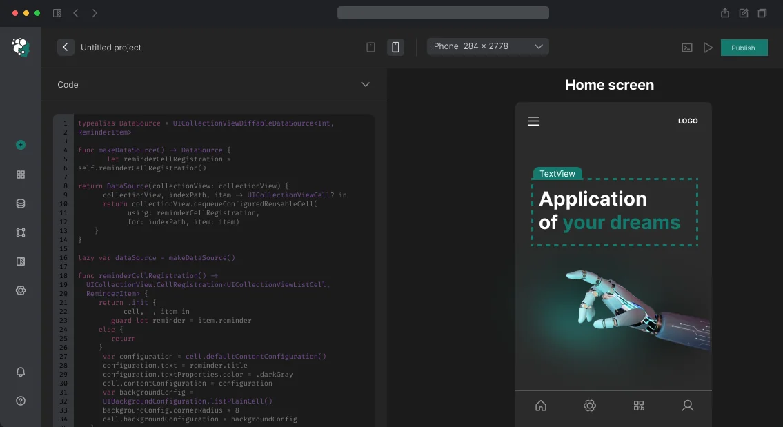
Product photos are technically the most complex screen element. Horizontal UIScrollView with isPagingEnabled on iOS seems simple, but breaks when images have different aspect ratios. Height container jumps when swiping—classic. Solution: fixed aspectRatio container (often 1:1 or 4:3) with contentMode = .scaleAspectFit and blur-hash placeholder via Blurhash.
On Android Compose the same story: HorizontalPager from Accompanist (now native Compose Foundation) plus AsyncImage from Coil 2.x with placeholder and error states. Zoom on double tap—separate task often forgotten in requirements, then added as hotfix.
Gallery pagination: dot indicators work up to 5–6 images. Beyond that, need counter "1/12." This is designed in advance.
Screen Structure
The screen cannot be split into "fixed" and "scrollable" content arbitrarily—this decision affects architecture in CoordinatorLayout (Android) or UIScrollView + sticky header (iOS). Design must explicitly fix what is pinned to bottom (Buy button), what scrolls with content, what stays in the navigation bar.
Mandatory states:
- Product in stock / out of stock
- Variant selection (color, size)—before and after selection
- Added to cart (brief confirmation without navigation)
- Loading (skeleton for text fields, shimmer for gallery)
- Load error with retry option
Variant selection is separate UX pattern. Color chips require accessibilityLabel with color name, not just color swatch. Size picker with letter sizes (XS/S/M/L/XL) should show unavailable sizes as strikethrough, not hide them—user should see the size exists, it is just unavailable now.
"Add to Cart" Button
Fixed at screen bottom—standard for mobile commerce. Button height minimum 52pt (iOS HIG), 56dp (Material Design 3). States: default, loading (spinner instead of text), success (brief), disabled. Haptic feedback on successful add—on iOS via UIImpactFeedbackGenerator, on Android via VibrationEffect.
Timeline
1 day with existing design system and gallery components. Cost is calculated individually after reviewing requirements and current design state.