

Mobile App Product Catalog Screen Design
The catalog is the entry point for most user sessions. Perception speed, filtering, product navigation—everything works or breaks on this screen. Typical mistake: designer draws a pretty grid, developer implements it, then it turns out that UICollectionViewFlowLayout cannot handle dynamic cell heights and cards jump while scrolling. Or on Android Jetpack Compose LazyVerticalGrid starts redrawing all visible cells on every filter state change—and the user sees flickering.
What Really Matters in Catalog Design
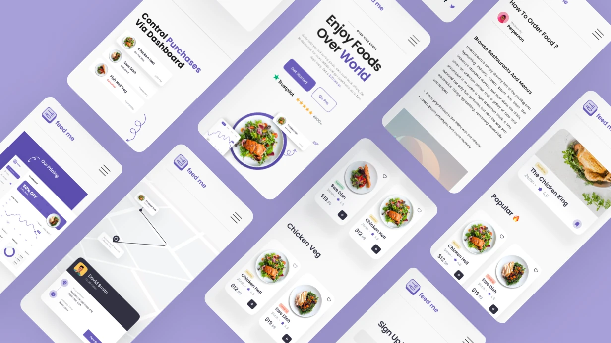
The main choice—grid or list. This is not aesthetics, it is a UX decision with implementation consequences. Grid with two columns on iPhone SE 2nd gen leaves ~160 pt card width. If the card contains: photo, title, price, rating, "add to cart" button—priorities must be clearly set by hierarchy, otherwise text is cut off or the button disappears.
Switching between modes (grid/list)—a common feature added "on the fly." When this decision is made at design level in advance, implementation via @State in SwiftUI or remember { mutableStateOf() } in Compose is clean. When not—workarounds appear.
Components we refine:
- Product card: states normal, out-of-stock, sale, new—all four, not just normal
- Filters and sorting: bottom sheet vs inline chips—depends on parameter count
- Loading states: skeleton placeholders with correct proportions for real content
- Empty state when search/filter returns no results
- Pagination: loading indicator at end of list
Product photos come in different sizes and aspect ratios. Card must handle this—AspectRatio mode fill vs fit, placeholder on load error, blur-hash for smooth reveal via Blurhash SDK.
How We Build the Design
We work in Figma with Auto Layout. Each component covers all states via Component Properties—this accelerates handoff to developer and eliminates misunderstanding "how does a blocked product look."
Typographic scale and color tokens connect to the existing design system if it exists. If not—form minimal set: 4–5 text styles, basic palette accounting for future dark mode. Saves time on revisions.
For eCommerce catalogs, we separately refine behavior on slow internet: what we show while first page loads, how a card looks with partially loaded image.
Timeline
Catalog screen design—about 1 day with ready design guide. If guide does not exist and we need to form style from scratch, add 0.5–1 day on agreeing basic tokens. Estimate is clarified after reviewing requirements and current design system state.