

We create 3D environments for mobile games — buildings, props, landscapes. The main focus is performance: every module is optimized to run at 60 FPS on mid-range devices. With over five years of experience and more than 20 shipped projects, we ensure that level designers get a construction kit, not just pretty pictures.
Environment in a mobile 3D game isn't just a collection of beautiful objects. It's a system of modular meshes that a level designer can assemble like a construction set, with batched materials, proper occlusion, and a polygon budget that allows rendering an entire scene at 60fps on an iPhone 13.
Why modularity is critical for a mobile game
In Unity: Static Batching combines static objects with the same material into one draw call. Condition: identical Material instance. 50 walls from one prefab with one material = 1 draw call instead of 50. GameObjects → Static must be enabled. It increases RAM (combined meshes stay in memory), so for mobile be careful with total static geometry size.
GPU Instancing — for repeating objects (trees, rocks, plants) that may still move. One GPU call draws N copies with different transformation matrices. In Unity: Material.enableInstancing = true.
Snapping grid: all modules are built on a common grid — 1m, 0.5m, 0.25m. Snap vertices (attachment points) on module edges. In Blender, set Snap to Vertex for modeling, Unit Scale = 1.0 (not 0.01, otherwise scale won't match Unity's 1 unit = 1 meter).
Optimization techniques for environment
Occluder and occludee. Large walls, buildings should be occluders — objects that hide what's behind them. In Unity Occlusion Culling — bake data via Window → Rendering → Occlusion Culling → Bake. Objects behind walls are not rendered at all. For a mobile game with interiors (dungeon crawler, RPG) this is critical — without occlusion each room loads the GPU even if not visible.
Collision mesh. Collision should not match the visual mesh. For a complex object (gnarly tree, ruins) a simple Box/Capsule Collider is enough for gameplay, saves Physics CPU. In Unity: Mesh Collider with Convex = true for convex objects, Box/Capsule Collider for simple shapes.
Detail meshes vs terrain. Unity Terrain + Detail Meshes for grass and small vegetation — built-in system with LOD and culling. For mobile: Detail Distance no more than 30–50 units, Detail Density limited (grass with density 1.0 gives thousands of objects). Billboard detail type (flat grass texture) is faster than full 3D meshes.
Comparison of draw call optimization techniques
| Technique |
Principle |
When to use |
Impact on FPS |
| Static Batching |
Combine static geometry with same material |
Immovable objects (walls, floors) |
+20–40% (draw calls from 50 to 1) |
| GPU Instancing |
One draw call for many identical objects |
Repeated objects (trees, rocks) |
+10–20% (many copies) |
| Occlusion Culling |
Don't render objects behind occluders |
Interiors, closed spaces |
+30–60% depending on architecture |
How Level of Detail (LOD) affects performance
| LOD level |
Polygon budget |
When visible |
Application |
| LOD0 |
100% |
Close to camera |
Hero props, key objects |
| LOD1 |
50–60% |
Medium distance |
Secondary props, most objects |
| LOD2 |
10–20% or billboard |
Far distance |
Filler, crowd |
Light baking
Real-time Global Illumination on mobile is too expensive. The standard is baked lighting via Unity Lightmapper (built-in or Progressive GPU Lightmapper). Lightmap Resolution 10–20 texels/unit for environment, 40+ for important objects. Lightmap Size max 2048 on mobile — several atlases for large scenes.
URP Baked Global Illumination: objects with Contribute Global Illumination participate in baking. Dynamic objects (characters) get GI via Light Probes — placed in the editor where characters move.
Ambient Occlusion for environment — via baking into texture (Substance Painter or Blender bake), not via real-time SSAO. SSAO on mobile is a luxury not in the performance budget.
How we optimize lighting
From practice: a mobile runner, Unity URP. Scene with city blocks: 300 draw calls, 35 FPS on Xiaomi Redmi 10. Problem: each modular block had its own material instance (due to random color changes in the inspector on some objects). Materials were no longer identical — static batching broke. After resetting all materials to the original shared instance: 45 draw calls, stable 60 FPS. Savings with baked lighting instead of real-time: up to 30% of the GPU budget.
Styling and level of detail
Hero props — key objects the player sees close up: chests, doors, altars. High detail, quality textures 1024×1024 or 2048×2048.
Secondary props — furniture, decor, common environment elements. Medium detail, atlas textures (multiple objects on one atlas).
Filler / background props — distant background, crowd. Minimal detail, LOD2 or billboard.
Trim sheets — one texture atlas with strips of different materials (brick, metal, wood) applied to modular meshes. Allows one atlas to cover all environment of a location. Popular in AAA development, applicable on mobile too.
How we create a modular set (step by step)
- Analyze gameplay and level layout: define room types, transitions, number of unique props.
- Design the modular block grid (floor, wall, corners, doorways) with a common snap grid.
- Model blocks in Blender with UVs for atlas and second UV for lightmap.
- Create texture atlases and trim sheets (e.g., brick, wood, metal) to reduce material count.
- Export in FBX/glTF with correct pivot points and scale.
- Import into Unity, set up static batching and occlusion culling, test draw calls and FPS.
Checklist for module acceptance
- Unified snap grid (0.5m or 0.25m)
- UV2 for lightmap
- LOD0 and LOD1
- Simple collision (Box/Capsule)
- Materials from one shared instance
- Pivot point at center of bottom edge
What's included in the work (turnkey)
- Modular geometry set for the location (floor, walls, ceilings, transitions, decor)
- Hero props with full texture set
- LOD0 + LOD1 for environment objects
- UV setup for light baking (Lightmap UV, second UV channel)
- Optimized collisions
- Export to FBX/glTF with correct pivot points
- In-engine test: Draw Calls, batching, Occlusion Culling
Timelines and cost
Modular kit for one location (20–40 unique modules) — 4–8 weeks depending on style complexity and number of hero props. Full environment for a mid-size mobile game (3–5 locations) — 2–4 months. Cost is calculated individually based on scope. We'll assess your project in 2 days — reach out for a consultation.
UX/UI Design for Mobile Apps: Why a Figma Layout Doesn't Guarantee a Ready Interface
A designer sends a layout—beautiful, with gradients and custom components. The developer opens it and realizes: the button is 36pt, the tap target is 20pt. On an iPhone SE, it's physically impossible to press with a thumb. The bottom sheet covers content when the keyboard appears. Navigation is built against the native iOS model. Apple will reject the app, or users will leave within a week—depending on how lucky you get with the review.
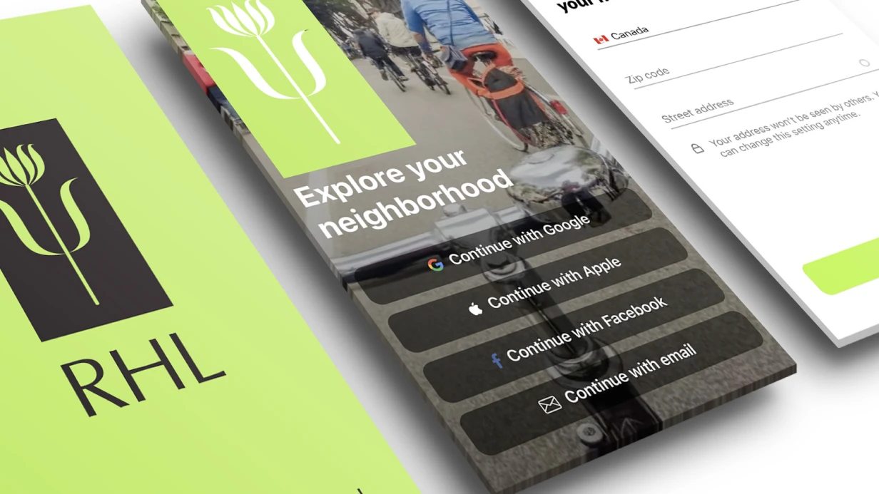
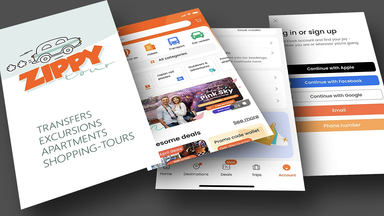
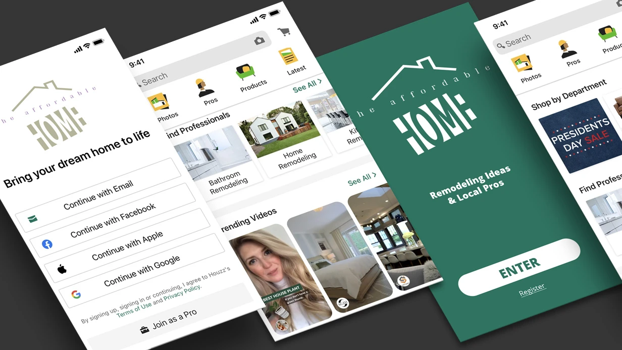
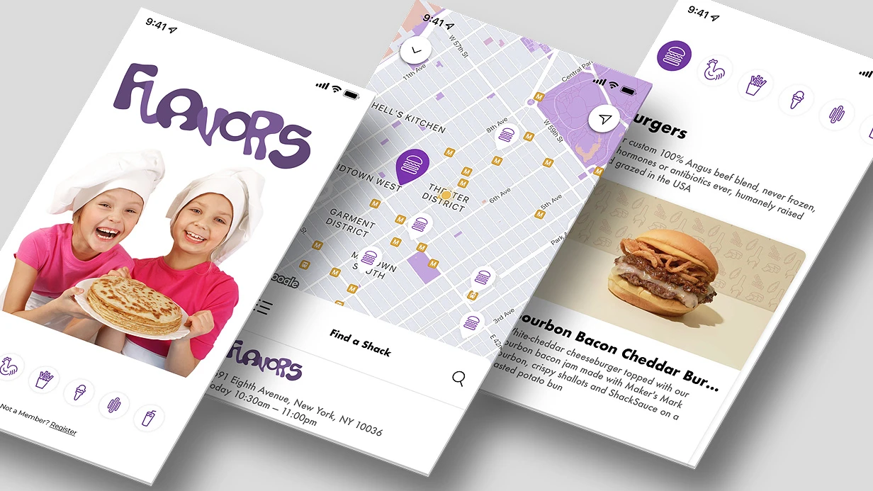
We have been designing mobile UX/UI for over 5 years and have seen hundreds of such situations. During this time, we have designed and helped launch 30+ mobile apps—from fintech products to social networks. You don't need to guess whether the design will pass App Review or Google Play—we embed platform requirements from the first screen. We'll assess your project in one day, contact us.
Mobile UX/UI is not an adaptation of web design. It is a separate discipline with specific platform constraints: safe area, touch gestures, UIViewController lifecycle, Activity state management.
Why Can't You Ignore Human Interface Guidelines and Material Design 3?
Apple HIG and Google Material Design 3 are not aesthetic recommendations. They are documented user expectations formed by years of using system applications. Expectations confirmed by user experience research on mobile platforms (User experience design).
HIG defines: minimum tap target 44×44 pt, safe area insets for notch and Dynamic Island, standard gestures (swipe back on iOS, back gesture on Android 10+). Ignoring safe area is a common mistake. safeAreaLayoutGuide in UIKit and safeAreaPadding in SwiftUI exist precisely for this. A designer who doesn't set safe area margins in Figma guarantees a bug during development.
Material Design 3 introduced Dynamic Color—the color scheme is generated from the user's wallpaper via MaterialTheme.colorScheme in Jetpack Compose. An app that ignores dynamic colors on Android 12+ looks out of place. This is not critical for niche products but is noticeable in mass-market apps.
The most painful platform guideline inconsistencies we encounter on projects:
- Custom navigation on top of system navigation. iOS users expect swipe back from any point on the left edge of the screen. A custom
NavigationController without interactive gesture breaks this. Android users expect the system back button—a custom back button in the left corner does not fully replace it.
- Modal windows instead of navigation push. Bottom sheets are appropriate for actions, not for navigating content.
- Missing haptic feedback.
UIImpactFeedbackGenerator on iOS is not decoration but part of the interface response. Buttons, swipes, and confirmation actions without tactile feedback feel broken.
Table: Comparison of iOS and Android UX/UI Requirements
| Parameter |
iOS (HIG) |
Android (Material Design 3) |
| Minimum tap target |
44×44 pt |
48×48 dp |
| Safe area |
safeAreaLayoutGuide / safeAreaPadding |
Insets in WindowInsets |
| Back gesture |
Swipe from left edge |
System back gesture (Android 10+) |
| Color scheme |
System dark/light |
Dynamic Color from wallpaper |
| Typography |
San Francisco (Dynamic Type) |
Roboto (Material Type Scale) |
| Haptic feedback |
UIImpactFeedbackGenerator |
HapticFeedbackConstants (Compose) |
How to Get the Most Out of Figma?
The Figma Variables API has changed the workflow. Design tokens—colors, typography, radii, spacing—are stored as variables and exported directly to code via figma-tokens or style-dictionary. This eliminates manual value transfer and desynchronization between design and implementation. Practice shows: Figma Variables speeds up asset handoff to development by 2–3 times compared to static frames, and using design tokens reduces code transfer errors by 60%.
Auto Layout with wrap and spacing between elements allows building components that behave like flex containers. A developer opens a component and sees not a static artifact but a description of behavior at different content sizes.
Component Properties—variants, boolean toggles, instance swaps—enable building a full design system right in Figma. A button with 4 states (default, hover, pressed, disabled), 3 sizes, and 2 icon variants is one component, not 24 frames.
Figma Prototype with Variables allows creating an interactive prototype with real state: showing how the screen changes with different variable values. This is no longer just a "clickable layout" but a full UX testing tool.
How to Benefit from Prototyping and UX Testing Before Development?
The most expensive mistake in a mobile product is to develop a feature, release it, and discover that users don't understand how it works. A Figma prototype at the testing stage costs zero development hours. Redoing a finished screen costs days. Testing a prototype before development begins reduces the number of fixes by 80%.
For usability testing, we use Maze (task testing on a prototype—the user goes through a scenario, we get heatmaps and mis-click rates) or direct sessions via UserTesting. Key metrics are task completion rate and time on task, not "like/dislike."
A/B testing on mobile is harder than on web: the App Store doesn't allow UI changes without an app update. Therefore, it's important to test hypotheses on a prototype before release, not through production experiments. According to research, fixing a bug found on a prototype costs 10 times less than after production release. And average task completion time increases by 40% after proper UX optimization during prototyping.
Why Are Animations Critical for Interface Perception?
Animations in mobile apps are feedback. An element doesn't appear instantly—it transitions to the desired state over 200–350 ms. This gives the brain context to understand what happened.
- iOS:
withAnimation in SwiftUI, UIViewPropertyAnimator in UIKit for interactive animations with interruption capabilities. Spring animations with dampingRatio are the basis of most Apple system transitions.
- Android:
AnimatedVisibility, animateContentSize, Crossfade in Compose. MotionLayout for complex scenes with multiple transformations.
- Flutter:
AnimationController + Tween, Hero animations between screens, Lottie for After Effects exports. Lottie is especially effective for onboarding illustrations and empty states.
The key constraint is 16 ms per frame (60 fps) or 8 ms (120 fps on ProMotion devices). Animations must run on the GPU via CALayer/RenderThread, not on the CPU via layoutSubviews. Profiling via Core Animation instrument in Xcode is a mandatory step before releasing animated screens.
Why Is Accessibility Not an Optional Feature?
VoiceOver on iOS and TalkBack on Android are used by up to 15% of users—this statistic is confirmed by accessibility research described in Accessibility (Wikipedia). In absolute numbers for a large app, this is thousands of people. Additionally, App Store rejections due to accessibility occur, though rarely.
Minimum checklist:
- All interactive elements have
accessibilityLabel
- Text contrast ratio at least 4.5:1 (WCAG AA)
- Dynamic Type is supported—the interface doesn't break at maximum font size
- VoiceOver focus flows through the screen in a logical order
SwiftUI automatically generates an accessibility tree from component semantics. UIKit requires manual setup of accessibilityTraits, accessibilityHint, and grouping via shouldGroupAccessibilityChildren.
What Does the Work Include?
The UX/UI design deliverables include:
| Deliverable |
Description |
| User flows and wireframes |
Screen structure and user paths |
| Design system |
Design tokens, components, Style Dictionary for export |
| UI layouts (Figma) |
All screens following platform guidelines |
| Interactive prototype |
Prototype with variables and animations |
| Development specification |
Zeplin / Figma Dev Mode with dimensions, margins, states |
| Maintenance guide |
Recommendations for adding new screens and components |
What Is the Process and Timeline?
Design goes through stages: research and competitive analysis → user flows and wireframes → design system → UI layouts → prototype → testing → handoff to development.
Timeline estimates:
| Scope |
Timeline |
| Redesign of 3–5 screens |
1–2 weeks |
| MVP (10–15 screens) |
3–5 weeks |
| Full product (30+ screens) |
6–10 weeks |
The project scope and timeline are determined after analyzing your requirements—number of screens, component complexity, whether a design system is needed or we work with an existing one. Get a consultation for your project—contact us for a preliminary assessment. Order a complete mobile app design—we'll assess your project in one day and propose the optimal work scope.