

Creating Tilemap for Mobile Games: Complete Guide
We create tilemaps for mobile games—from tileset to a fully optimized scene with batched rendering. With over 10 years in mobile development and more than 50 tilemap projects delivered, we have a proven track record. This article covers real technical problems developers face and how we solve them. We guarantee a reduction in draw calls by at least 50% for any project using our optimization methods.
Tilemap is a system where a level is built from repeating fixed-size tiles. It's not just a visual tool—it's a pipeline from tileset creation to engine loading with batched rendering and correct collision.
How to Choose Tile Size?
Standard tile sizes: 16×16, 32×32, 64×64, or 128×128 pixels. For pixel art, use 16×16 or 32×32; for casual 2D, 64×64 or 128×128. The critical requirement is seamless edges: the right edge of a tile must exactly match the left edge of its neighbor, otherwise visible seams appear. In Aseprite or Photoshop, enable Tile Mode (View → Tile Mode in Aseprite) for real-time seam preview.
A single PNG tileset is standard—all tiles arranged in a grid on one image. In Unity, the Tilemap system works with Sprite Atlas or Tile Palette. In Tiled, the tileset is defined as one PNG with grid parameters. One texture = one draw call for the entire tilemap scene when batching is properly configured. As referenced in the Unity Tilemap Collider 2D documentation, using CompositeCollider2D merges individual collider shapes.
Autotile (Terrain Tiles in Unity, Wang Tiles in Tiled) automatically selects the correct tile based on neighbors. The artist draws 8–16 transition tiles, and the engine handles the rest.
Layer Structure
A professional tilemap is not a single layer but at least three:
- Background—sky, distant background, static without collisions. Z = -2, no collider.
- Ground—terrain, platforms. Z = 0, with TilemapCollider2D + CompositeCollider2D.
- Foreground/Details—grass, decoration above the character. Z = 2, no collisions.
CompositeCollider2D merges all individual tile colliders into one collider mesh. Without it, 100 platform tiles = 100 Box Collider2D checks per physics update. With CompositeCollider, it's one Polygon Collider. The physics performance difference can be up to 100 times fewer checks. This is a dramatic improvement—CompositeCollider2D performs up to 100x better than individual colliders.
Animated Tiles
AnimatedTile in Unity is a tile with a set of sprites and playback speed. Water, lava, flickering lights. Each AnimatedTile is a separate update cycle. Don't overuse: 50 animated water tiles on screen = 50 Coroutine or Update calls. For large water surfaces, use a shader with UV animation—much more efficient.
Level Editors and Export
- Tiled Map Editor—external level editor, exports to JSON/XML/TMX. Integrated with Unity via SuperTiled2Unity or Tiled2Unity package.
- LDtk—modern alternative to Tiled with better UX and native Unity integration (official package).
- Godot TileMap—built-in system with terrain set and autotiling support, no external tools needed.
Comparison of editors:
| Editor |
Unity Integration |
Autotiling |
Export |
| Tiled |
SuperTiled2Unity |
Wang Tiles |
JSON, TMX, XML |
| LDtk |
Official package |
Built-in |
JSON |
| Godot TileMap |
Built-in |
Terrain set |
Internal format |
From practice: a mobile platformer with Unity + SuperTiled2Unity. A level with 800 tiles produced 35 draw calls—unexpectedly high. The cause: the artist accidentally used two different tileset PNGs with identical content. Unity created two materials for two textures. After merging into one tileset, draw calls dropped to 2 for the entire tile geometry. This case confirms: one tileset = one texture = one draw call. Merging multiple texture atlases into one can reduce draw calls by up to 90%.
Pixel Art Specifics for Tilesets
Use Filter Mode: Point (no filter)—mandatory. Bilinear filtering blurs pixels at tile seams. Enable Pixel Snap in Camera Settings or use PixelPerfectCamera. For tilesets with thin pixel lines, disable compression (Compression: None) to avoid artifacts. Pixels Per Unit must match tile size: tile 32px → PPU = 32.
Tilemap Types
| Type |
Features |
| Orthographic (rectangular) |
Standard for platformers, top-down |
| Isometric |
Diagonal view, RPGs/strategies. Tile Shape: Isometric in Unity |
| Hexagonal |
Strategy games. Tile Shape: Hexagonal in Unity and Godot |
| Top-down with offset |
45° view, JRPG style |
Only the most common types are bolded for quick reference. Isometric tiles require Y-sorting. Use Renderer.sortingOrder based on transform.position.y or TilemapRenderer.Mode: Individual with custom IComparator.
How to Create a Tileset in 4 Steps
- Determine tile size and style (pixel art or smoothed).
- Draw base tiles (floor, wall, ceiling) with seamless edges.
- Create transition tiles for autotiling (8–16 variants).
- Export as a single PNG with grid.
What's Included in Our Work
- Tileset creation (seamless tiles with transition variants).
- Autotiling setup (Terrain/Wang).
- Level assembly in Unity/Godot/Tiled according to your design.
- Physics optimization using CompositeCollider2D.
- Draw call and batching verification in profiler.
- Animated tiles for special effects (water, lava).
We provide the full cycle—from concept to a ready scene with mobile performance in mind. Our pricing starts at $800 for a single-location tileset (base tiles + transitions + decoration), with volume discounts for multiple locations. Contact us to discuss your project and get a preliminary timeline estimate.
Timeline
- Tileset for one location (base tiles + transitions + decoration): 1–2 weeks.
- Level assembly based on an existing tileset: 3–5 days for 5–10 standard levels.
- Full set for a game with 3–5 thematic locations: 1–2 months.
Tileset Configuration Example
For a 32×32 tileset with autotiling: in Unity Tilemap settings, set Tilemode = Terrain, create a set of 8 transition tiles. Use Sprite Atlas for batching. In Godot, similarly set up a TerrainSet with overlays. For advanced rendering, ensure your tilemap uses a single Sprite Atlas and that the rendering mode is set to Chunk for GPU instancing; avoid multiple materials across layers. In Godot, set the TileMap's texture filter to Nearest and disable mipmaps. Use the Light2D system carefully to avoid breaking batching.
UX/UI Design for Mobile Apps: Why a Figma Layout Doesn't Guarantee a Ready Interface
A designer sends a layout—beautiful, with gradients and custom components. The developer opens it and realizes: the button is 36pt, the tap target is 20pt. On an iPhone SE, it's physically impossible to press with a thumb. The bottom sheet covers content when the keyboard appears. Navigation is built against the native iOS model. Apple will reject the app, or users will leave within a week—depending on how lucky you get with the review.
We have been designing mobile UX/UI for over 5 years and have seen hundreds of such situations. During this time, we have designed and helped launch 30+ mobile apps—from fintech products to social networks. You don't need to guess whether the design will pass App Review or Google Play—we embed platform requirements from the first screen. We'll assess your project in one day, contact us.
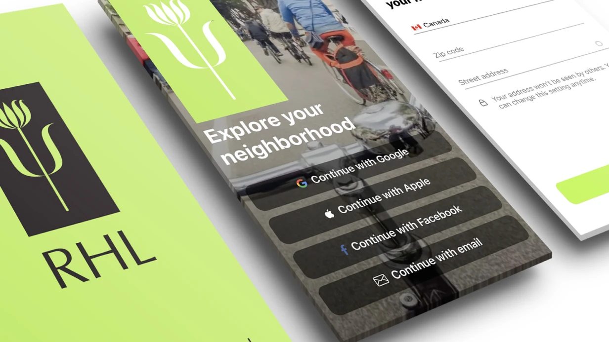
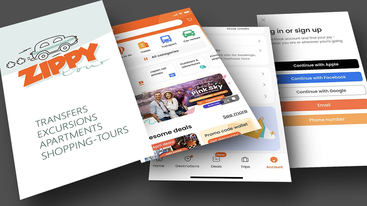
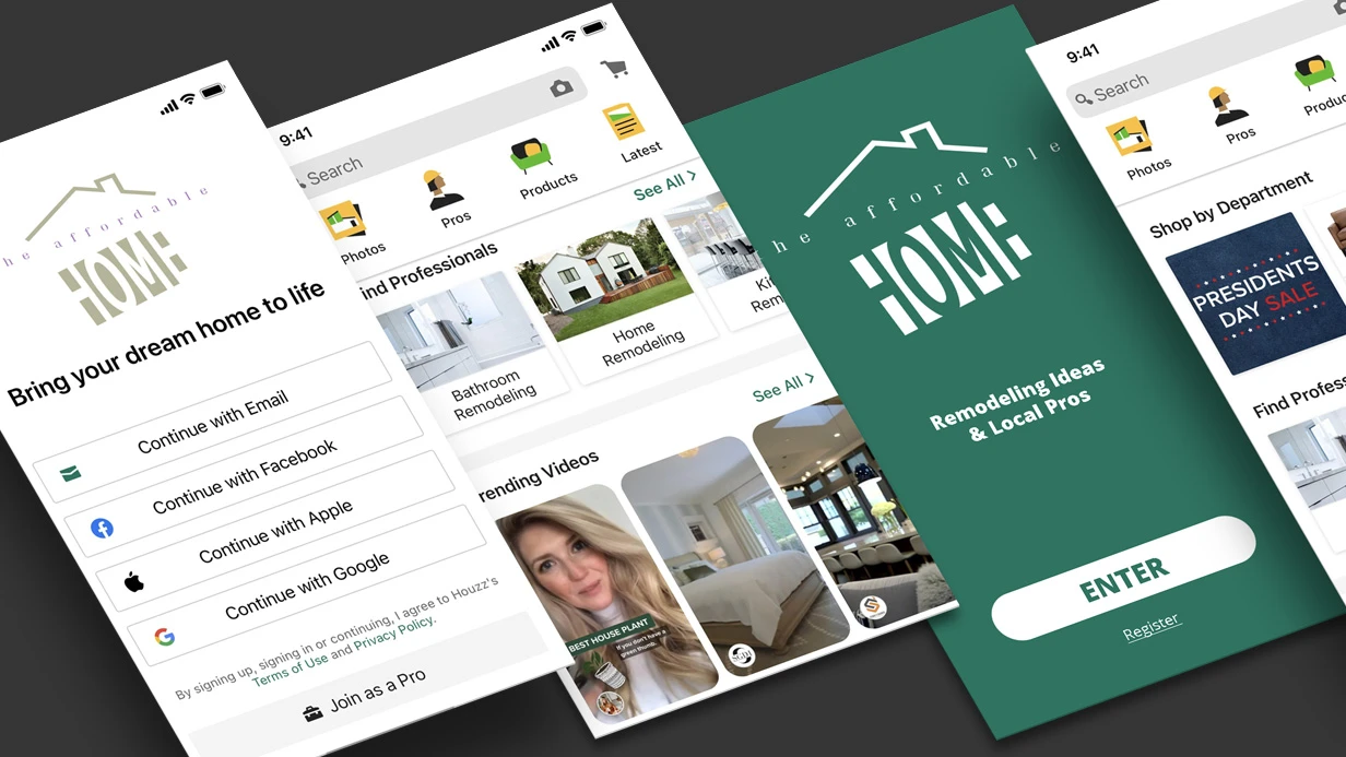
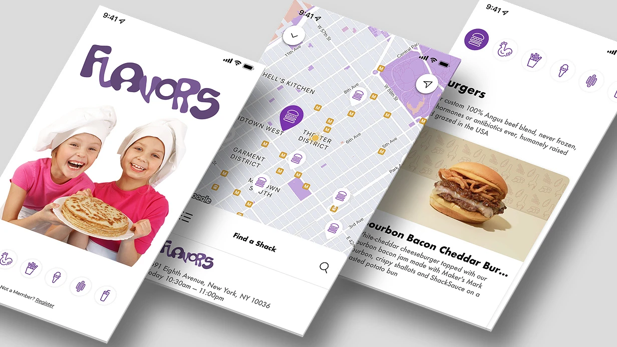
Mobile UX/UI is not an adaptation of web design. It is a separate discipline with specific platform constraints: safe area, touch gestures, UIViewController lifecycle, Activity state management.
Why Can't You Ignore Human Interface Guidelines and Material Design 3?
Apple HIG and Google Material Design 3 are not aesthetic recommendations. They are documented user expectations formed by years of using system applications. Expectations confirmed by user experience research on mobile platforms (User experience design).
HIG defines: minimum tap target 44×44 pt, safe area insets for notch and Dynamic Island, standard gestures (swipe back on iOS, back gesture on Android 10+). Ignoring safe area is a common mistake. safeAreaLayoutGuide in UIKit and safeAreaPadding in SwiftUI exist precisely for this. A designer who doesn't set safe area margins in Figma guarantees a bug during development.
Material Design 3 introduced Dynamic Color—the color scheme is generated from the user's wallpaper via MaterialTheme.colorScheme in Jetpack Compose. An app that ignores dynamic colors on Android 12+ looks out of place. This is not critical for niche products but is noticeable in mass-market apps.
The most painful platform guideline inconsistencies we encounter on projects:
- Custom navigation on top of system navigation. iOS users expect swipe back from any point on the left edge of the screen. A custom
NavigationController without interactive gesture breaks this. Android users expect the system back button—a custom back button in the left corner does not fully replace it.
- Modal windows instead of navigation push. Bottom sheets are appropriate for actions, not for navigating content.
- Missing haptic feedback.
UIImpactFeedbackGenerator on iOS is not decoration but part of the interface response. Buttons, swipes, and confirmation actions without tactile feedback feel broken.
Table: Comparison of iOS and Android UX/UI Requirements
| Parameter |
iOS (HIG) |
Android (Material Design 3) |
| Minimum tap target |
44×44 pt |
48×48 dp |
| Safe area |
safeAreaLayoutGuide / safeAreaPadding |
Insets in WindowInsets |
| Back gesture |
Swipe from left edge |
System back gesture (Android 10+) |
| Color scheme |
System dark/light |
Dynamic Color from wallpaper |
| Typography |
San Francisco (Dynamic Type) |
Roboto (Material Type Scale) |
| Haptic feedback |
UIImpactFeedbackGenerator |
HapticFeedbackConstants (Compose) |
How to Get the Most Out of Figma?
The Figma Variables API has changed the workflow. Design tokens—colors, typography, radii, spacing—are stored as variables and exported directly to code via figma-tokens or style-dictionary. This eliminates manual value transfer and desynchronization between design and implementation. Practice shows: Figma Variables speeds up asset handoff to development by 2–3 times compared to static frames, and using design tokens reduces code transfer errors by 60%.
Auto Layout with wrap and spacing between elements allows building components that behave like flex containers. A developer opens a component and sees not a static artifact but a description of behavior at different content sizes.
Component Properties—variants, boolean toggles, instance swaps—enable building a full design system right in Figma. A button with 4 states (default, hover, pressed, disabled), 3 sizes, and 2 icon variants is one component, not 24 frames.
Figma Prototype with Variables allows creating an interactive prototype with real state: showing how the screen changes with different variable values. This is no longer just a "clickable layout" but a full UX testing tool.
How to Benefit from Prototyping and UX Testing Before Development?
The most expensive mistake in a mobile product is to develop a feature, release it, and discover that users don't understand how it works. A Figma prototype at the testing stage costs zero development hours. Redoing a finished screen costs days. Testing a prototype before development begins reduces the number of fixes by 80%.
For usability testing, we use Maze (task testing on a prototype—the user goes through a scenario, we get heatmaps and mis-click rates) or direct sessions via UserTesting. Key metrics are task completion rate and time on task, not "like/dislike."
A/B testing on mobile is harder than on web: the App Store doesn't allow UI changes without an app update. Therefore, it's important to test hypotheses on a prototype before release, not through production experiments. According to research, fixing a bug found on a prototype costs 10 times less than after production release. And average task completion time increases by 40% after proper UX optimization during prototyping.
Why Are Animations Critical for Interface Perception?
Animations in mobile apps are feedback. An element doesn't appear instantly—it transitions to the desired state over 200–350 ms. This gives the brain context to understand what happened.
- iOS:
withAnimation in SwiftUI, UIViewPropertyAnimator in UIKit for interactive animations with interruption capabilities. Spring animations with dampingRatio are the basis of most Apple system transitions.
- Android:
AnimatedVisibility, animateContentSize, Crossfade in Compose. MotionLayout for complex scenes with multiple transformations.
- Flutter:
AnimationController + Tween, Hero animations between screens, Lottie for After Effects exports. Lottie is especially effective for onboarding illustrations and empty states.
The key constraint is 16 ms per frame (60 fps) or 8 ms (120 fps on ProMotion devices). Animations must run on the GPU via CALayer/RenderThread, not on the CPU via layoutSubviews. Profiling via Core Animation instrument in Xcode is a mandatory step before releasing animated screens.
Why Is Accessibility Not an Optional Feature?
VoiceOver on iOS and TalkBack on Android are used by up to 15% of users—this statistic is confirmed by accessibility research described in Accessibility (Wikipedia). In absolute numbers for a large app, this is thousands of people. Additionally, App Store rejections due to accessibility occur, though rarely.
Minimum checklist:
- All interactive elements have
accessibilityLabel
- Text contrast ratio at least 4.5:1 (WCAG AA)
- Dynamic Type is supported—the interface doesn't break at maximum font size
- VoiceOver focus flows through the screen in a logical order
SwiftUI automatically generates an accessibility tree from component semantics. UIKit requires manual setup of accessibilityTraits, accessibilityHint, and grouping via shouldGroupAccessibilityChildren.
What Does the Work Include?
The UX/UI design deliverables include:
| Deliverable |
Description |
| User flows and wireframes |
Screen structure and user paths |
| Design system |
Design tokens, components, Style Dictionary for export |
| UI layouts (Figma) |
All screens following platform guidelines |
| Interactive prototype |
Prototype with variables and animations |
| Development specification |
Zeplin / Figma Dev Mode with dimensions, margins, states |
| Maintenance guide |
Recommendations for adding new screens and components |
What Is the Process and Timeline?
Design goes through stages: research and competitive analysis → user flows and wireframes → design system → UI layouts → prototype → testing → handoff to development.
Timeline estimates:
| Scope |
Timeline |
| Redesign of 3–5 screens |
1–2 weeks |
| MVP (10–15 screens) |
3–5 weeks |
| Full product (30+ screens) |
6–10 weeks |
The project scope and timeline are determined after analyzing your requirements—number of screens, component complexity, whether a design system is needed or we work with an existing one. Get a consultation for your project—contact us for a preliminary assessment. Order a complete mobile app design—we'll assess your project in one day and propose the optimal work scope.