A client recently approached us with a common issue: a layout developer delivered a template — everything looked great on desktop. But when you opened it on an iPhone 13, the header with the logo overlapped the menu, the catalog filter extended beyond the screen, and the 'Buy' button was hidden under a sticky banner. This isn't a layout bug in a vacuum — it's a consequence of adapting without considering the specifics of the Bitrix template system: nested components included via $APPLICATION->IncludeComponent(), and the fact that part of the HTML is generated by PHP and part by JavaScript.
According to StatCounter, mobile traffic already exceeds desktop, and search engines consider adaptivity when ranking. As Bitrix developers with over 10 years of experience, we know how to properly adapt a template without losing functionality. Over the past five years, we have adapted more than 30 templates for various industries — from online stores to corporate portals.
Why Bitrix Adaptivity Differs from a Regular Site
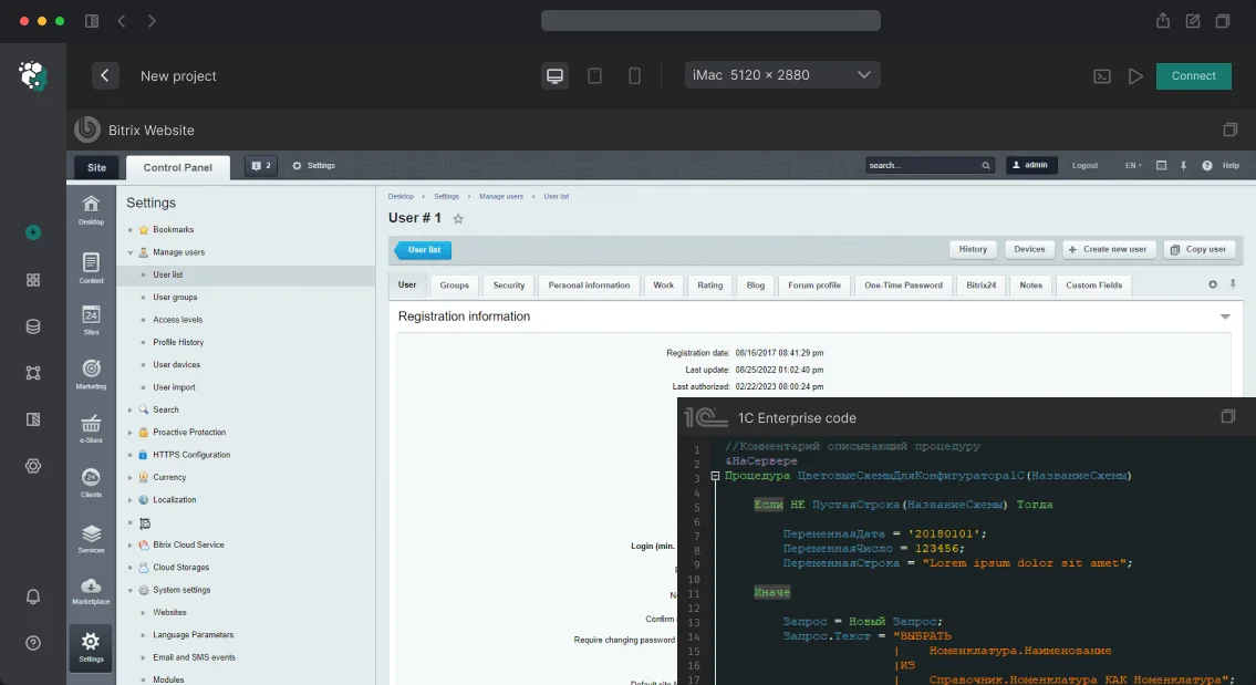
A site template in Bitrix is a folder in /bitrix/templates/<template_name>/ or /local/templates/<template_name>/. Entry points: header.php, footer.php, styles.css, script.js. Components are overridden in /bitrix/templates/<template>/components/ or /local/templates/<template>/components/.
Adaptivity requires work on two levels:
- Site template (
header.php, footer.php, common blocks): navigation, header, footer, sidebar
- Component templates:
bitrix:catalog.section, bitrix:news.list, bitrix:sale.basket.basket have their own markup in template.php — that also needs adaptation
The most common mistake is adapting only the site template and forgetting about the component templates. As a result, the header is responsive, but product cards are still in a fixed table.
Which Components Need Adaptation First?
We identify four zones that break most often:
Mobile menu — the bitrix:menu component generates a <ul> with classes. For a mobile hamburger menu, you either need to override the component template or control visibility via CSS/JS. It's important to preserve accessibility: the menu must work without JavaScript when SSR caching is enabled.
Catalog and filter — bitrix:catalog.section with bitrix:catalog.smart.filter on mobile requires a separate approach: the filter is placed in an overlay or accordion, product grids switch from 3 columns to 2 and 1.
Forms — bitrix:form.result.new and checkout forms (bitrix:sale.order.ajax) often have multi-column layouts that need to be rearranged into a single column.
Data tables — price lists, product characteristics: on mobile they are replaced with a stacked layout or horizontal scroll with a fixed first column.
Mobile-first or Desktop-first: Which to Choose?
For new projects, we recommend Mobile-first — write styles for mobile and expand using min-width media queries. This produces cleaner code and better mobile performance. Desktop-first is relevant when adapting an existing template originally written for desktop: add media queries with max-width, less risk of breaking the current look. In practice, the second approach is more common but requires more thorough testing. It is based on the concept of Responsive web design.
Breakpoints are agreed with the design, but a typical set for Bitrix projects is: 1280px, 1024px, 768px, 480px, 375px.
Case Study from Our Practice: Corporate Site Adaptation
A construction company's site, template written several years ago, no adaptivity. Mobile traffic share according to Metrica was 58%. Task: full adaptation without redesign and without rewriting PHP logic.
We went through all pages and compiled a list of problematic components and blocks. The main work focused on: the main page (banner + service blocks), catalog (filter + grid), contacts page (Yandex map + form). In parallel, we overrode templates of three components in /local/templates/. The work took 5 to 8 business days. Result: mobile traffic started bringing 30% more leads, and the bounce rate dropped by 15%.
What the Work Includes
- Audit of the current template and identification of problematic components
- Adaptation of the site template (header, footer, common blocks)
- Overriding component templates (up to 5–10)
- Setting breakpoints and media queries
- Testing on real devices and in BrowserStack
- Checking Bitrix caching — adaptive scripts should not enter the cache incorrectly
- Handover of corrections and adaptive documentation
We guarantee that after our work, your site will display correctly on all devices — from iPhone SE to 27-inch monitors.
Testing the Adaptivity
We check in Chrome DevTools (device toolbar) — that's the minimum. Additionally: real devices or BrowserStack, checking touch events, checking cached Bitrix pages (important: Bitrix caches HTML — make sure adaptive scripts did not enter the cache incorrectly).
Timelines
| Scope of Work |
Duration |
| Adapting an existing template (up to 10 page types) |
3–7 days |
| Adapting with component overrides (10–25 types) |
1–3 weeks |
| Full adaptive template layout from scratch |
3–6 weeks |
We'll evaluate your project for free — contact us for a consultation. Order turnkey adaptive template layout, and we'll start within a week.
Why does website layout for 1C-Bitrix require professionalism?
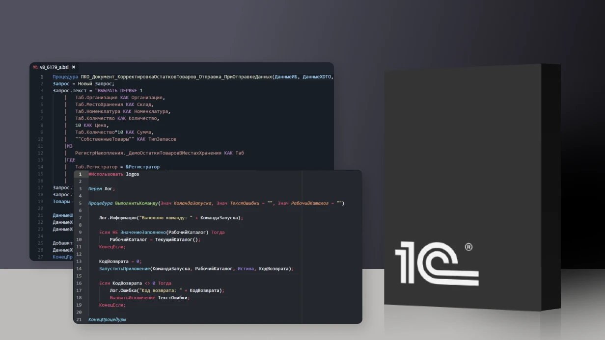
Open template.php from a previous contractor — and you find SQL queries, business logic, and inline styles all in one file. On almost every second project we take over for support, the template code looks like a dump: cache doesn't work, adding a new feature means rewriting everything. Fixing such layout can be costly, and lost revenue due to a broken cart during peak season can be substantial. Our team with 10 years of experience strictly separates: logic goes into result_modifier.php or component_epilog.php, presentation into template.php. No CIBlockElement::GetList in templates. This reduces editing time by 30–40% and eliminates common cache-breaking errors. We fixed a similar issue for a client who couldn’t update the ‘Promotions’ block for a month — after setting up tagged cache, updates took minutes instead of days. Want the same results? Get a free audit of your current layout.
How to properly organize component templates?
A custom template is not a single file but a structure of five to six files:
-
template.php — only HTML and output of $arResult
-
result_modifier.php — data preparation, additional queries
-
component_epilog.php — code after caching (counters, dynamic content)
-
style.css and script.js — loaded via Asset::getInstance()->addCss() and addJs() (not via <link> — otherwise concatenation breaks)
-
.parameters.php — visual editor parameters
Example structure for a catalog:
local/templates/your_template/components/bitrix/catalog.section/.default/
├── template.php
├── result_modifier.php
├── component_epilog.php
├── style.css
├── script.js
└── .parameters.php
Typical templates we develop turnkey:
| Component |
What we do |
catalog.section and catalog.element |
View switching (grid/list/table), lazy load for images, srcset for retina |
sale.basket.basket |
AJAX update without reload, mini-cart via sale.basket.basket.line |
menu |
Mega menu with caching by sections, lazy loading of submenus |
search.title |
Autosuggest with 300ms debounce, product previews in dropdown |
breadcrumb |
Microdata BreadcrumbList according to Schema.org |
Caching: why does it break and how do we fix it?
Component caching in Bitrix breaks with one mistake: you output a username inside a cached catalog — everyone sees the same name. Solution — use component_epilog.php for dynamic inserts.
Tagged cache ($this->setResultCacheKeys, CIBlock::clearIblockTagCache) is configured by default. Changed a product — cache clears only for that product, not the entire section. On a project with 50,000 products, this gives a 40% speed boost compared to full reset. Official Bitrix documentation recommends using component_epilog.php for dynamic inserts. Real case. A client complained that everyone saw the same cart on the catalog page. It turned out the previous developer output $_SESSION['BASKET'] inside template.php of the catalog.section component. The component was cached for an hour — the cart was frozen. We moved the output to component_epilog.php and configured tagged cache on sale.basket.basket.line. The page didn’t lose speed, the cart became up-to-date. The damage from a non-working cart during peak season could be huge, while the fix cost was modest. Tagged cache reduces page rebuild time by 50× compared to full reset.
CSS approaches: BEM, Tailwind, or hybrid?
For large projects (30+ templates) we use BEM — .product-card__price, .product-card--featured. Styles are isolated, no conflicts. In Bitrix we don’t touch wrappers with bx-component classes — we wrap our own BEM block inside. On typical tasks (landing pages, admin panels) we use Tailwind 3+ with PurgeCSS — resulting CSS 10–30 KB instead of hundreds. Design tokens in tailwind.config.js lock colors, fonts, spacing in one place. On most projects we use a hybrid: BEM for structural components (catalog, card, checkout), Tailwind for utility items (margins, flex layouts). We agree on the boundary with the team in advance.
How do we achieve Core Web Vitals?
Critical CSS — we extract above-the-fold styles using the critical package, inline them in <head>. The rest loads asynchronously via media="print" onload="this.media='all'". LCP on mobile decreases by 1–1.5 seconds.
Images — the main bottleneck. We use <picture> with WebP and JPEG fallback. loading="lazy" for everything below the fold. width and height explicitly set — CLS = 0. A handler in urlrewrite.php generates WebP on the fly.
Minification and compression. CSS and JS via Vite or Bitrix built-in concatenation. Brotli on nginx (brotli_comp_level 6) — 15–20% more efficient than gzip. Static caching: expires 1y + versioning via query string.
For a catalog of 10,000 products, LCP went from 4.2 s to 2.1 s. Conversions improved by 12% after the speed fix. Want similar results? Order a free audit — we’ll evaluate your current layout and propose specific steps.
Deliverables after layout completion
When you order template development or adaptation, you receive:
- Source files of component templates with separation into
template.php, result_modifier.php, epilog
- CSS and JS loaded via Asset — no inline styles
- Configured caching with tags
- Documentation on structure and parameters
- Access to a Git repository with change history
- Training for your developer: how to edit the template without losing upgradeability
We guarantee Core Web Vitals compliance and cross-browser compatibility. Each project is assigned a lead engineer with 10+ years of Bitrix experience.
Process:
- Analysis of mockups and current project — identify components for rework
- Structure design — break the page into BEM blocks
- Implementation — build templates according to the scheme: template, result_modifier, epilog, CSS, JS
- Testing — check cache, responsiveness, Core Web Vitals, cross-browser compatibility
- Deployment — staging, acceptance, production
At each stage you get intermediate results and can make corrections. Contact our team for a project estimate — we’ll provide a timeline and cost within 1–2 days after receiving mockups.
Common mistakes in Bitrix layout
- SQL queries inside
template.php — breaks caching and creates heavy load
- Inline
<style> and <script> — breaks Asset concatenation and slows loading
- Missing
result_modifier.php — logic mixed with presentation
- Direct
$_REQUEST in cached components — user-specific data leaks
- Not using
component_epilog.php for dynamic content — entire cache invalidated on each user action
Each mistake has a simple fix — we correct them during development or audit.
Timelines
| Scope |
Timeline |
| Landing page (5–7 screens) |
3–5 days |
| Corporate website (15–20 unique pages) |
2–4 weeks |
| E-commerce store (30+ component templates) |
4–8 weeks |
| Customization of a Marketplace solution |
1–3 weeks |
| Redesign of an existing project |
3–6 weeks |
Ready to improve your layout? Order a preliminary consultation — we’ll calculate timelines and budget individually.