
Game UI/UX Prototyping: Avoid Costly Rework
We design UX prototypes for game interfaces that account for gameplay specifics: readability in motion, fast navigation, and minimal cognitive load. Game UI differs from mobile apps or websites—the player holds a gamepad or sees the interface peripherally, so design rules are different. We started as game dev engineers with 7+ years in the industry, and our background lets us spot bottlenecks at the wireframe stage. Over that time we've completed more than 25 projects—from indie RPGs to multiplatform action games—and we guarantee the prototype cuts implementation rework by up to 40% (and in complex cases, up to 60%).
— lead of one studio we worked with "A bad prototype costs pennies, bad code costs millions"
Why prototyping reduces the development budget?
The most painful scenario: a designer drew an inventory, a coder built it in uGUI, an artist added animations—and only during a playtest it turned out that opening the inventory makes the player lose context of their character's location because the inventory covers the whole screen with no minimap overlay. Rework at this stage costs 5–10 times more than fixing at the wireframe level. Our experience shows: an interactive prototype uncovers such problems 3 times faster than static mockups. Clients report saving between $15,000 and $40,000 per major UI system by prototyping early—for a mid-size game, that’s a 50% reduction in UI implementation costs.
Another case: a branching dialogue system that no one had fully walked through on the prototype. In implementation it turned out that with more than three levels of branching, the player physically can't fit all answers on a mobile screen—text is truncated, buttons overlap. Focus testing on the prototype, even with 5 participants, catches these issues before they become code. In a recent project, focus testing revealed 12 critical issues that would have cost $30,000 to fix post-implementation.
How we build UX prototypes for games: a step-by-step plan
- User flows: Map transitions between states for each scenario (e.g., first launch, tutorial, pause, inventory, shop). For each scenario we document what happens when Escape is pressed, when the connection drops, when there aren't enough resources to buy.
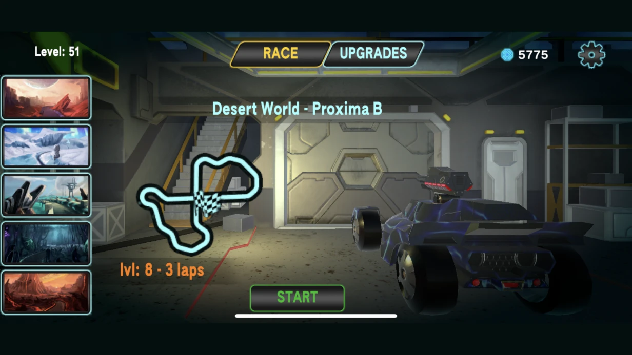
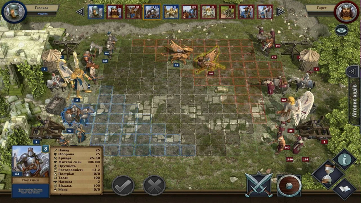
- HUD information architecture: Categorize data into always-needed (health, ammo, minimap), on-demand (inventory, map), and contextual (dialogue, quest tracker when near a goal). This visibility layer breakdown must be defined before the artist starts.
- Wireframe creation: Build grayscale layouts in Figma with real text and real data sizes. If the inventory can hold 500 items, the prototype must show a grid for 500 items, not 6 placeholder icons. Only at this stage does it become clear whether pagination, filters, or search is needed.
- Interactive prototype: Use Figma Prototyping with conditional transitions (Variants + Interactive Components) to simulate navigation. For more complex cases—Unity UIToolkit with a UXML prototype without final design: it runs directly in the engine and allows testing with a gamepad immediately. The Interaction Spec typically includes 50-100 transition triggers per screen.
- Focus testing: Test with 5+ participants who see the interface for the first time. They find issues the team stopped noticing after a month of work. The Edge Cases Map covers 15-20 edge cases per module, including empty states, network errors, and maximum values.
How we test prototypes?
Focus testing on the prototype is not a luxury. Even 5 people who see the interface for the first time find issues the team stopped noticing after a month of work. At this stage, it's free. After implementation—expensive. We guarantee the prototype is tested on at least three scenarios: normal flow, edge cases, and erroneous actions.
Platform-specific prototyping requirements
Mobile and PC interfaces are different even for the same gameplay. Touch targets on mobile: at least 44×44 dp, recommended 56×56 for active elements. This means on a smartphone in portrait orientation, the inventory grid will be at most 4 columns with 64×64 icons at reasonable margins. If the design was made for PC with 8 columns—rework is inevitable.
For console UI with a gamepad, the prototype must include a focus management scheme: which element is selected by default when each screen opens, where the focus moves when D-pad is pressed in each direction. This is documented in text in the prototype—not assumed, but specified.
| Platform | Key prototyping requirements |
|---|---|
| PC | Keyboard shortcuts, mouse navigation, multi-resolution support |
| Mobile | Touch targets >44dp, portrait/landscape adaptation, swipe gestures |
| Console (gamepad) | Focus management, D-pad scheme, active element highlighting |
Documentation package for the prototype
A prototype without documentation is an artifact that loses value as soon as its author goes on leave. The minimum documentation package for a game UX prototype includes three items.
First—Interaction Spec: for each interactive element, all states (default, hover, pressed, disabled, selected for gamepad) and transition triggers are described. Not "button activates on click", but "OnPointerDown → visual feedback 80 ms → OnPointerUp + condition X → transition to screen Y". This spec typically contains 50-100 triggers per screen.
Second—Edge Cases Map: what happens with zero data (empty inventory), maximum data (99 items in one slot), network error, action interruption midway. This is what programmers usually discover during implementation—but better if the answers are already in the documentation. We cover 15-20 edge cases per module.
Example edge case: empty inventory in an RPG
- Display a message "Inventory is empty" with an empty backpack icon. - The "Sort" button is disabled. - Switching to the "Weapons" tab gives a similar message. - The player can close the inventory without selecting an item.Third—Responsive Behavior Guide: how each screen adapts to different resolutions and orientations. Screenshots from Figma at 375px, 768px, and 1920px width with rules described—not just "adaptive", but "at width below 480px, the list changes from two columns to one".
This documentation cuts implementation time and reduces the number of fixes during the implementation stage by about half (50% reduction). We guarantee that after handing over the prototype, the team receives comprehensive instructions.
What's included in the UX prototyping work
Within the order you receive:
- Detailed user flows and HUD information architecture.
- A grayscale wireframe prototype with real data.
- An interactive prototype in Figma or Unity UIToolkit (by choice).
- Documentation: Interaction Spec, Edge Cases Map, Responsive Behavior Guide.
- A focus testing report with recommendations.
- Consultation on adaptation for target platforms.
Work stages
We start with requirements gathering: game mechanics, platforms, target audience, engine technical constraints. Then we document user flows and information architecture. Wireframe prototyping with iterations and internal playtests. After wireframes are approved—handoff for design or parallel visual style development.
| Project scale | Prototyping timeline |
|---|---|
| Single screen (inventory, map, shop) | 2–5 days |
| Full UI kit for an indie project (10–15 screens) | 1–3 weeks |
| Complex system with branching (dialogues, quests, leveling) | 2–5 weeks |
| Multiplatform UI with PC/mobile/console adaptation | 4–8 weeks |
The cost is calculated individually after discussing the number of screens and mechanics complexity. For reference, single-screen prototypes start at $500, while full multiplatform UI kits range from $3,000 to $8,000. Estimated savings from early prototyping amount to $15,000–$40,000 per major UI system. Contact us for a consultation—we'll help assess the tasks and offer the best solution. Order a prototype to avoid expensive rework during implementation.