Uncover Conversion Killers: UX Audit for 1C-Bitrix Sites
Conversion is dropping, traffic is there, but sales are not — a typical situation for many online stores on 1C-Bitrix. The cause is often usability problems: the user cannot find a product quickly, the order form scares away with mandatory registration, and the mobile version is broken. We conduct a usability audit that identifies specific conversion drop-off points and provides ready-made solutions in terms of Bitrix component settings. Over many years of work we have analyzed more than 50 projects on Bitrix and know where customers most often walk away.
One critical problem found can significantly impact revenue. For example, after fixing the mandatory registration issue, one client saw an additional $10,000 per month. The average conversion increase after our audit is 15–30%. By fixing 3–5 key issues, you will see results quickly.
Common Usability Problems on Bitrix
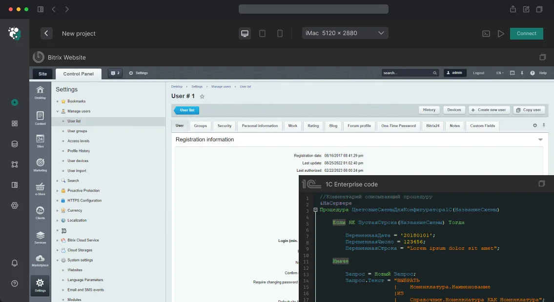
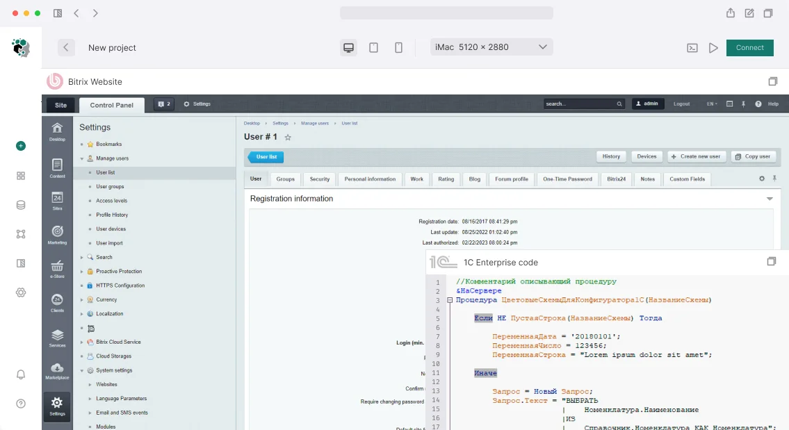
Smart filter (catalog.section.filter) is a frequent source of issues. Typical scenarios: the filter only applies on button click, but users expect instant response; when there are many property values, the list lacks search; the mobile filter popup covers content. All this leads to losing customers at the product selection stage.
Cart and checkout (sale.order.ajax) — the highest bounce rate occurs at delivery selection with unclear cost, mandatory registration (a barrier for guest checkout), and payment form redirecting without explanation. The solution: enable guest checkout via the parameter ALLOW_GUEST_ORDER = Y. Also check the cart display on mobile — often the "Checkout" button does not fit the screen.
Personal account (sale.personal.*) — the standard component has overloaded navigation and unclear order statuses. Users don’t understand where their order is. We recommend simplifying the interface and adding a progress bar.
Additionally, we check the mobile version: at resolutions 320 and 768 pixels, many components break or disappear. This is especially critical for online stores — over 60% of traffic comes from phones.
How We Conduct the Audit
We use a combination of methods. Heuristic evaluation (Wikipedia article) — a manual check based on Nielsen's 10 heuristics. We test 5–7 key user scenarios: product search, adding to cart, checkout, personal account, and contacting support.
We supplement the analysis with data: Yandex.Metrica Webvisor shows session recordings, Scroll Map reveals how far users go on long pages, and the Funnel report shows where they leave.
Why Heuristic Analysis Is 10x Faster Than A/B Testing Under Time Constraints
Heuristic analysis takes 1–3 days, while A/B testing requires 2–4 weeks to collect statistics. The depth of analysis is not lower, especially for typical Bitrix problems. We often recommend starting with heuristic audit and then A/B testing specific controversial solutions pointwise. According to our data, this approach leads to conversion growth twice as fast.
What Is Included in the Usability Audit
As a result, you get:
- A detailed report with each problem description, screenshot, impact rating, and specific recommendation (including Bitrix component settings).
- Prioritization by severity: from blocking to minor.
- Recommendations for mobile version, loading speed, accessibility.
- Access to analytical data (Webvisor, funnels) with our comments.
- Optional: training for your team on how to maintain usability standards.
- 30 days of support after report delivery for any clarifications.
Process and Timeline
- Data collection: access rights to site and analytics, definition of critical scenarios. (1 day)
- Heuristic analysis: walk through scenarios, noting problems. (2–3 days)
- Mobile testing (320px, 768px) and speed check. (1 day)
- Report preparation with prioritized recommendations. (1–2 days)
- (Optional) Implementation of changes — discussed separately.
Standard audit takes 5–7 business days.
Typical Findings (Examples)
| Problem |
Component |
Impact |
| Mandatory registration for checkout |
sale.order.ajax |
High |
| No add-to-cart confirmation |
catalog.element |
Medium |
| Filter resets between pages |
catalog.section.filter |
High |
| Search does not work with typos |
search.title |
Medium |
| No breadcrumbs in deep sections |
template |
Medium |
| Captcha on every form without alternative |
main.feedback |
Medium |
After our audit, conversion typically increases by 15–30% by eliminating 3–5 critical problems. For one client, fixing just the mandatory registration issue resulted in a $12,000 monthly revenue increase.
Comparison of Audit Methods
| Method |
Timeline |
Depth |
Cost |
| Heuristic analysis |
1–3 days |
High |
Low |
| A/B testing |
2–4 weeks |
Medium |
High |
| Data-driven analysis |
1–2 weeks |
High |
Medium |
The choice of method depends on goals. Heuristic analysis is a fast way to get actionable recommendations.
Guaranteed Results from Our Experienced Team
With over 10 years of experience in Bitrix development and 50+ audits completed, we bring certified expertise. Our team includes certified Bitrix specialists. We guarantee a measurable conversion increase within 30 days of implementing our top-3 recommendations, or we will re-do the audit free of charge.
How to Order an Audit and What to Do Next
Contact us to discuss your project. We will provide a consultation on scope and timeline. After the audit, you will receive a ready action plan to increase conversion. Order an audit and get a conversion improvement plan today.
Bitrix Site Audit: Find Problems Before They Find You
Imagine: you open a project from a previous team — init.php has 3,000 lines, OnBeforeIBlockElementUpdate handlers are nested, there's a 4GB dump.sql in the site root, and the upload/ directory is larger than the database. We see such projects every week. And this is not an exception — it's the norm for Bitrix after several years of active development without quality control. An audit of a 1C-Bitrix site is the only way to objectively assess the real state of a project before investing in improvements or scaling. It reveals bottlenecks in code, database, server configuration, and security. Most importantly, it shows what to fix to make the site faster and prevent crashes during peak sales. Regular 1C-Bitrix site audit pays off in 2–3 months: hosting savings are substantial, and error fix time is cut by three times compared to a reactive approach.
Why is a Bitrix site audit necessary?
Changing contractors — you take over a project from another team and don't know what "mines" are left in the code. Event handlers in init.php, forgotten scripts, modified kernel files — all can backfire at the worst moment. We once found 47 handlers in one project, 12 of which were dead — information blocks were deleted, but the code kept calling CIBlockElement::GetList() on every hit. For several years of such load — millions of extra queries to the database.
Position drop — technical reasons almost always underlie organic traffic loss: page duplicates, broken canonical, 50,000 junk URLs in the index. An audit will show where Google is losing your traffic. In one typical project, the number of URLs with sorting parameters reached 300,000 — each combination of PAGEN_1=2&sort=price was indexed separately.
Slowness under load — the site goes down right during a sale, when every minute of downtime costs money. We find the reasons: unoptimized queries, lack of cache, heavy agents. For example, one query to b_iblock_element_property without an index can add 3–4 seconds to page generation time.
Suspicion of hacking — spam emails from the server, redirects to casino on mobile traffic, strange files in /bitrix/modules/. A security audit will reveal backdoors and web shells.
Before major improvements — investing in project development without knowing its real state is like building a second floor without checking the foundation. Half of our clients come precisely before starting new functionality.
What hides in init.php and the database?
Most problems on Bitrix are concentrated in three places: init.php, the database, and server configuration. We break down each layer in detail.
init.php and event handlers — the main code dump. There accumulate OnAfterUserLogin, OnBeforeOrderAdd, OnAdminContextMenuShow that no one refactors for years. In one project we found 47 handlers, 12 of which were dead (information blocks deleted, but the code kept calling CIBlockElement::GetList() on every hit). An audit clears out such ballast and reduces server load.
Versions and compatibility. Kernel version — if below 22.0, update is critical (PHP 8.1 not supported). Marketplace modules often conflict after updates. License without an active key — no security updates.
Server configuration. PHP memory_limit < 256M — problems with catalogs of 10,000+ items. OPcache revalidate_freq = 0 in production — CPU overloaded. MySQL innodb_buffer_pool_size should be 70–80% of RAM. On MySQL 8.0+ query_cache is removed, but it remains in old configs — generating errors in logs. Absence of expires for static files in nginx — each page reload downloads JS/CSS again.
Database — the most interesting part. The b_event_log table grows to gigabytes without cleanup settings. In one project it occupied 12 GB, though 500,000 records were written daily. The b_search_content_text table with a full-text index can weigh more than the content itself. Tables from deleted modules (b_forum_*, b_learning_*) take up space and slow down backups. We enable slow query log, wait a day, analyze. One query to b_iblock_element_property without an index can slow the entire site — we recorded delays up to 7 seconds per page.
File system. /upload/resize_cache/ — weighs tens of gigabytes, stores resizes of long-deleted images. Backups in the root — backup_old.tar.gz next to index.php, accessible via direct link. Manually modified kernel files will be overwritten during update, and custom logic will silently disappear.
How does SEO audit remove duplicates and trash from the index?
Filter and sort parameters generate thousands of URLs: /catalog/?PAGEN_1=2, /catalog/?sort=price&order=asc — each indexed as a separate page. Bitrix SEO module can set canonical, but by default it doesn't do it for parameterized URLs. The standard robots.txt blocks /bitrix/, but doesn't block /search/, /personal/, /ajax/ — there are thousands more junk pages. Bitrix's sitemap.xml generator sometimes includes inactive items and 404 pages. Without structured data Schema.org (Product, BreadcrumbList, Organization), snippets in search results are bland. Core Web Vitals: LCP > 2.5s on mobile is common for unoptimized Bitrix — unoptimized images and blocking JS are to blame. On average, after an audit we reduce the index by 60–80% — remove duplicates, set up canonical and proper noindex. Order an SEO audit to get your site the traffic it's losing now.
Why check Bitrix security?
SQL injections via $_REQUEST in custom components — previous developers don't always use $DB->ForSql(). XSS when outputting user input without htmlspecialcharsbx(). Custom file upload forms that don't check MIME type and extension — upload .php as an "image" and get a web shell. Typical findings: disabled "Proactive Protection" module (WAF not working, intrusion log empty), admin panel without IP restriction (/bitrix/admin/ open to the world), adminer.php or phpMyAdmin in the root — forgotten after migration, obfuscated code in .htaccess with mobile traffic redirect via RewriteCond %{HTTP_USER_AGENT}, modified kernel files with eval(base64_decode(...)) inserts. In one project we found 23 such files — the site had been distributing spam content via AMP for months. Read more about SQL injection and cross-site scripting. Contact us for a security check of your project — we will find vulnerabilities that scanners miss.
How do we improve performance?
We profile using Blackfire or Tideways — see which functions consume CPU. A frequent candidate is CIBlockElement::GetList() in a loop (classic N+1). We check hit rate of OPcache, Memcached, Bitrix managed cache. If composite site cache invalidates on every order, it's useless — we once reduced invalidations from 80% to 2% by proper tag configuration. Bitrix agents — if agents_use_crontab is not enabled, they execute on user hits; a heavy agent = slow for random visitor. Load testing: base RPS, degradation at 2× and 5× load, behavior when limit exceeded (graceful degradation or 502 Bad Gateway?). On one project we found peak RPS was 12, and after optimization became 150 — a 12.5x increase.
What do we look for in code?
We assess custom developments of previous teams: do they use D7 ORM or just $DB->Query() bypassing everything. PSR-12, autoloading, module structure — or everything in one file. N+1 — GetList() inside while($arItem = $rsItems->Fetch()) — classic. Modified kernel files (bitrix/modules/sale/lib/) with manual edits — updates will break everything. "Temporary" solutions living for three years — // TODO: redo from last year. On average, we find 15–25 problems in code per project, half of them with potential data loss.
Report format
| Category |
Contents |
| Critical |
Security, data loss, crashes. Fix today |
| Important |
Performance, SEO, stability |
| Recommendations |
Architectural improvements, refactoring, optimizations |
| Plan |
Prioritized task list with effort estimates |
Each problem is described by scheme: what we found → where → how it affects → how to fix → effort. We deliver the report in PDF and Google Docs for collaboration. Five signs that a Bitrix site needs an audit: init.php has grown over 2,000 lines; database exceeds 5 GB, and b_event_log table over 1 GB; pages load longer than 3 seconds on mobile; Search Console shows tens of thousands of pages in index with errors; you found files with suspicious content in /bitrix/modules/. If at least one point matches — time to order an audit.
How do we conduct an audit?
- Access — Bitrix panel, SSH, database, Yandex.Webmaster, Search Console.
- Automation — Bitrix "Quality Monitor", Screaming Frog, GTmetrix, security scanners. Catch 60% of problems.
- Manual analysis — the remaining 40%. Architecture, code, business logic, configuration — only hands-on. Each audit is led by a senior developer with 10+ years of experience.
- Report with priorities.
- Discussion — meeting with you, answering questions, agreeing on a remediation plan.
Average time for a full cycle — 5 business days for technical audit, up to 3 weeks for comprehensive. We guarantee confidentiality of results and safety of your data.
What is included in deliverables?
- Documented report with description of each problem and fix recommendations.
- Checklist of critical vulnerabilities and their priority.
- List of performance optimization suggestions with impact assessment.
- Post-audit consultation — review of results, task prioritization.
- Access to test results (screenshots, profiling logs, raw data).
Types of audit and timelines
| Type |
Timeline |
For whom |
| Express (checklist) |
2–3 days |
Quick assessment, small sites |
| Technical |
3–5 days |
Identifying infrastructure issues |
| SEO |
3–5 days |
Position drop, trash in index |
| Security |
5–7 days |
Sites with payments, personal data |
| Performance |
3–5 days |
Slow, crashes under load |
| Comprehensive |
2–3 weeks |
Full picture before serious investments |
We have conducted 50+ audits of Bitrix projects — from online stores to corporate portals. Our experience shows: on average, an audit pays off within 2–3 months by reducing hosting costs and cutting error fix time (3 times faster than reactive approach). Regular audit is the best way to extend project life.
Result — not a stack of papers, but a guide to action with concrete tasks and priorities. Need an audit of your Bitrix site? Get a consultation today — contact us, and we will assess your project for free within 1 business day. Order a comprehensive audit to get the full picture before serious investments.