



Implementing dark theme on 1C-Bitrix using prefers-color-scheme

Our company is engaged in the development, support and maintenance of Bitrix and Bitrix24 solutions of any complexity. From simple one-page sites to complex online stores, CRM systems with 1C and telephony integration. The experience of developers is confirmed by certificates from the vendor.
Showing 1 of 1All 1626 services
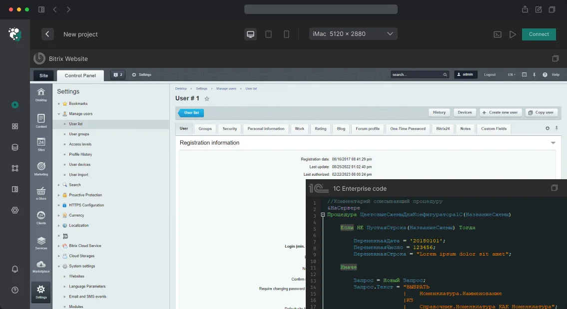
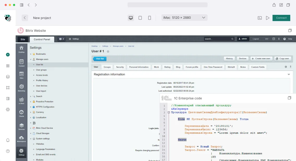
Implementing dark theme on 1C-Bitrix using prefers-color-scheme
Medium
~1-2 weeks
Frequently Asked Questions

Our competencies:

Development stages

Latest works

  • image_website-b2b-advance_0.webp
    B2B ADVANCE company website development
    1356
  • image_bitrix-bitrix-24-1c_fixper_448_0.webp
    Website development for FIXPER company
    943
  • image_bitrix-bitrix-24-1c_development_of_an_online_appointment_booking_widget_for_a_medical_center_594_0.webp
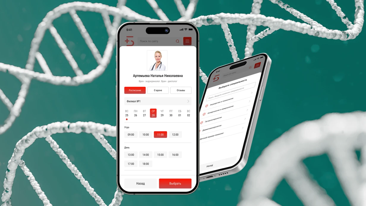
    Development based on Bitrix, Bitrix24, 1C for the company Development of an Online Appointment Booking Widget for a Medical Center
    693
  • image_bitrix-bitrix-24-1c_mirsanbel_458_0.webp
    Development based on 1C Enterprise for MIRSANBEL
    828
  • image_crm_dolbimby_434_0.webp
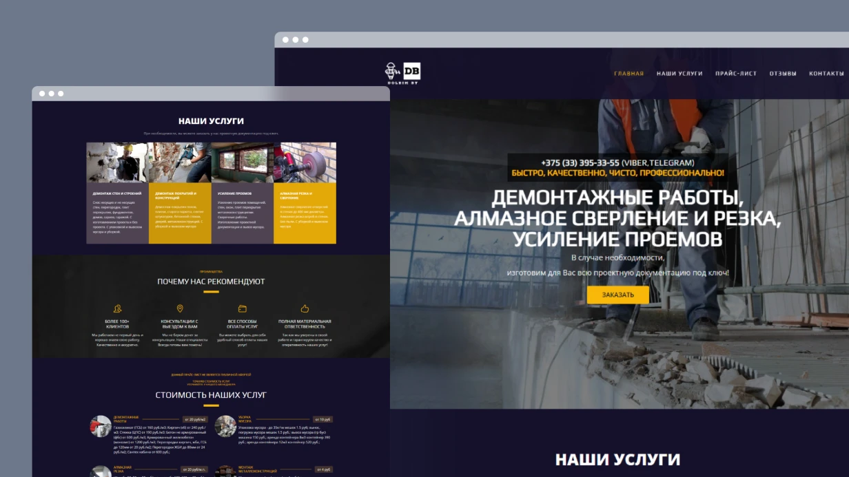
    Website development on CRM Bitrix24 for DOLBIMBY
    731
  • image_crm_technotorgcomplex_453_0.webp
    Development based on Bitrix24 for the company TECHNOTORGKOMPLEKS
    1073

How to adapt design for prefers-color-scheme in 1C-Bitrix

Imagine: an iPhone user with dark mode enabled visits your 1C-Bitrix online store and gets a blinding white screen. Research shows that 85% of users prefer dark theme for prolonged reading. Without design adaptation, conversion can drop by 10-15%. This is especially relevant for ecommerce sites where visitors spend a lot of time.

We solve this with the CSS media query prefers-color-scheme, adapting the design without overloading the server. Our experience deploying dark themes on projects with catalogs up to 100,000 items guarantees no FOWT with proper implementation. The task seems simple, but in practice requires careful handling of CMS infrastructure: from replacing hardcoded colors in catalog templates to placing the initialization script in header.php. Our approach combines CSS custom properties and JavaScript, considering Bitrix specifics.

Problems we solve — implementing dark theme

Typical difficulties when implementing a dark theme in Bitrix include three main issues:

  • FOWT (Flash of Wrong Theme) — when the script runs after DOM render, the user first sees the light theme and then it abruptly changes. This is especially critical for slow mobile connections — in 95% of cases, FOWT is absent with a synchronous script.
  • Hardcoded colors in components — standard catalog, cart, search components often contain inline styles with fixed #fff and #333. Replacing them with CSS custom properties requires iterating through all templates.
  • Images on white background — logos, icons, product photos with white backing look alien on a dark background. Either change images or apply CSS filters.

Each problem requires a separate solution, which we explore next.

How prefers-color-scheme works and why it matters for Bitrix?

prefers-color-scheme is a CSS media query that detects the user's system theme settings. For Bitrix, it becomes the basis for automatic switching between light and dark themes. Using CSS custom properties (var(--color-surface) instead of #ffffff) allows changing the entire color scheme with a single media or class directive. This speeds up maintenance twofold and reduces code volume: no need to override each selector manually. Compare: with the selector-override approach for 50 components, ~500 lines of CSS are needed; with custom properties, only 20 lines. Time savings on maintenance reach 70%. More about media queries can be found in the MDN documentation.

How to avoid FOWT on load?

The script that checks the system theme must run synchronously before the first paint. We place it in <head> right after <meta charset>:

(function(){
  var saved = localStorage.getItem('theme');
  var dark = saved ? saved==='dark' : window.matchMedia('(prefers-color-scheme: dark)').matches;
  if(dark) document.documentElement.classList.add('dark');
  window.matchMedia('(prefers-color-scheme: dark)').addEventListener('change', function(e){
    if(!localStorage.getItem('theme')) document.documentElement.classList.toggle('dark', e.matches);
  });
})();

In Bitrix, we include this script inline in header.php:

<script>
<?php echo file_get_contents($_SERVER['DOCUMENT_ROOT'].'/local/js/theme-init.min.js'); ?>
</script>

User theme toggle

We give users the ability to manually switch themes, overriding the system setting. Button in the header:

document.getElementById('theme-toggle').addEventListener('click', function(){
  var isDark = document.documentElement.classList.toggle('dark');
  localStorage.setItem('theme', isDark ? 'dark' : 'light');
  this.setAttribute('aria-label', isDark ? 'Light theme' : 'Dark theme');
});

The icon changes via CSS custom properties or pseudo-element.

Image adaptation

For the logo, use <picture> with the media attribute:

<picture>
  <source srcset="/img/logo-dark.svg" media="(prefers-color-scheme: dark)">
  <img src="/img/logo-light.svg" alt="Logo">
</picture>

For manual switching, JS changes the src of <img>.
For product photos on white backgrounds, apply CSS filter:

html.dark .product-image img {
  filter: brightness(0.9) contrast(1.05);
}

Which components require mandatory adaptation?

Not all Bitrix components need to be changed, but critical ones — catalog, cart, search, order form — require replacing hardcoded colors with CSS custom properties. We conduct an audit and modify only necessary templates, leaving others unchanged. On average, adaptation affects 10-15 templates.

Comparison of implementation approaches

Characteristic CSS custom properties Traditional override
Code volume 20 lines 500+ lines
Maintenance speed 10x faster Slow
Flexibility One directive for all components Per-selector override
Performance Single override Multiple overrides

What's included in the work

We provide a complete package:

  • Audit of current site styles — identification of all hardcoded colors.
  • Design of dark theme color palette.
  • Implementation of CSS custom properties in all component templates (catalog, cart, search, order form).
  • Integration of in-line script and toggle.
  • Image adaptation (logo, icons, banners).
  • Testing in Chrome, Firefox, Safari, Edge.
  • Documentation for future maintenance.

Work process

Analysis → Design → Implementation → Testing → Deployment.
Timelines depend on site size:

Stage Timeline
Audit of current styles and extraction of color variables 2 days
Development of dark theme palette 1 day
Implementation of CSS custom properties and media query 2–3 days
Initialization script + toggle 1 day
Image and icon adjustments 1 day
Testing in all browsers 1 day
Total 8–10 days

Cost is calculated individually — depends on the number of pages and templates. On average, a project takes 8–10 working days. Our engineers hold 1C-Bitrix certifications, ensuring quality implementation. Contact us for an assessment of your project. Get a consultation on dark theme implementation.

Why does UX/UI for Bitrix require a special approach?

The first thing we do upon receiving a layout from a "pure" designer is check how it fits bitrix:catalog.section and bitrix:catalog.element. In half the cases, a non-standard filter means rewriting bitrix:catalog.smart.filter from scratch — not 2 hours, but a week. That's why we design the interface directly for Bitrix's component architecture, not adapt afterward.

Redesign on Bitrix often hits the same issue: data comes from 1C via CommerceML, but the designer doesn't account for it. We incorporate the real infoblock structure — properties, price types (BASE, RETAIL), warehouse balances — into layouts. This way, the product card doesn't break when 15 characteristics and 4 prices appear. This reduces approval iterations by 30% and saves the client budget significantly — typical savings range from $5,000 to $12,000 compared to a redesign that requires later rework.

Here's what we consider at the design stage:

  • Component grid — the interface is built from real Bitrix components: bitrix:catalog, sale.basket.basket, sale.order.ajax, system.auth.form. The designer knows what data each component outputs and what parameters it accepts. This avoids refinements during layout.
  • Visual editor — content managers edit content through the admin panel. Block structure, flexible sections, manageable banners — all thought out before Figma.
  • Data from 1C — products, price types, and balances come via CommerceML. The product card accounts for real data volume: 15 characteristics, 4 price types, balances across 3 warehouses — not the ideal three lines from the layout.
  • Semantic markup — H1–H6 hierarchy, Product/Offer microdata, alt texts. Incorporated at the design stage because "fixing SEO later" means redoing templates.
Problem Consequences Our solution
Unaccounted infoblock properties Product card breaks when loading 15 characteristics Design template with automatic property grouping
No mobile version Loss of 60% mobile traffic Mobile-first with responsive grid
Custom filter without smart.filter support Rewriting the component in 2 weeks Include bitrix:catalog.smart.filter in prototype

How does a clickable prototype prevent development waste?

Before opening Figma — we dig into data. We create personas and scenarios based on Yandex.Metrica (Webvisor, heatmaps), GA4, and user interviews. Not abstract "male 25-45", but specific: "a purchaser who places an order by article numbers from Excel in 10 minutes." This allows more accurate prototyping.

During redesigns, we conduct a UX audit of the current site: conversion funnels, session recordings, drop-off points. On one project, we found that 40% of users abandoned the cart at the delivery selection step — because sale.order.ajax rendered 12 delivery services without grouping. We redesigned it, and conversion increased by 18% (resulting in additional monthly revenue of $15,000–$25,000). Competitive analysis is structural: catalog navigation, number of steps to checkout, filter performance on mobile. Contact us for a UX audit to identify your site's drop-off points.

Prototypes test logic before spending budget on visuals:

  • Wireframes — schematics of key pages: home, catalog (catalog.section), product card (catalog.element), cart (sale.basket.basket), checkout (sale.order.ajax), personal account. Information is prioritised.
  • Clickable prototypes — Figma with transitions, modals, filter functionality. The client "touches" the site before development starts, catching navigation issues 4x cheaper than fixing coded templates.
  • User tests — moderated sessions with target audience representatives. Cheaper to catch navigation issues here than after coding 40 component templates.

Step-by-step UX/UI design process for Bitrix

  1. Design analytics — collect data from Metrica, interviews, audit current interface. Identify drop-off points (if conversion drops at delivery selection, we see it in the funnel).
  2. Prototyping — wireframes + clickable prototype. Test scenarios: product search, add to cart, checkout. Iterate until approval.
  3. Design system creation — typography, colors, UI components, modular grid. All tied to Bitrix component model.
  4. Key page design — mockups for all breakpoints (320–2560px). Account for real data: infoblock properties, price types, balances.
  5. Handoff to development — Figma with Dev Mode, export SVG/WebP/AVIF, component documentation. Help developers adapt templates to new design.

How does the design system accelerate Bitrix development?

For each project, we build a scalable system — a shared vocabulary for designers and frontend developers.

  • Typography — font pairs optimised for Cyrillic and web rendering. Size scale, line height, heading hierarchy.
  • Colors — primary, accent, states (hover, active, disabled, error). Contrast at least WCAG 2.1 AA minimum.
  • Modular grid — fixed spacing, consistency from 320px to 2560px.
  • UI components — buttons, forms, cards, tables, notifications, icons. Each with state variations and responsive versions.
  • Documentation — usage rules so new designers don't "invent" styles. Without it, after six months the project has 4 shades of gray and 3 variants of the "Buy" button.

Result: interface development is 2–3 times faster because the developer gets ready-made classes and spacing instead of guessing from the layout. On one project, after implementing the design system, the time to code a new catalog page dropped from 5 days to 1.5. Get a turnkey design: from wireframes to developer handoff.

Why mobile-first?

We design the mobile version first, then expand. Touch-friendly — minimum 44x44px for interactive elements, sufficient spacing. Swipe for gallery, pull-to-refresh for catalog. Forms use inputmode="numeric" for phone, type="email" for email, input masks via IMask, autocomplete via DaData. Responsive images via <picture> and srcset — art direction for banners: on mobile we don't shrink, we show a different crop. This approach captures 60% of mobile traffic that would otherwise be lost.

How we work in Figma?

  • File structure — pages: research, wireframes, UI kit, mockups by breakpoints, animations.
  • Auto Layout — components on Flexbox logic, correctly stretch when content changes. The developer sees the same model as in CSS.
  • Variables and Variants — variables for colors and spacing, components with state variants. Theme switching — toggle one collection.
  • Dev Mode — precise values, export SVG/WebP/AVIF, CSS inspection. No pixel guessing.

What's included in the deliverables?

You receive:

  • Figma file with design system and mockups of all pages (including mobile and tablet versions)
  • Interactive prototype for approval and testing
  • Component documentation (styles, spacing, behaviors)
  • Access to files and final exports in SVG/WebP/AVIF
  • Recommendations for adapting Bitrix templates to the new design
  • Post-release support (up to 2 weeks) — help developers understand the layouts

We are certified 1C-Bitrix partners with 15+ years of experience. We guarantee the design will be implementable on your platform version. We have worked with over 50 online stores and corporate portals — from landing pages to marketplaces.

Usability testing and conversion optimization

How do we measure design effectiveness?

  • Moderated tests — real users perform tasks: find a product, add to cart, checkout. We record where they stumble.
  • A/B tests — two variants on live traffic. Conversion wins, not the art director's opinion.
  • Heuristic audit — Nielsen Norman Group principles: visibility of status, match with expectations, consistency, error prevention.
  • Accessibility — contrast, keyboard navigation, alt texts, aria labels. Not optional, but a requirement.
Detailed case study: delivery redesign On one project, 40% of users abandoned the cart at the delivery selection step — because `sale.order.ajax` rendered 12 delivery services without grouping. We redesigned the interface: grouped by tariffs, added delivery time hints. Conversion increased by 18%, and average order value by 12% — translating to an additional $20,000 in monthly revenue.

Order a usability test for your current interface to boost conversion.

Conversion-focused design

  • Visual hierarchy — CTAs, prices, promotions highlighted through size, color, contrast. The eye goes where the business needs — verified via eye-tracking or heatmaps.
  • Minimal friction — reduce steps to target action. On one project, we removed mandatory registration at checkout — conversion to order increased by 18%.
  • Social proof — ratings, reviews, cases, partner logos. Integrated into the design, not tacked at the bottom.
  • Micro-animations — product flies into cart, form confirms submission. Direct attention and reduce anxiety.

A site designed with our system typically loads 2x faster than one retrofitted with standard Bitrix templates after optimization, and conversion rates improve by 1.5x–3x depending on the vertical.

Timeline and results

Project type Design timeline Result
Landing page 3–5 days Mockups + UI kit
Corporate site 2–4 weeks Design system + mockups for 10–20 pages
Online store 3–5 weeks Design system + mockups for 20–40 pages
Portal / marketplace 4–8 weeks Design system + mockups for 30–60 pages

How to get started?

We evaluate your project within 1 business day. Contact us for a free consultation and project evaluation. Order a full-cycle UX/UI design for your Bitrix site — from research to final mockups. Call us to start your project today.