Developing an interface for integration with Bitrix24? Ready-made UI kits don't account for the portal's design system — you manually adjust styles, colors, and spacing. Bitrix24 UI Kit solves this: its React components automatically inherit the portal theme. We use @bitrix24/b24ui to build interfaces — from buttons to complex dashboards that are indistinguishable from native ones. Get a consultation — we'll evaluate your project in one day.
What problems does Bitrix24 UI Kit solve?
Standard UI frameworks require manual adaptation to the portal theme, RTL, and Bitrix24 specifics. Bitrix24 UI Kit eliminates this: components inherit portal styles, including dark theme. Development with it is 2–3 times faster than writing from scratch. Built-in RTL and multilingual support reduces code volume by a third. With ready-made components, you save up to 40% on interface development budget.
How to integrate Bitrix24 UI Kit with React?
Integration is done via the @bitrix24/b24ui package. It contains ready-made React components that automatically pick up the portal theme through <cite>B24ThemeProvider</cite>. For working with REST API, use @bitrix24/b24jssdk with full TypeScript typing. Installing one package replaces manual adaptation of each component.
import { B24ThemeProvider, Button, Input, Table } from '@bitrix24/b24ui';
Example of theme setup and token usage
function App() {
  return (
    <B24ThemeProvider>
      <Dashboard />
    </B24ThemeProvider>
  );
}

// Hook for theme awareness
function ThemeAwareComponent() {
  const { theme, isDark } = useB24Theme();
  return <div className={isDark ? 'dark-specific' : ''}>...</div>;
}
The theme syncs with the portal via BX24.getTheme() and the theme change event — when the user switches theme in Bitrix24, the app reflects the change instantly.
How to customize Bitrix24 UI Kit components?
Customization is possible in two ways: by passing props (e.g., color, size) and by using CSS variables for design tokens. If you need to extend functionality, create a wrapper component that inherits UI Kit styles. Design tokens are available as CSS variables: --b24-color-base-3, --b24-radius-md, --b24-font-family. The full list is in the official documentation.
Theme setup and initialization
Use B24ThemeProvider for automatic synchronization. The useB24Theme hook returns the theme object and an isDark flag. When the theme changes on the portal, the app updates without reloading.
Case study: KPI dashboard for a sales department (from our practice)
Client — a large sales department with 30 managers. They needed a KPI dashboard with real data from Bitrix24 CRM. The interface had to be stylistically indistinguishable from the portal, support dark theme, and require no training. Components used from UI Kit: Table for manager list, Badge for statuses (completed/not), Avatar for photos, Select for period, Button for export. Custom components built on top of UI Kit: KPI progress bar (via UI Kit CSS variables), sparkline charts (Recharts styled to Bitrix24 palette), rating table with drag-and-drop sorting. Data fetched via REST API CRM using @bitrix24/b24jssdk with async requests and caching. Result: users don't perceive the dashboard as a third-party app — the interface blends in organically. Development time reduced by 40%, overall cost 2.5 times lower than building from scratch.
Comparison: custom UI vs. Bitrix24 UI Kit
| Criteria |
Without UI Kit |
With Bitrix24 UI Kit |
| Portal theme adaptation |
Manual, 2-3 days |
Automatic, 0 days |
| RTL support |
Additional development |
Built-in |
| Consistency |
Must check with design |
Guaranteed |
| Code volume |
High |
Low (components ready) |
| User training |
Required |
Not required |
What's included in the development
- Requirements audit and component plan compilation
- Project setup: @bitrix24/b24jssdk, @bitrix24/b24ui, TypeScript
- Component development: base (from UI Kit) + custom (on top of design tokens)
- Dark theme support, testing in both variants
- Documentation of custom components for the support team
- Source code delivery, deployment instructions
Popular Bitrix24 UI Kit components
| Component |
Purpose |
Customization props |
| Button |
Button |
size, color, rounded, loading |
| Input |
Input field |
size, placeholder, error |
| Table |
Data table |
columns, data, sortable |
| Badge |
Status badge |
color, size |
| Modal |
Modal window |
size, closeable, footer |
| Notification |
Notification |
type, duration |
Process overview
- Analysis — study requirements, prototype
- Design — determine component composition, customization
- Implementation — write code, use B24ThemeProvider
- Testing — check all states (light/dark theme, RTL, multilingual)
- Deployment — deploy the app on the portal, set up CI/CD
Timeline and cost
Basic set of screens on UI Kit — 1–2 weeks. Custom design system on top of UI Kit tokens — from 3 weeks. Cost is calculated individually after requirements audit. We've completed over 20 projects on Bitrix24 — we guarantee quality and deadlines. Contact us to evaluate your project in one day.
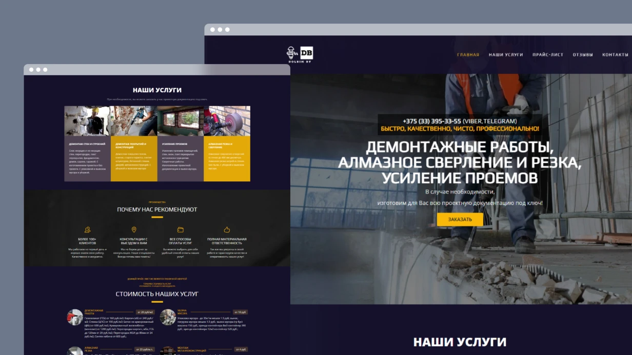
Why does UX/UI for Bitrix require a special approach?
The first thing we do upon receiving a layout from a "pure" designer is check how it fits bitrix:catalog.section and bitrix:catalog.element. In half the cases, a non-standard filter means rewriting bitrix:catalog.smart.filter from scratch — not 2 hours, but a week. That's why we design the interface directly for Bitrix's component architecture, not adapt afterward.
Redesign on Bitrix often hits the same issue: data comes from 1C via CommerceML, but the designer doesn't account for it. We incorporate the real infoblock structure — properties, price types (BASE, RETAIL), warehouse balances — into layouts. This way, the product card doesn't break when 15 characteristics and 4 prices appear. This reduces approval iterations by 30% and saves the client budget significantly — typical savings range from $5,000 to $12,000 compared to a redesign that requires later rework.
Here's what we consider at the design stage:
- Component grid — the interface is built from real Bitrix components:
bitrix:catalog, sale.basket.basket, sale.order.ajax, system.auth.form. The designer knows what data each component outputs and what parameters it accepts. This avoids refinements during layout.
- Visual editor — content managers edit content through the admin panel. Block structure, flexible sections, manageable banners — all thought out before Figma.
- Data from 1C — products, price types, and balances come via CommerceML. The product card accounts for real data volume: 15 characteristics, 4 price types, balances across 3 warehouses — not the ideal three lines from the layout.
- Semantic markup — H1–H6 hierarchy, Product/Offer microdata, alt texts. Incorporated at the design stage because "fixing SEO later" means redoing templates.
| Problem |
Consequences |
Our solution |
| Unaccounted infoblock properties |
Product card breaks when loading 15 characteristics |
Design template with automatic property grouping |
| No mobile version |
Loss of 60% mobile traffic |
Mobile-first with responsive grid |
Custom filter without smart.filter support |
Rewriting the component in 2 weeks |
Include bitrix:catalog.smart.filter in prototype |
How does a clickable prototype prevent development waste?
Before opening Figma — we dig into data. We create personas and scenarios based on Yandex.Metrica (Webvisor, heatmaps), GA4, and user interviews. Not abstract "male 25-45", but specific: "a purchaser who places an order by article numbers from Excel in 10 minutes." This allows more accurate prototyping.
During redesigns, we conduct a UX audit of the current site: conversion funnels, session recordings, drop-off points. On one project, we found that 40% of users abandoned the cart at the delivery selection step — because sale.order.ajax rendered 12 delivery services without grouping. We redesigned it, and conversion increased by 18% (resulting in additional monthly revenue of $15,000–$25,000). Competitive analysis is structural: catalog navigation, number of steps to checkout, filter performance on mobile. Contact us for a UX audit to identify your site's drop-off points.
Prototypes test logic before spending budget on visuals:
- Wireframes — schematics of key pages: home, catalog (
catalog.section), product card (catalog.element), cart (sale.basket.basket), checkout (sale.order.ajax), personal account. Information is prioritised.
- Clickable prototypes — Figma with transitions, modals, filter functionality. The client "touches" the site before development starts, catching navigation issues 4x cheaper than fixing coded templates.
- User tests — moderated sessions with target audience representatives. Cheaper to catch navigation issues here than after coding 40 component templates.
Step-by-step UX/UI design process for Bitrix
-
Design analytics — collect data from Metrica, interviews, audit current interface. Identify drop-off points (if conversion drops at delivery selection, we see it in the funnel).
-
Prototyping — wireframes + clickable prototype. Test scenarios: product search, add to cart, checkout. Iterate until approval.
-
Design system creation — typography, colors, UI components, modular grid. All tied to Bitrix component model.
-
Key page design — mockups for all breakpoints (320–2560px). Account for real data: infoblock properties, price types, balances.
-
Handoff to development — Figma with Dev Mode, export SVG/WebP/AVIF, component documentation. Help developers adapt templates to new design.
How does the design system accelerate Bitrix development?
For each project, we build a scalable system — a shared vocabulary for designers and frontend developers.
- Typography — font pairs optimised for Cyrillic and web rendering. Size scale, line height, heading hierarchy.
- Colors — primary, accent, states (hover, active, disabled, error). Contrast at least WCAG 2.1 AA minimum.
- Modular grid — fixed spacing, consistency from 320px to 2560px.
- UI components — buttons, forms, cards, tables, notifications, icons. Each with state variations and responsive versions.
- Documentation — usage rules so new designers don't "invent" styles. Without it, after six months the project has 4 shades of gray and 3 variants of the "Buy" button.
Result: interface development is 2–3 times faster because the developer gets ready-made classes and spacing instead of guessing from the layout. On one project, after implementing the design system, the time to code a new catalog page dropped from 5 days to 1.5. Get a turnkey design: from wireframes to developer handoff.
Why mobile-first?
We design the mobile version first, then expand. Touch-friendly — minimum 44x44px for interactive elements, sufficient spacing. Swipe for gallery, pull-to-refresh for catalog. Forms use inputmode="numeric" for phone, type="email" for email, input masks via IMask, autocomplete via DaData. Responsive images via <picture> and srcset — art direction for banners: on mobile we don't shrink, we show a different crop. This approach captures 60% of mobile traffic that would otherwise be lost.
How we work in Figma?
- File structure — pages: research, wireframes, UI kit, mockups by breakpoints, animations.
- Auto Layout — components on Flexbox logic, correctly stretch when content changes. The developer sees the same model as in CSS.
- Variables and Variants — variables for colors and spacing, components with state variants. Theme switching — toggle one collection.
- Dev Mode — precise values, export SVG/WebP/AVIF, CSS inspection. No pixel guessing.
What's included in the deliverables?
You receive:
- Figma file with design system and mockups of all pages (including mobile and tablet versions)
- Interactive prototype for approval and testing
- Component documentation (styles, spacing, behaviors)
- Access to files and final exports in SVG/WebP/AVIF
- Recommendations for adapting Bitrix templates to the new design
- Post-release support (up to 2 weeks) — help developers understand the layouts
We are certified 1C-Bitrix partners with 15+ years of experience. We guarantee the design will be implementable on your platform version. We have worked with over 50 online stores and corporate portals — from landing pages to marketplaces.
Usability testing and conversion optimization
How do we measure design effectiveness?
- Moderated tests — real users perform tasks: find a product, add to cart, checkout. We record where they stumble.
- A/B tests — two variants on live traffic. Conversion wins, not the art director's opinion.
- Heuristic audit — Nielsen Norman Group principles: visibility of status, match with expectations, consistency, error prevention.
- Accessibility — contrast, keyboard navigation, alt texts, aria labels. Not optional, but a requirement.
Detailed case study: delivery redesign
On one project, 40% of users abandoned the cart at the delivery selection step — because `sale.order.ajax` rendered 12 delivery services without grouping. We redesigned the interface: grouped by tariffs, added delivery time hints. Conversion increased by 18%, and average order value by 12% — translating to an additional $20,000 in monthly revenue.Order a usability test for your current interface to boost conversion.
Conversion-focused design
- Visual hierarchy — CTAs, prices, promotions highlighted through size, color, contrast. The eye goes where the business needs — verified via eye-tracking or heatmaps.
- Minimal friction — reduce steps to target action. On one project, we removed mandatory registration at checkout — conversion to order increased by 18%.
- Social proof — ratings, reviews, cases, partner logos. Integrated into the design, not tacked at the bottom.
- Micro-animations — product flies into cart, form confirms submission. Direct attention and reduce anxiety.
A site designed with our system typically loads 2x faster than one retrofitted with standard Bitrix templates after optimization, and conversion rates improve by 1.5x–3x depending on the vertical.
Timeline and results
| Project type |
Design timeline |
Result |
| Landing page |
3–5 days |
Mockups + UI kit |
| Corporate site |
2–4 weeks |
Design system + mockups for 10–20 pages |
| Online store |
3–5 weeks |
Design system + mockups for 20–40 pages |
| Portal / marketplace |
4–8 weeks |
Design system + mockups for 30–60 pages |
How to get started?
We evaluate your project within 1 business day. Contact us for a free consultation and project evaluation. Order a full-cycle UX/UI design for your Bitrix site — from research to final mockups. Call us to start your project today.