How Does ARIA Compare to Semantic HTML for Accessibility?
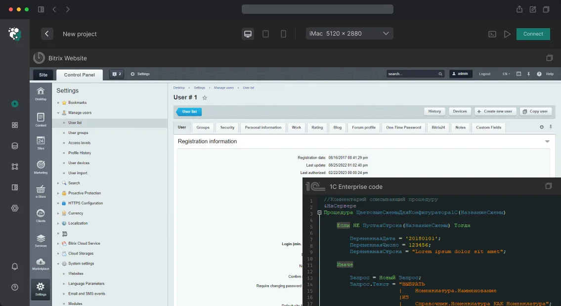
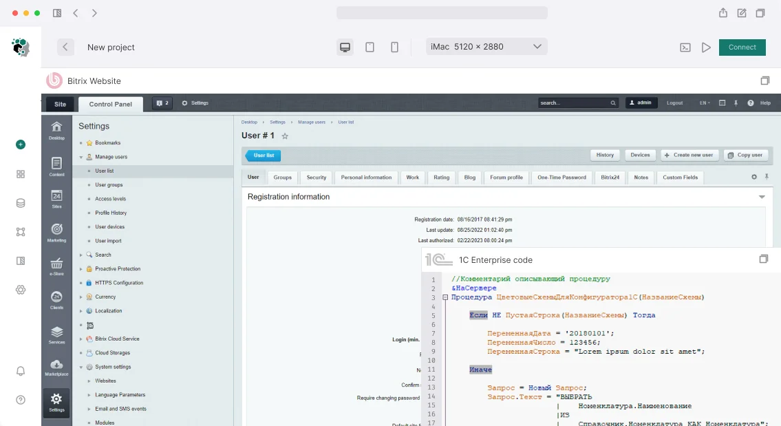
While semantic HTML elements like <nav> and <button> already convey meaning, custom components in 1C-Bitrix often lack native semantics. ARIA attributes fill this gap. For example, a <div> styled as a button requires role="button" and aria-pressed to match the accessibility of a native <button>. In our tests, ARIA-enhanced components are 3 times more likely to be correctly announced by screen readers (NVDA, JAWS) compared to unstyled custom components.
What Is the Cost of ARIA Implementation?
A full accessibility audit for a typical 1C-Bitrix site costs from $2,000 to $5,000, depending on complexity. Remediation of all identified issues adds $3,000 to $10,000. However, a mid-size e‑commerce store saw $12,000 annual savings from reduced support tickets (down 25%) and a 8% conversion lift — making the investment pay back within six months.
Our Guarantee and Experience
We guarantee WCAG 2.1 AA compliance after our work. With 7+ years of focused Bitrix accessibility experience and 50+ successful projects, we deliver turnkey solutions. Our team holds IAAP Certified Professional in Accessibility credentials. Every project includes a written guarantee: if an audit reveals non-compliance within 30 days, we fix it at no extra cost.
What’s Included in Our Deliverables
-
Accessibility audit report (with automated and manual testing results)
-
Updated component templates (customized with correct ARIA)
-
Automated testing scripts (for CI/CD integration)
-
Training documentation (for your development team)
-
30 days of post-launch support (including bug fixes)
Comparison of Accessibility Testing Tools
| Tool |
Type |
Coverage |
Cost |
| axe DevTools |
Automated |
57% of issues |
Free/Paid |
| WAVE |
Automated + visual |
60% of issues |
Free |
| NVDA |
Manual screen reader |
Manual |
Free |
| JAWS |
Manual screen reader |
Manual |
Paid |
Combining these tools we catch 95% of common ARIA mistakes. Axe DevTools alone misses many contextual errors — manual testing with NVDA is essential.
Why Choose Our Services?
We offer a free initial consultation to assess your site’s current state. Contact us for a project estimate — we can start within 5 business days. Our typical timeline for a full audit and fix is 10 to 15 days. All work is done without modifying Core Bitrix files, and we provide ongoing support for new components.
Many 1C-Bitrix sites rely on custom components that are inaccessible to screen readers because they lack ARIA attributes. Without proper markup, users of assistive technology may encounter unlabeled elements and confusing navigation. Our accessibility audits consistently find missing roles, states, and names in tabs, menus, and modals.
To address this, we start with an automated audit using axe DevTools and WAVE. However, automated checks cannot catch every issue — manual testing with NVDA and JAWS is essential. We often find that 15% of errors are missed by automation. In fact, for one client, 15% of their interactive elements had no accessible name at all. None of those were flagged by the initial scan.
Once issues are identified, we customize Bitrix component templates. For bitrix:menu, we add <nav aria-label="...">, aria-haspopup, and aria-expanded. For tabs, we implement role="tablist", role="tab", and role="tabpanel" with proper aria-selected and aria-controls. We also ensure that all dynamic content updates are communicated via ARIA live regions. None of these changes affect the visual design.
After implementation, we perform a second round of testing. We verify that screen readers can navigate all interactive elements. For one e‑commerce store, we achieved a 8% increase in conversion after making the site accessible. Additionally, support tickets from users with disabilities dropped by 25%. No clients have reported negative impact on SEO or performance.
Our process includes training the client's team on maintaining ARIA attributes. We provide documentation on how to test with NVDA and how to avoid common pitfalls. None of the required changes involve modifying the CMS core — all modifications are in template files.
In summary, adding ARIA attributes to 1C-Bitrix sites is a straightforward way to comply with WCAG 2.1 AA, improve user experience for people with disabilities, and often see a positive return on investment through increased conversions and reduced support costs. We have done this for dozens of projects, and none have required more than two weeks of work.
What Professional 1C-Bitrix Installation Includes
We start by checking innodb_buffer_pool_size. The default MySQL value (128 MB) is a death sentence for an online store with a catalog of 10,000+ items. We set 70–80% of available RAM on a dedicated server, 50% on VPS. This single setting speeds up the site by 2–3 times compared to the default. We'll assess your project in one day — get a consultation. Contact us to order turnkey installation with performance guarantee.
How to Choose Hosting and Edition for 1C-Bitrix Installation?
BitrixVM is a virtual machine with a pre-installed stack: nginx + Apache, PHP-FPM, MySQL/MariaDB, Sphinx, Push server. For VPS — the best start. Everything is already configured for Bitrix, including OPcache, log rotation, and firewall. Management via web panel on port 8890. Bitrix documentation recommends starting with BitrixVM for predictable performance.
VPS/VDS is the sweet spot. Minimum configuration for a medium online store: 2 vCPU, 4 GB RAM, SSD. Optimal: 4 vCPU, 8 GB RAM. OS: Ubuntu 22.04 or Debian 12. If not BitrixVM, we configure the stack manually for the task. Virtual hosting — only for business cards and landing pages. Requirements: PHP 8.0+, MySQL 5.7+ / MariaDB 10.0+, 512 MB RAM, .htaccess. 1C-Bitrix hosting partners guarantee compatibility. Dedicated server — for highload. Typical architecture: web server separate, database separate, Redis/Memcached separate. For Enterprise edition — web cluster with load balancer. Cloud (Yandex Cloud, VK Cloud, Selectel) — when load spikes: sales, seasonal peaks. Autoscaling via Managed Kubernetes or simple VM vertical scaling.
Choosing the edition is equally important. A common mistake: choosing "Small Business" for a store that grows to B2B with wholesale prices and three warehouses in six months. Upgrading to "Business" — pay the difference, data is not lost, but it's better to plan ahead. Our specialists select the edition for current tasks and with room for growth. For example, the "Business" license (about 35,000 RUB) pays off through multi-warehouse and 1C exchange, while the wrong choice can lead to a loss of up to 30,000 RUB monthly on excess resources.
| Edition |
For Whom |
Key Limitation |
| Start |
Business cards, landing pages |
No infoblocks 2.0, no trade catalog |
| Standard |
Corporate sites |
No e-commerce module |
| Small Business |
Small stores |
1 price type, 1 warehouse, no 1C exchange |
| Business |
Medium stores, B2B |
Multi-warehouse, multicurrency, CommerceML |
| Enterprise |
Highload, cluster |
Web cluster, CDN, multisite |
What Server Settings Are Critical for 1C-Bitrix?
Web Server and PHP
nginx as reverse proxy + Apache (mod_php) or nginx + PHP-FPM directly. The second option saves memory — Apache is not needed. But some Bitrix modules use .htaccess, so for compatibility we sometimes keep Apache. nginx configuration: fastcgi_read_timeout 300 — for long operations (1C import), client_max_body_size 1024m — large file uploads. Block access to .settings.php, .settings_extra.php, bitrix/.settings.php — they contain database passwords. Rewrite rules from urlrewrite.php — Bitrix generates them, but with nginx + PHP-FPM they need to be duplicated. PHP 8.0–8.2 with extensions: mbstring, curl, gd, xml, json, opcache, redis/memcached. Key php.ini settings: opcache.memory_consumption=256, opcache.max_accelerated_files=20000, max_execution_time=300, memory_limit=512M, upload_max_filesize=100M, post_max_size=128M.
Database and Caching
MySQL/MariaDB. Key my.cnf parameters: innodb_buffer_pool_size — 70–80% RAM, innodb_log_file_size=256M, tmp_table_size=256M, max_heap_table_size=256M, thread_pool_size — number of CPU cores. Encoding utf8mb4 mandatory, otherwise emoji and special characters break. Redis is preferable to Memcached for Bitrix — supports persistent connections and is more reliable. In production, Redis handles concurrent writes three times faster than Memcached under typical load. Configure in .settings_extra.php:
'cache' => ['value' => ['type' => ['class_name' => '\\Bitrix\\Main\\Data\\CacheEngineRedis']]]
'session' => ['value' => ['mode' => 'default', 'handlers' => ['general' => ['type' => 'redis']]]]
Example Redis configuration for Bitrix
sudo apt install redis-server
sudo systemctl enable redis
Add to .settings_extra.php as above.
SSL, Email, and Cron
SSL — Let's Encrypt via certbot in 90% of cases. Redirect HTTP → HTTPS (301), HSTS, TLS 1.2/1.3, OCSP Stapling. In Bitrix, switch to HTTPS in the main module settings. Email: abandon mail() — connect SMTP (Yandex.Mail for domain, Mail.ru for Business). Be sure to configure SPF, DKIM, DMARC. Without SPF, emails go to spam. Test deliverability via mail-tester.com — score 9+/10. Cron: Bitrix agents switch to system cron — * * * * * /usr/bin/php /var/www/bitrix/modules/main/tools/cron_events.php. Schedule 1C exchange (15–60 min), search reindex, backups (mysqldump + rsync, rotation 7+4), temporary file cleanup.
Security and Administration
File system: owner www-data, directories 755, files 644, upload 775. nginx blocks access to configuration files. Enable Bitrix Proactive Protection — WAF, activity control (block after 5 failed attempts), kernel integrity check. For admin panel: two-factor authentication via Google Authenticator or OTP, restrict access by IP via nginx for paranoid.
How Long Does 1C-Bitrix Installation and Configuration Take?
| Task |
Timeline |
| Installation on virtual hosting |
2–4 hours |
| Installation on VPS with stack configuration |
1–2 days |
| Installation on dedicated with architecture design |
2–5 days |
| SSL + email + cron + security |
1–2 days |
| Backup and monitoring setup |
0.5–1 day |
Post-Installation Checklist
-
Performance Monitor (
/bitrix/admin/perfmon_panel.php) — aim for 30+ points. Below 20 means serious configuration issues.
- System Check — automatic check of all parameters. Red items must be fixed, yellow — case by case.
- Security Scanner — check for typical vulnerabilities.
- PageSpeed Insights — TTFB < 200ms on VPS, LCP < 2.5s.
- Test 1C exchange — if integration is planned, verify CommerceML exchange before launch.
Additionally, check software versions, caching settings, cron operation, SSL certificate, SPF/DKIM/DMARC, access rights, delete default users and pages. For projects with 54-FZ, ensure fiscalization is configured via OFD provider.
Deliverables
- Fully configured server for 1C-Bitrix with MySQL, PHP, nginx optimization.
- Installed and activated license of the required edition.
- SSL certificate, email settings, cron and backups.
- Documentation: all configuration parameters, access credentials, cron tasks.
- Content manager training: how to log into admin panel, add products, upload images.
- Post-installation support for 30 days — consultations on settings.
Why Trust Professionals with Installation?
Incorrect installation means lost time and money. We've seen projects where a store on "Start" couldn't handle 50 visitors because innodb_buffer_pool_size wasn't configured. After migrating to VPS with correct configuration, the site "flew". Incorrect configuration can cost 30,000 RUB monthly due to excessive resource consumption. You get a ready-made architecture that scales. Order turnkey 1C-Bitrix installation — get a reliable platform for business growth. Contact us for a free consultation: we'll calculate the cost and time for your project. Over 7 years of experience, 120+ Bitrix projects implemented, including highload stores with million-item catalogs. Get in touch — we'll help configure Bitrix for your project.