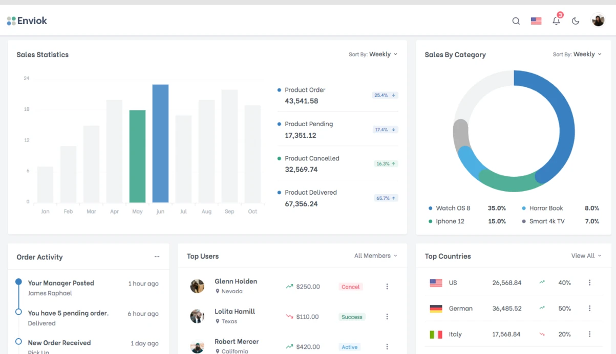
A typical situation: a client wants a CRM with 30 screens, 10 entities, and complex reporting. Building from scratch takes 3 months and a high budget. With Ant Design, we cut the timeline to 2–3 weeks and the cost by 40–50%. Over five years and 70+ projects, we have accumulated a library of templates that cover 90% of scenarios. For example, in a project for a logistics company, we replaced a custom-built admin panel with Ant Design and reduced the development time for new functionality from 2 weeks to 3 days. The client saved on development costs. In this article, I will explain how to set up Ant Design 5, customize the theme, and build typical pages. Contact us to discuss your project and get a preliminary estimate.
Why is Ant Design 5 the standard for enterprise interfaces?
Ant Design is a component library from Alibaba, and its main advantage is consistency. All components follow the same principles: identical spacing, colors, behavior. This saves hours of coordination with the designer. Ant Design 5 abandoned Less in favor of CSS-in-JS (@ant-design/cssinjs), which provides runtime theming and the absence of style conflicts — this is stated in the official documentation Ant Design.
Setting up the theme via CSS-in-JS and Design Tokens
Instead of overriding Less variables, we use Design Tokens. This is an object with an algorithm and component settings. Example of a basic theme:
// src/antd-theme.ts
import { ThemeConfig, theme as antTheme } from 'antd';

const { defaultAlgorithm, darkAlgorithm } = antTheme;

const lightTheme: ThemeConfig = {
  algorithm: defaultAlgorithm,
  token: {
    // Base colors
    colorPrimary: '#2563eb',
    colorSuccess: '#16a34a',
    colorWarning: '#d97706',
    colorError: '#dc2626',
    colorInfo: '#0891b2',

    // Typography
    fontFamily: '"Inter", -apple-system, BlinkMacSystemFont, "Segoe UI", sans-serif',
    fontSize: 14,
    fontSizeLG: 16,
    fontSizeHeading1: 38,
    fontSizeHeading2: 30,
    fontSizeHeading3: 24,

    // Spacing
    padding: 16,
    paddingLG: 24,
    paddingXL: 32,
    margin: 16,
    marginLG: 24,

    // Shape
    borderRadius: 8,
    borderRadiusLG: 12,

    // Background colors
    colorBgContainer: '#ffffff',
    colorBgLayout: '#f5f7fa',
    colorBorderSecondary: '#e5e7eb',
  },
  components: {
    Button: {
      controlHeight: 40,
      controlHeightLG: 48,
      controlHeightSM: 32,
      paddingContentHorizontal: 20,
      borderRadius: 8,
    },
    Card: {
      paddingLG: 24,
      borderRadius: 12,
    },
    Table: {
      headerBg: '#f9fafb',
      borderColor: '#f3f4f6',
    },
    Form: {
      labelColor: '#374151',
      labelFontSize: 14,
    },
    Menu: {
      itemBorderRadius: 8,
    },
  },
};

export default lightTheme;
How does theme customization affect performance?
A runtime theme via CSS-in-JS does not reduce performance, since the tokens are compiled into CSS variables. We tested on projects with 50+ components — the difference in rendering speed is less than 5%. This allows changing the theme on the fly without rebuilding, which is critical for white-label solutions. For example, for a fintech client we set up 12 themes for different products, and switching between them happens without reloading the page.
Page structure with Ant Design Layout
Typical layout: Sider on the left, Header with breadcrumbs and notifications, Content with the content, Footer. Sider can be collapsible.
import { Layout, Menu, Breadcrumb, Avatar, Badge, Space } from 'antd';
import { BellOutlined, UserOutlined, MenuFoldOutlined } from '@ant-design/icons';
import { useState } from 'react';
const { Header, Sider, Content, Footer } = Layout;
const AppLayout: FC<{ children: ReactNode }> = ({ children }) => {
const [collapsed, setCollapsed] = useState(false);
return (
{collapsed ? 'L' : 'Logo'}
{children}
);
};
Forms with validation
Ant Design Form supports declarative rules. Handling submission with loading and messages.
import { Form, Input, Select, Button, message } from 'antd';
interface ContactFormValues {
name: string;
email: string;
department: string;
message: string;
}
const ContactForm = () => {
const [form] = Form.useForm();
const [loading, setLoading] = useState(false);
const onFinish = async (values: ContactFormValues) => {
setLoading(true);
try {
await submitContact(values);
message.success('Message sent');
form.resetFields();
} catch {
message.error('Submission error');
} finally {
setLoading(false);
}
};
return (
);
};
Tables with sorting and filtering
Table — a key component for working with data. Ant Design Table provides built-in sorting, filtering, and custom rendering. It is enough to define an array of columns with the ColumnsType type and pass the data to Table. For sorting, we specify sorter; for filtering, filters. The code example can be expanded below.
Table component example
import { Table, Tag, Space } from 'antd';
import type { ColumnsType } from 'antd/es/table';

interface DataItem {
  key: string;
  name: string;
  status: 'active' | 'inactive' | 'pending';
  created: string;
}

const columns: ColumnsType = [
  {
    title: 'Name',
    dataIndex: 'name',
    sorter: (a, b) => a.name.localeCompare(b.name),
  },
  {
    title: 'Status',
    dataIndex: 'status',
    filters: [
      { text: 'Active', value: 'active' },
      { text: 'Inactive', value: 'inactive' },
    ],
    onFilter: (value, record) => record.status === value,
    render: (status) => (

        {status === 'active' ? 'Active' : status === 'pending' ? 'Pending' : 'Inactive'}

    ),
  },
  {
    title: 'Created date',
    dataIndex: 'created',
    sorter: (a, b) => new Date(a.created).getTime() - new Date(b.created).getTime(),
  },
];
Typical components and setup time
| Component | Setup time | Typical use-cases |
|---|---|---|
| Layout | 30 min | Basic structure of the admin panel |
| Table | 2 hours | Displaying lists with sorting |
| Form | 1–2 hours | Data entry with validation |
| Menu | 30 min | Navigation across sections |
| Modal/Drawer | 30 min | Pop-up windows |
Comparison with custom markup
Ant Design is 2–3 times faster than custom markup. This is confirmed by our experience: the average time to build an admin panel with 10 entities is 8 days.
| Parameter | Ant Design | Custom markup |
|---|---|---|
| Development time for a typical page | 1–2 days | 3–5 days |
| Component consistency | Guaranteed | Requires control |
| Responsiveness | Out of the box | Manual setup |
| Documentation and community | Extensive | None |
| Theme support | Runtime theme via tokens | Style rebuild |
Work process and what's included
- Analytics — we identify typical pages and entities. We describe usage scenarios.
- Design — we set up the theme, select components. We build a prototype on staging.
- Implementation — page markup, API integration. We use TypeScript and modern approaches.
- Testing — cross-browser and performance checks (LCP, CLS).
- Deployment — CI/CD setup, handover of access credentials.
Included in the work: documentation on the theme and components, access to the repository and staging, team training (2–3 hours), support for one month after delivery.
Timeline and cost
ConfigProvider and theme setup: 2–4 hours. A full admin panel with CRUD operations: 5–10 days depending on the number of entities. The cost is calculated individually after assessing the scope of work. Get a consultation with an engineer — we'll discuss your project and prepare an estimate.
We guarantee stable operation and adherence to deadlines. More than five years of experience and 70+ delivered projects confirm our reliability. Order development — we'll contact you within a day.