How do we guarantee design-to-code fidelity?
We restructure the UX/UI process so that design and code do not diverge. Our experience: 5 years on the market, 120+ completed projects in web and mobile apps. We work under a contract with a fixed timeline guarantee. Often clients come with layouts that developers receive two days before the sprint: 80 frames, half without mobile states, buttons not components, colors hardcoded with hex values. Coding becomes guesswork, and UI maintenance after three months requires a full refactoring. Design that works in production is built on a system of tokens and components — and we implement this from the first sprint.
Why design without tokens breaks code, and how we fix it
How Figma becomes an engineering tool
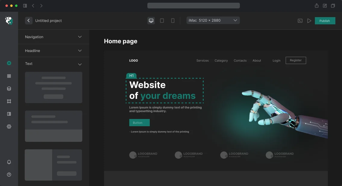
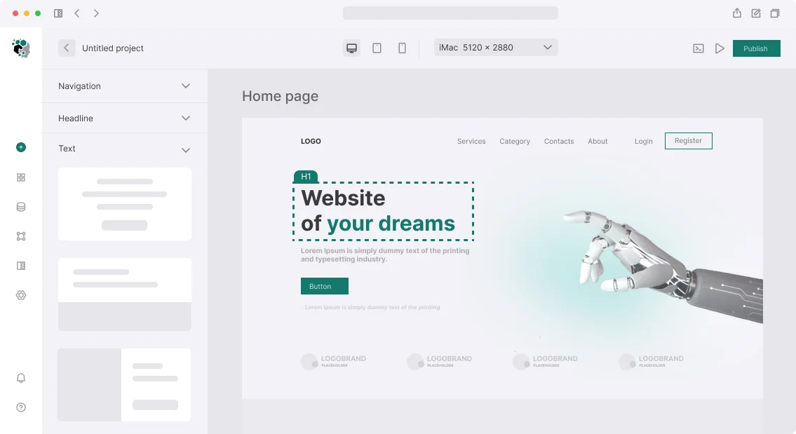
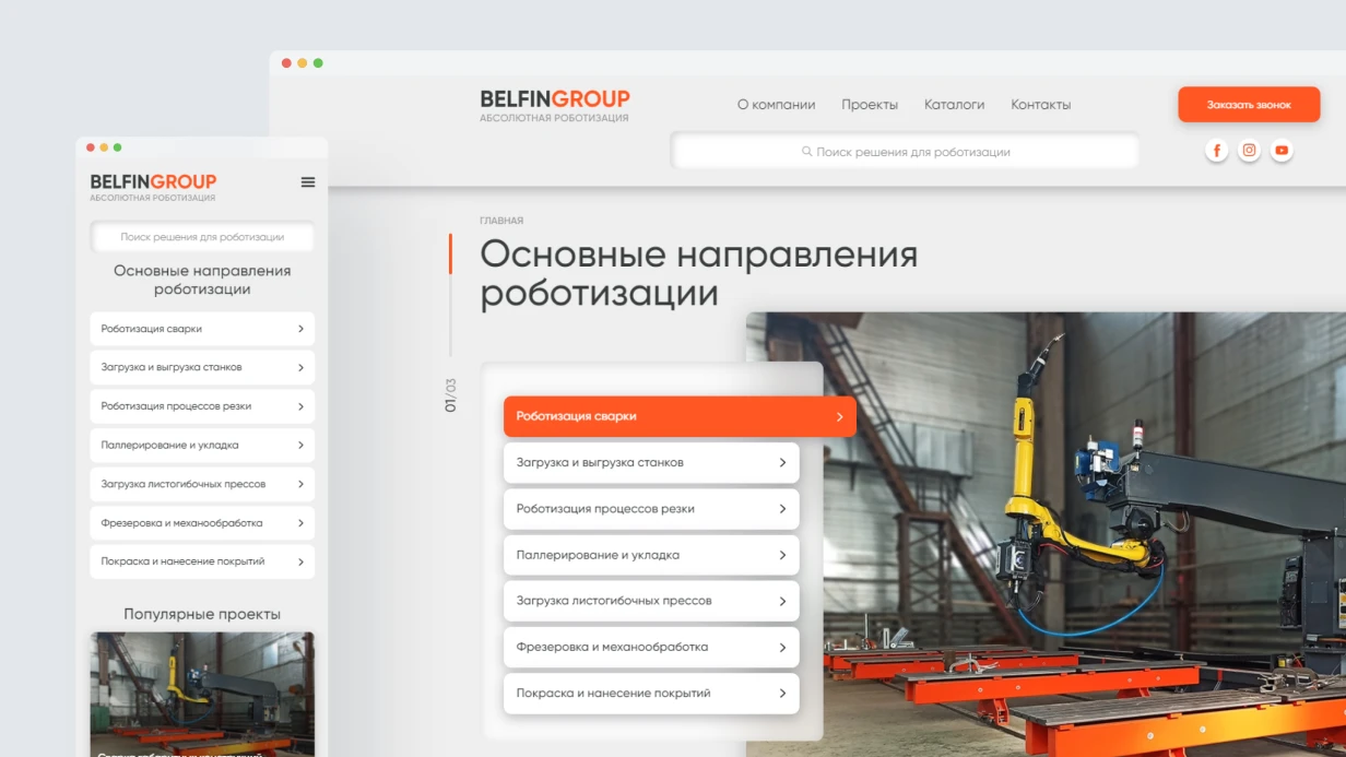
Figma is not just "a place to draw." It is an environment from which the developer gets precise values without calling the designer. We use Design Tokens — unified variables for colors, spacing, radii. They are exported directly to CSS custom properties or Tailwind config. For example, color/primary/500, spacing/md, radius/button. Without tokens, design and code diverge within a month.
What is the role of auto layout in responsive design?
Auto layout is mandatory. Components without auto layout break when text changes. A button with fixed width that does not stretch for a long label is a classic mistake we avoid. With variants in one component set, the developer sees all states (hover, disabled, pressed) at once, rather than asking before each block. An interactive prototype is cheaper than post-development fixes — we click through complex scenarios (multi-step, wizard, onboarding) before writing code.
What do design systems provide and when are they overkill?
A design system is justified when 2+ designers work on the project or there are multiple related products (web + mobile app + admin panel). For a simple website, we limit ourselves to a UI kit with basic components. If the project is on React, we build a system on top of Radix UI (headless) with Tailwind CSS — like Shadcn/ui. Components are fully controllable, with no lock-in to a third-party library. Wikipedia calls this approach strategically correct for scaling.
How do we ensure responsiveness without surprises?
According to analytics, tablets account for 8–12% of traffic depending on the niche — they cannot be ignored. But we do not create "desktop + mobile" with three breakpoints. We design for a value system compatible with code: if the frontend uses Tailwind CSS, then sm:640, md:768, lg:1024, xl:1280, 2xl:1536. The designer works with the same numbers in Figma. Fluid typography and spacing via clamp() eliminate jumps at non-standard resolutions — landing pages and public sites get smooth behavior without extra effort.
What is included in the deliverables
We deliver results that can be immediately handed off to development, without any guesswork by the developer.
| Stage | What you receive |
|---|---|
| UX research + IA | User journey map, page structure, friction point report |
| Wireframes (lo-fi) | Grayscale schemes for block logic alignment |
| UI kit / design system | Typography scale, color system, basic components with variants in Figma Variables |
| Hi-fi mockups | Real content, responsive versions for 5+ breakpoints |
| Handoff package | Figma Dev Mode, exported SVGs, annotations for non-standard states, token link |
Additionally: team training on design system (1–2 hours), Figma access throughout development, support during implementation.
How we guarantee UI quality
Each layout is reviewed by an engineer for feasibility: no conflicts with auto layout, correct mobile states, accessible contrast (WCAG AA). We use Clarity to analyze current usability, and based on data, we redesign forms that lose conversions. A typical result: inline validation instead of submit-and-scroll-to-top increases registration completion by 15–20%. Skeleton screens instead of spinners reduce perceived loading time.
Timeline and cost estimates
| Stage | Timeline |
|---|---|
| UX research + IA | 3–7 working days |
| Wireframes (10–20 screens) | 5–10 working days |
| UI kit / design system | 5–15 working days |
| Hi-fi design (10–20 screens) | 7–14 working days |
| Responsive versions | +30–50% of mockup time |
Timelines depend on the number of unique screens and component complexity. Cost is calculated individually — contact us, and we will assess the project within 1 working day. Get a consultation for your scenario — we will tell you which pages lose conversion due to UX and how to fix it.