
Landing Page Optimization for Conversion Boost
We've conducted dozens of landing page audits and know: conversion is hindered not by design but by systemic issues. Slow loading, unclear offer, lack of social proof — each eats up to 30% of potential leads. Without data, optimization becomes guesswork. Our approach: diagnosis across 5 layers — message, structure, speed, trust, mobile responsiveness. We collect heatmaps, analyze funnels in GA4, measure Core Web Vitals. After the audit, we compile a prioritized list of hypotheses and implement changes iteratively. Average conversion increase after our intervention: 25–40%, with timelines from 4 business days to 3 weeks. With a substantial monthly ad budget, savings after page speed optimization can be significant. We work with any complexity of landing pages: from one-pagers to multi-page funnels. Our stack includes React, Next.js, Vue, Laravel, WordPress — we choose the right tool for the job.
Audit Before Changes
Basic diagnostics are needed before making any edits.
Conversion funnel in GA4: Sessions → Scroll to 50% → CTA Click → /thank-you page. Configured via Events + Conversions. If /thank-you is not the only indicator, add a form_submit event with a form_id parameter.
Heatmaps (Hotjar / Microsoft Clarity):
- Scroll depth map — where 50% of visitors stop scrolling
- Click map — what they click, what they perceive as clickable
- Session recordings — real user behavior, rage clicks, form abandonment
PageSpeed / Web Vitals:
npx lighthouse https://example.com/landing --output json --output-path ./lighthouse-report.json --preset desktop
LCP above 2.5s or CLS above 0.1 means direct conversion losses, especially on mobile.
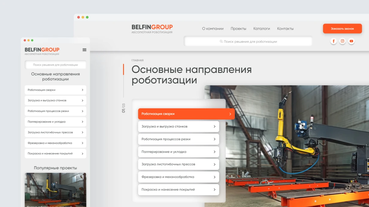
Landing Page Structure: Block Hierarchy
The order of blocks matters more than their visual polish. A proven layout for selling a service/product:
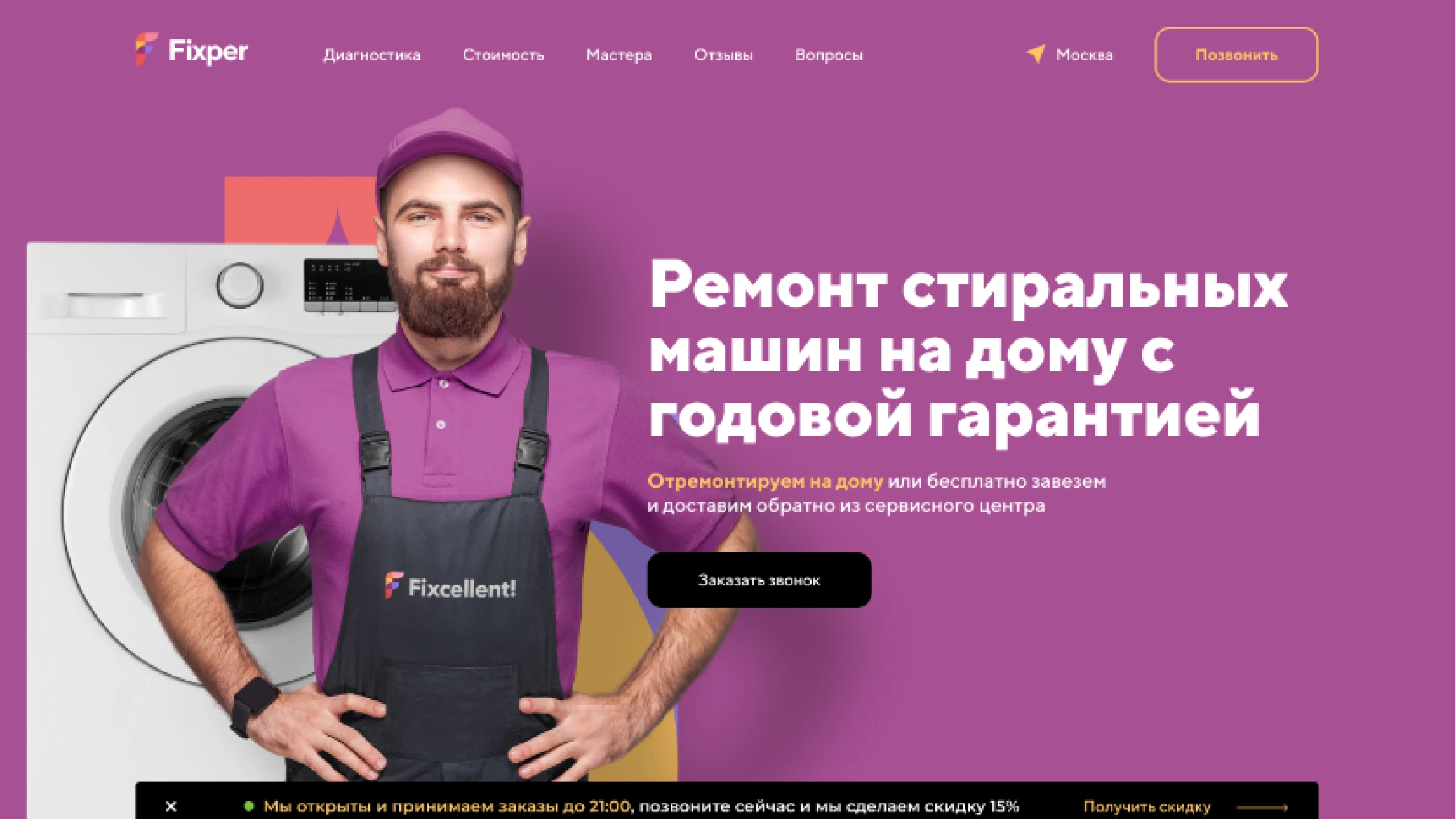
- Hero — offer + main CTA in the first screen. Not a slogan, but specifics: "Website audit in 5 days — 12 metrics, written report"
- Social proof — client logos, project count, aggregator rating. Immediately after hero, while attention is highest
- Problem/Value — articulate pain → proposed solution. No corporate clichés
- Mechanics and Process — what exactly the client gets, step-by-step description
- Results/Case Studies — measurable outcomes. "+34% conversion" is more convincing than "improved metrics"
- Objections — address typical doubts in text format, not FAQ accordion
- Repeated CTA — with a different wording than hero
- Footline — minimal form or contacts
Typical mistake: placing the team description and company history in 3rd position. Users don't scroll down to the CTA.
Offer and Copywriting
Hero headline is checked by criteria:
- contains an action verb or result
- specific (number, deadline, format)
- answers "what do I get" in 3 seconds
Instead of: "Professional website development" Better: "Landing page development with CRM integration — delivered in 2 weeks with a contract"
Subheadline explains mechanics or audience. One or two sentences.
Micro-copy near forms reduces anxiety: "We'll respond within 1 business hour. No spam, no third-party data sharing."
Form: Conversion Bottleneck
Each additional field reduces conversion. Data from numerous A/B tests (Nielsen Norman Group):
- 3 fields → 4 fields: –25% conversions on average
- Mandatory phone when email is present: –40%
Minimum form for initial contact: name + email/phone (choose one) + button. Everything else is qualification questions handled during callback. Cost per lead after form optimization decreases.
Technically, the form should be:
<form method="POST" action="/api/lead" novalidate>
  <label for="name">Name</label>
  <input id="name" name="name" type="text" autocomplete="name" required minlength="2" />
  <label for="contact">Email or phone</label>
  <input id="contact" name="contact" type="text" autocomplete="email" required />
  <button type="submit">Get audit</button>
</form>
autocomplete is not cosmetic. On mobile, without it users abandon forms 20–30% more often.
Inline validation on blur, not submit:
input.addEventListener('blur', () => validate(input));
Why Page Speed Is Critical for Conversion?
On mobile 3G/4G, every second of loading causes conversion losses. Specific measures:
- Images: WebP/AVIF format, loading="lazy" for below fold, fetchpriority="high" for hero, explicit width/height
- Fonts: preconnect + preload woff2
- Critical CSS inline, rest defer
According to Google, increasing Core Web Vitals LCP from 1.5 to 2.5 s reduces conversion by 10–15%. An optimized landing page converts 1.5 times better than an unoptimized one. Average ad budget savings after speed optimization: 25–35%. For instance, with a typical monthly ad spend, that's significant savings. Mobile adaptation is especially important — without it, up to 60% of traffic leaves without action.
Example: one speed optimization case
For an e-commerce landing page, we reduced LCP from 4.5 s to 1.8 s by optimizing images and fonts. Conversion increased by 28% on mobile devices. Full report on request.How to Set Up A/B Testing Correctly?
Without A/B tests, optimization is just hypotheses. Minimum toolkit: Google Optimize (deprecated, alternatives: VWO, AB Tasty, Optimizely) or custom implementation via Edge Middleware (Vercel/Cloudflare Workers).
Priority elements to test:
- hero headline wording (highest impact)
- CTA button text
- form position (in hero vs separate block)
- page length (short vs long version)
For statistical significance at 3–5% conversion, you need ~500–1000 conversions per variant. With low traffic, the test will drag on for months — in that case, prioritize expert changes over testing.
Timelines
Audit + technical fixes (speed, forms, micro-copy) without redesign — 4–6 business days. Structural rework with 2–3 variants for A/B testing — 8–12 days. Full cycle: audit → redesign → test → iteration — estimated as a product sprint from 3 weeks.
What's Included
- Current landing page audit: Web Vitals, heatmaps, GA4 funnel
- Hypothesis development and change prioritization
- Implementation of fixes: micro-copy, CTA, speed, forms
- A/B testing setup (on request)
- Access transfer and documentation
Our expertise: 7+ years in web development, 50+ optimized landing pages, average conversion growth 25–40%. We guarantee transparent reporting and fixed timelines. All specialists have Google and Yandex certifications. The cost of landing page optimization is calculated individually based on the scope of tasks.
Conversion Optimization Impact Table:
| Metric | Before Optimization | After Optimization | Improvement |
|---|---|---|---|
| Page Speed (LCP) | 3.2 s | 1.8 s | -44% |
| CLS | 0.15 | 0.02 | -87% |
| Form Conversion | 2.1% | 3.4% | +62% |
| Mobile Lead Share | 1.8% | 2.9% | +61% |
| Approach | Result | Risks |
|---|---|---|
| Design only | Aesthetics without conversion | Budget wasted |
| Design + speed | Improvement but no guarantee | No proof without A/B test |
| Full cycle: audit → hypotheses → test | Measurable conversion growth | Requires time and resources |
Contact us for a landing page audit. Order a consultation — first 30 minutes free. Get specific recommendations to increase lead conversion today.