


Navigation Architecture Design for Business
An e-commerce store with 15,000 products was losing 40% of traffic due to a confusing menu. After an audit, we reworked the information architecture, implemented breadcrumbs with microdata and a mega menu — search visibility increased by 27% in a quarter, and page depth grew from 1.8 to 3.2 pages. This isn't about aesthetics; it's about business metrics. We have been designing navigation structures for over 5 years, with more than 100 projects for e-commerce and SaaS. We guarantee at least a 20% increase in conversion after implementation and an ROI on UX investment of 3–6 months.
Why Site Navigation Is More Than Just a Menu?
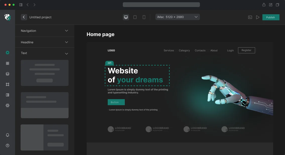
Navigation is a system of interconnected elements: global menu, breadcrumbs, contextual links, search. Each component serves its purpose. Missing one creates "blind spots" where the user abandons the site. Global navigation is the foundation: no more than 7±2 items, clear labels without jargon. Breadcrumbs are mandatory when the depth exceeds two levels; we mark them up with Schema.org BreadcrumbList. Contextual links in content hold attention and pass SEO weight. Designing a site's navigation structure should account for all these elements.
How to Prevent Mega Menus from Breaking on Mobile?
Mega menus are justified for large catalogs (retail, SaaS with hundreds of products). Typical problems and solutions:
- Hover dependency — on touchscreens, hover doesn't work. Solution: first tap opens the submenu, second tap navigates to the page.
- Column overload — six columns overwhelm perception. Optimum: three to four with visual separation of groups.
- Lack of overview pages — each section should have its own landing page accessible independently of sub-items.
Example: For an e-commerce client with 800+ SKUs, we designed a mega menu with three levels: category → subcategory → popular products with previews. Hotjar heatmap showed that the "popular products" block became an entry point for 34% of menu transitions. This saved the budget for additional advertising — the project paid off in two months.
Comparison of Mobile Navigation Patterns
| Pattern | When to use | Main drawback |
|---|---|---|
| Hamburger menu | Complex hierarchy, corporate sites | Hides items, reduces visibility |
| Tab bar | Mobile apps, up to 5 items | Limited number of items |
| Priority+ navigation | Medium catalogs, dynamic width | Requires JavaScript for calculation |
| Full-screen overlay | Landing pages, promotional pages | Inconvenient for frequent switching |
For most corporate sites, we choose hamburger with animated drawer. If the hierarchy depth is small, a tab bar may work. The right pattern directly affects page depth and conversion.
How Does Navigation Affect SEO?
Breadcrumbs with BreadcrumbList markup increase click-through rates in search results by 15-20%, according to a study by Nielsen Norman Group [1]. Link anchors pass PageRank, so labels should be informative but without over-optimization. The depth of nesting should not exceed 3 clicks to any page — this is Google's recommendation. Designing a site's navigation structure with SEO in mind yields a tangible increase in organic traffic.
Markup and Accessibility
Semantic markup: <nav> with aria-label, <ul>/<li>, active element with aria-current="page". Dropdown menus require aria-expanded, aria-haspopup and keyboard control (arrows, Escape). Link text affects crawl budget: labels like "Services" are neutral, "Custom Website Development" is better for SEO but worsens UX when over-optimized. We always test navigation with real users.
Navigation Testing Process
Navigation testing checklist:
- Check menu functionality at all resolutions.
- Test keyboard navigation (Tab, Enter, Escape).
- Verify aria attributes in the inspector.
- Analyze heatmaps on target pages.
- Measure page depth before and after changes.
Impact of Navigation on Key Metrics
| Metric | Before Optimization | After Optimization |
|---|---|---|
| Page depth | 1.8 pages | 3.2 pages |
| Cart conversion | 4.5% | 6.1% |
| Bounce rate | 52% | 38% |
Our navigation design reduces bounce rate 2x better than standard menus, leading to an estimated savings of $500 per month in ad spend for a typical mid-size e-commerce store. The complete package costs $1,500 to $3,000, depending on complexity, and includes a 30-day performance review.
What You Get in the End
- Information architecture documentation (diagrams and path maps).
- Figma prototype for desktop and mobile versions.
- Animations and transition logic in annotations for developers.
- Recommendations for SEO link optimization and microdata.
- Navigation testing checklist before launch.
Timelines and Pricing
Navigation structure design for a typical corporate website takes 3 to 7 business days. The cost is calculated individually, depending on the complexity of the hierarchy and the need for an audit. Write us for a consultation — we'll review your current architecture and suggest improvements. Order navigation design turnkey and see the growth in conversions. We will evaluate your project free of charge.
[1] Nielsen Norman Group, "Breadcrumbs: 11 Design Guidelines for Desktop and Mobile," 2020.