


Your kiosk doesn't match the architectural style — and guests overlook it
A kiosk that clashes with the architecture looks like a foreign element. Guests perceive it as a temporary technical structure — and unconsciously avoid it. Even if the screen works, they trust the information less: it seems imposed, not part of the space.
This leads to lower foot traffic: fewer interactions, less value from the kiosk, and lost revenue. Instead of a helpful assistant, you get an expensive stand that is an eyesore and doesn't pay off.
This is especially noticeable in spaces with thoughtful interiors: museums, business centers, hotels — there, the mismatch immediately catches the eye.
We solve this pain with architectural-style kiosk design. Not just a "pretty shell," but full alignment with the surroundings: materials, color palette, shapes, lighting.
The kiosk becomes a natural part of the interior — it is noticed, but not as a foreign object, rather as a logical element of the space.
Architectural alignment also changes guests' attitude. When a kiosk fits into the environment, people approach it without hesitation, interact more readily, and remember the information.
Trust in the place as a whole also grows: everything is thought through to the smallest detail — so visitors are treated attentively here too.
As a result, you get not just an information stand, but a tool that enhances the impression of the space. Guests spend more time at the kiosk, return to it again, and share their experience with others. It is this kind of kiosk design that turns a technical device into part of the architectural image.
5 benefits of a kiosk interface that understands the visitor
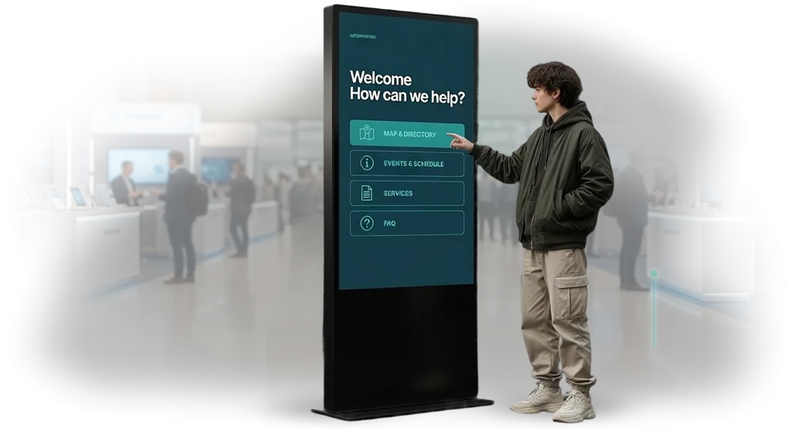
The touchscreen kiosk interface is the first thing a visitor encounters, and it determines whether the guest will explore further or simply walk past.
When the screen speaks the guest's language, clearly shows the route, and responds with a single touch, the person feels cared for. And care is trust — which carries over to both your brand and the space you represent.
Thoughtful UX/UI increases engagement: visitors are more willing to explore information, linger at the screen, and return to it repeatedly. They don't need to seek staff assistance — the kiosk guides them through the scenario itself.
The result: shorter lines at the information desk, more self-service actions by guests, and higher visit satisfaction.
Architectural-style navigation addresses two tasks at once: it helps visitors quickly orient themselves at the venue and subtly emphasizes the character of the space. Consistent styling between the screen and the building's architecture creates a cohesive image.
This works for brand recognition: the visitor remembers not just a kiosk, but the aesthetics surrounding it. Such an interface becomes part of the interior, not a standalone gadget.
A convenient interface saves time for both guests and your team. Fewer repetitive questions to administrators, fewer errors when searching for the right department or event.
And it also opens up more opportunities to showcase additional services: hall rentals, café, souvenirs, current promotions. This is a subtle but steady increase in average check and repeat visits.
The fifth benefit is flexibility. A clear UX/UI allows you to quickly update kiosk information for new events, seasonal offers, or layout changes. You don't overpay for modifications — you manage the content yourself.
And you maintain the brand style because all interface elements are already built into the design system. These are exactly the kinds of interfaces we create — ones that deliver value every day, not just ones that look modern.
Kiosk formats: choose the right one for your task
Every venue — shopping mall, museum, business center, or exhibition hall — operates by its own rules. Sometimes you need to quickly guide a visitor to an office, other times you need to hold their attention at a display and spark interest in the brand's story.
There is no universal kiosk, so we select a format based on the area, visitor flow density, and usage scenarios.
Navigation kiosks save guests' time and relieve staff of dozens of similar questions. Promo kiosks turn waiting time into a small interactive tour and strengthen interest in the product. Information kiosks work as both a reference desk and the venue's business card. Here is a short table to help you decide:
| Kiosk format | Suitable for | What it gives the client |
|---|---|---|
| Navigation kiosk | Shopping malls, business centers, airports, stadiums | Helps visitors quickly find their destination, reduces the load on the information desk |
| Promo kiosk | Exhibitions, showrooms, entrance areas, waiting zones | Engages guests with interactivity, increases time spent with the brand and event memorability |
| Information kiosk | Museums, hotels, clinics, government institutions | Provides information at any time, tells about services and events, improves service quality |
For each task, we calculate the optimal placement, screen scenarios, and visual design. We create the interface design in the architectural style of the venue, so the kiosk looks like an extension of the space rather than a random technical element.
As a result, guests find their way easily, staff focus on their own tasks, and the impression of the venue becomes cohesive.
How kiosk design development works: 7 steps
It all starts with a brief — a short interview where we break down the kiosk's tasks and audience. At this stage, we determine what matters most to you: navigation speed, image-driven presentation of materials, or convenience for staff.
Then we move step by step, and at every stage you see the result, not a "black box" for a couple of months.
- Brief and task analysis. We discuss usage scenarios: how many visitors per day, which functions are needed first, where the kiosk will be placed. We collect input on the brand style and the architecture of the space.
- Screen prototype. We show the structure: which sections, how the menu works, how many touches it takes to reach the needed information. We approve the logic before resources are invested in graphics.
- Design concept. We develop a visual language: fonts, icons, color accents. We tailor the interface to the architectural style of the location so the kiosk looks like part of the space.
- Layout approval. You receive finished screens for approval. We make edits based on your feedback — up to two iterations are included in the cost.
- Technical development. We hand the design to developers: layouts for different screen resolutions, button behavior, transition animations. Here we determine how the interface will look on real hardware.
- Assembly and testing on the device. We test scenarios: what happens with a long press, how the system behaves when there's no activity, whether text is readable in bright light. We fix issues before launch.
- Launch and support. We deploy the design, train your team, and hand over source files and instructions. After launch, we stay in touch — we promptly fix small issues if they come up in real-world use.
At each stage, you receive an intermediate result and understand what's happening. This approach eliminates the risk of "surprises" at the final stage and unnecessary rework costs.
What's included in the delivery of kiosk UX/UI design
Kiosk UX/UI design is not just pictures. The delivery includes a package that makes it clear to your team what to build and to you what to control.
All elements are connected by a single logic and adapted to the architectural style of the venue — the kiosk looks like part of the interior, not a randomly placed box.
Here's what you get:
- Layouts of key screens: main menu, catalog, navigation, contacts. Each screen is designed for touch control — large tap zones, clear labels, margin around the edges.
- Interface guideline: fonts, colors, element sizes, layout rules. With it, the design can be easily extended to new sections while maintaining the style.
- Interactive prototype: touch scenarios. Before launch, you can see how a visitor goes from the first touch to the target action.
- Source files in editable formats: texts, images, and promotional banners can be changed without a contractor.
- Content recommendations: text structure, font sizes, number of menu items, image selection. The interface remains readable in bright light and from a distance of 1–2 meters.
- Acceptance checklist: parameters to verify on a real kiosk — touch response, contrast, safe zones.
The package is delivered in stages: structure and scenarios, layouts, guideline, source files. At each stage you see the result and make edits before development starts — keeping the UI design delivery transparent.
Case study: architectural-style kiosk for a museum
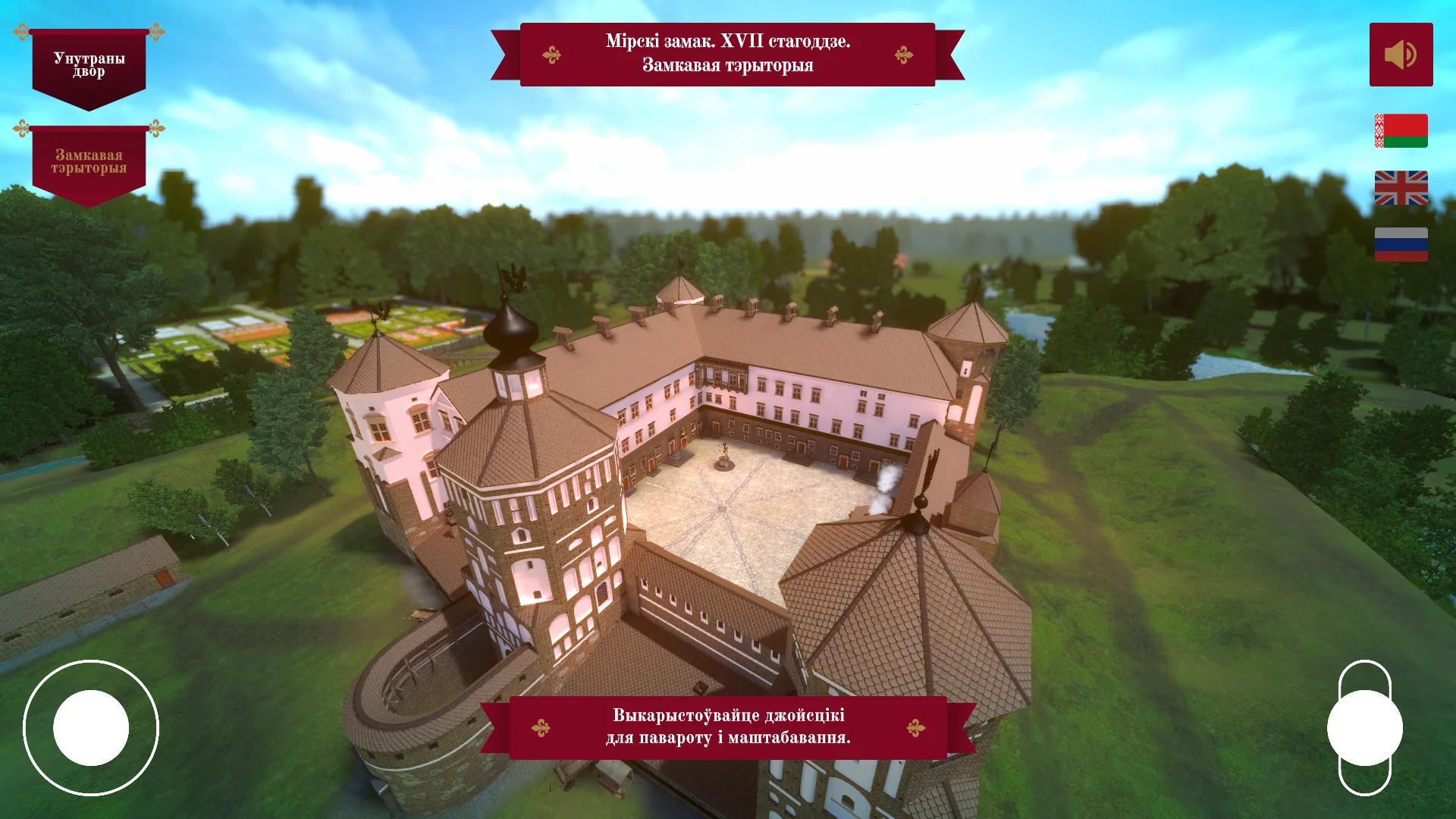
The architectural-style kiosk case study came from a museum's challenge: to keep visitors in the exhibition. People walked through the halls in 20 minutes and rarely lingered at the displays; tour guides told the story, but interactivity was lacking. The museum needed to engage guests without remodeling the halls and without large investments.
Our team developed a touchscreen kiosk that became part of the exhibition itself. The enclosure echoed the historical facade's style: the same proportions, color, and decor.
Inside — an interface created for museum navigation: a hall map, building histories, and a quiz for children and adults.
What the client got
In the first two months, more than 4,000 visitors used the kiosk. The average time at the stand grew from 20 seconds to 3 minutes — guests began exploring exhibits with the kiosk's prompts.
The number of repeat visits from families with children increased by a third, and the museum gained additional social media reach: visitors photographed the kiosk as an art object and tagged the museum's page.
The main result — not just numbers, but a change in guest behavior. People approach the kiosk, choose a route through the halls, and share their impressions with each other. The kiosk's architectural style works for museum recognition even before the guest touches the screen.
Answers to frequently asked questions about kiosk design
Clients often postpone launching kiosks due to doubts: will the timeline drag on, will the budget balloon, will the interface fit already-purchased stands.
These are normal questions — it's important to answer them before starting, so the project doesn't become a long build and doesn't require rework.
We design interfaces in architectural style — for a specific task and space. That's why each project starts with a short brief, and the result is predictable timelines and transparent cost. Below we address the most common questions about our kiosks.
How long does kiosk interface design take?
On average, design and approval take 2-3 weeks after the brief. The timeline depends on the number of screens and scenarios: simple navigation needs fewer iterations, a multi-level catalog needs more. At the start, we set a plan and stick to it.
How is the cost calculated?
The price is based on the scope of work: the number of unique screens, scenario development, preparation of production-ready layouts, and technical documentation. We provide a detailed estimate before work begins, so there are no hidden surcharges. We provide the exact cost after the brief and analysis of your source materials.
Will the design work on our equipment?
Yes. We adapt the interface to the diagonal and resolution of your touch panels, as well as to the installation specifics — vertical or horizontal placement, mounting on a floor stand or on a wall. The result looks cohesive and requires no modifications after installation.
How to choose a kiosk format that fits your style?
Start with the tasks and atmosphere of the space, not with a model catalog. Choosing a kiosk comes down to two questions: what the terminal should do and how it should fit into the interior. A waiting area is one thing, a busy lobby is another, and a space with classic finishes is a third.
The format directly affects the visitor's impression. A touchscreen stand with a custom enclosure that echoes the lines of the reception desk or architectural details is perceived as part of the space, not a random gadget.
When the kiosk design continues the style of the lobby or exhibition hall, the guest forms a cohesive picture — this increases trust in the brand and makes the interaction feel natural.
We help you choose a format based on your architecture and user scenarios. First, we study how people move through the space, what tasks they solve at the screen, and how much time they're willing to spend.
Then we offer placement and construction options: floor-standing, wall-mounted, built into furniture, or custom solutions. That way you get a kiosk that works for your company's image and handles everyday loads.
Importantly, the hardware doesn't limit the design. We adapt the interface to the chosen enclosure and select professional components that withstand intensive use.
In the end, you get not just a terminal, but an interior element that performs its functions and delights visitors with its appearance. Describe your space — we'll suggest a format that highlights its style and solves your tasks.
Order kiosk design today — make your space technological
Submitting a request for kiosk design is not buying a "box with a screen" — it's the first step toward making your space work for you. From the start, you get not just promises, but a clear plan tied to specific people and timelines.
We handle all the technical work, so you manage the process in the language of business: timelines, results, cost.
What you get right after your request
- A personal manager — we assign a specialist to you who knows your project and answers questions within the business day.
- Audit of the space and usage scenarios — we analyze visitor flow, placement points, and the tasks the kiosk must solve before proposing a design.
- Preliminary estimate and timelines — we set the cost and work stages before design begins, so you understand the budget and dates with no surprises.
- Examples of solutions from your industry — we show how similar tasks were handled in other projects, with metrics on engagement and payback.
- Technical specification for your business — a document describing how the kiosk will fit into the interior and which functions will serve your goals: increasing average check, collecting contacts, or navigation.
- Contract and clear accountability — we're responsible for results at every stage, so we work officially with clear guarantees.
After we receive your request, we prepare a commercial proposal within 1-2 days, then move to design: we develop a concept, align it with you, and hand it over to production and development.
Your involvement is only approving key decisions — we handle everything else and support the project through launch.