

Boring kiosks lose customers. The solution — a cinematic style
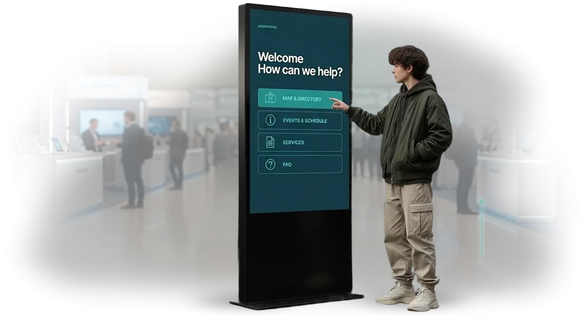
A visitor stops in front of a kiosk, sees gray menu tiles, and moves on to the neighboring stand. A standard interface doesn't hold attention — the touch kiosk turns into a faceless terminal that people ignore.
Every loss like that is a missed brand contact, a lost potential customer, and zero return on equipment investment.
The problem isn't the hardware, it's the scenario design: people expect a screen experience like a movie premiere, but they get a set of buttons.
A cinematic style is when a touch kiosk works like a mini-film: large imagery, smooth transitions, and full immersion in the brand's atmosphere. Instead of a boring “select a menu item,” the guest enters a story that guides and engages them.
That's exactly how industry leaders build their interfaces — just think of how navigation looks at Disney or premium hotel apps. They sell not functionality but emotion before the touch.
We apply the same rule to your kiosks: every visitor is a moviegoer, and their touch is the moment of truth. This approach increases interaction time, reduces abandoned sessions, and turns a kiosk from an information desk into a promotional point.
We design UX/UI for touch kiosks specifically in a cinematic style: we study your audience, build an interaction scenario, and refine animation and visual language so that every gesture gives a clear response.
As a result, the kiosk starts working for you — it holds attention, helps people find what they need in seconds, and stays in the visitor's memory, making them want to come back.
What business gets from cinematic aesthetics in interfaces
Cinematic aesthetics in interfaces isn't décor; it's a tool for turning a kiosk into part of the experience. When the screen greets a guest with deep transitions and polished visuals, people expect a story, not a menu. That's what determines how long they spend at the kiosk and what they take away about the brand.
Here are five business benefits a cinematic style delivers:
- Increased engagement. Dynamic micro-scenes hold attention longer than static tables. Visitors explore more offers and reach their goal more often.
- Brand recognition. A unified visual language between the kiosk and the overall brand identity creates an image that reads in photos and on social media.
- Time at the kiosk. Instead of “find and tap,” people linger for minutes — they go deeper into the product and make decisions faster.
- Repeat visits. Emotions make people come back: guests bring friends to show them “that screen.” Organic growth in repeat contacts.
- Image and premium feel. Cinematic style transfers associations with the film industry, quality, and status onto the brand.
These points are confirmed in practice. The head of a cinema that implemented a kiosk with this type of interface says: “The kiosk has become part of the show — guests don't choose a ticket, they live a scene. They come back and bring friends.” Cinema chain operator
This approach is not just aesthetics; it's a clear business mechanism that runs from attention to repeat visits and increased loyalty.
Kiosk interface formats: choose one for your task
Kiosk interface formats are not a matter of taste; they're a decision that directly affects the guest's impression and the efficiency of the location itself.
The same touch kiosk can look like a simple information stand or like an impressive part of a show that holds attention and stays in memory.
Choosing the right format helps solve a specific business problem: serve quickly, present a product in the best light, or create a strong emotional response.
To make it easier to navigate, we've gathered the main interface options and their use cases. This isn't an abstract classification — it's practical solutions already working in different industries.
| Interface format | Who it suits | What it gives the client |
|---|---|---|
| Classic navigation | Shopping malls, business centers, clinics | Quick search for the right office or product. Minimum time at the screen, maximum throughput |
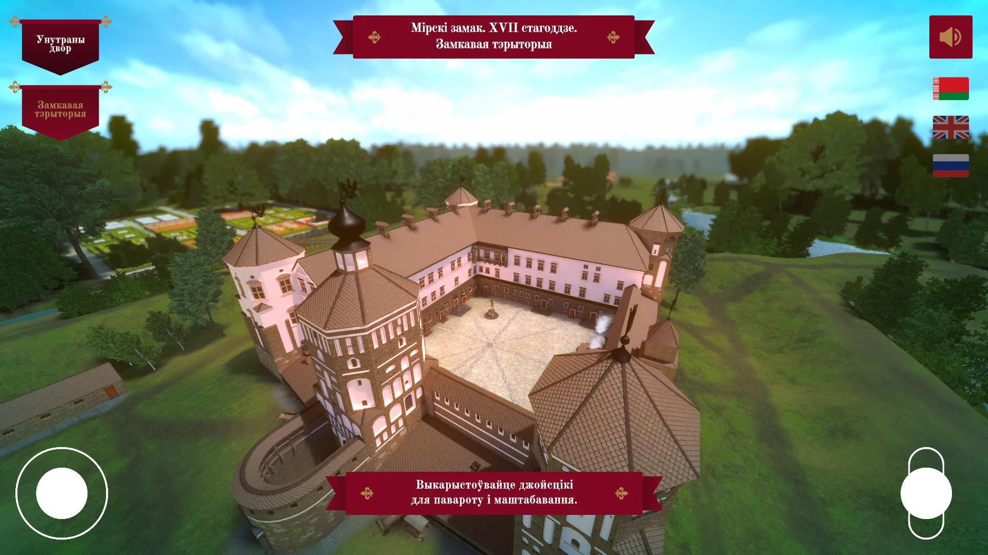
| Immersive with video content | Museums, showrooms, exhibition stands | Draws visitors into the brand's atmosphere. Increases time spent with the exhibit, improves memorability |
| Catalog with large cards | Restaurants, hotels, electronics stores | Convenient selection from a menu or catalog. Reduces staff workload and shortens service time |
| Hybrid with navigation and storytelling elements | Office lobbies, residential complexes, cultural spaces | Serves an informational function and builds company image through visual accents at the same time |
When choosing a format, it's important to look at your location's specific tasks and audience behavior. For example, waiting areas and queues work better with formats that entertain and visually capture attention.
But at a building entrance or in a high-traffic area, speed and simplicity of interaction come first.
We help you choose the right interface format at the design stage. We base decisions on your goals, visitor flow, and desired outcome — whether that's stronger brand recognition, a higher average ticket, or fast visitor navigation.
The key is that the kiosk becomes a useful tool, not just a screen in the corner. That's why we always test the proposed format in real usage scenarios and adapt it to your audience.
How we create cinematic-style interfaces
It all starts not with pixels, but with a script. A cinematic style means the guest perceives the screen as part of the event: smooth transitions, light, atmosphere, and clear logic inside. To achieve that result, we work like a film production — and you control every stage.
-
Brief and script concept — we define the task, study visitor flow, and identify the main scenarios: navigation, ordering, booking. We decide what we'll consider a success: time at the screen, number of sessions, repeat visits.
-
Sketches and storyboard — we show the visual rhythm with rough drafts: how frames change, where the story accent and call to action appear. We offer 2–3 style directions so you choose an emotion, not a picture.
-
Screen design in a cinematic style — we refine close-ups, shadows, light, and transition speed. Each screen looks like a film frame but remains intuitive even for someone approaching a kiosk for the first time.
-
Layout approval — you open a clickable prototype and “walk through” it the way your guest would. At this stage, edits are cheapest: we finalize the copy, brand style, and scenarios before development begins.
-
Kiosk screen adaptation — we adjust proportions, touch target sizes, and fonts for a large-format touchscreen. The interface stays aesthetic and works from the first second, without “missed” buttons.
-
Build and test on real equipment — we run the interface on the actual kiosk, check response speed, section switching, and behavior during freezes. You see a working version before the official launch.
-
Launch and support — we install the system, upload content, and train your team. After launch, we stay in touch: we help update materials and fine-tune scenarios based on how guests actually interact with the kiosk.
What's included in the delivery: a kit for your kiosk
You receive not just interface mockups, but a complete working kit for launching a kiosk. It includes all the artifacts that turn an idea into a clear, cinematic product: from screen structure to ready-made animations.
Every part of the kit solves a specific problem — so that a visitor understands the system from the first touch, and the brand looks premium and cohesive.
We hand over documentation and files that any development team can work with. No “surprises” at the layout stage, no loss of style or logic. Everything you need for launch is already prepared:
- Interface prototype — an interactive model with all transitions between sections. You can see how a visitor will move through the system before any code is written.
- Screen architecture — a diagram of all pages and interaction scenarios. It protects against missed states and unnecessary menu branches.
- Design system — a unified set of styles, fonts, icons, and components. It creates a cohesive cinematic look across all screens and simplifies future updates.
- Animations and micro-interactions — descriptions of smooth transitions, entrance effects, and touch responses. The interface feels alive and premium, not like a “flat picture.”
- Developer guide — layout rules and instructions for using the design system. Engineers transfer mockups into code accurately, and the final result matches the approved design.
- Final mockups of all screens — ready-to-use files that go straight into development. This speeds up launch and removes questions like “what should this look like here?”
With this kit, you get a predictable development process and a kiosk that works for brand recognition from day one. All that's left is to choose a contractor for implementation — or we can take that stage on ourselves if needed.
Case study: how cinematic aesthetics increased time spent at the kiosk
A family entertainment chain came to us with what seemed like a typical problem: guests walked past touch stands without stopping at the screens.
Standard menus with service lists didn't catch the eye — people didn't understand why they should approach the kiosk at all, went to the administrator, or simply lost interest.
We proposed not just a “convenient menu” but a cinematic interface — with smooth transitions, large frames, and atmospheric scenarios that trigger emotions even before the first touch.
Kinozona bet on the fact that guests come for experiences, and the interface should work like a trailer for the upcoming entertainment, not a technical manual.
Project results
The effect exceeded expectations: average session time grew 4x at once — from 40 seconds to two and a half minutes. Guests started “flipping through” celebration scenarios, comparing formats, and consulting each other right at the screen.
Key interface metrics changed dramatically:
- Table bookings through the kiosk grew by 140%.
- The share of repeat visits from those who ordered through the screen tripled.
- Subscriptions to exclusive special offers grew from zero to a third of all guests.
The chain's director noted in a personal meeting: “We expected it would just look nice. Instead, we got a tangible revenue increase — people started lingering, exploring our services, and coming back. The screens now work like full-fledged salespeople who never get tired.”
This case clearly shows: cinematic aesthetics is not a decorative add-on but a working tool that holds attention and turns idle curiosity into purposeful actions.
If your visitors walk past the screens, the problem isn't the kiosk's hardware — it's how the interface talks to them. We know how to talk in a way that makes money.
What if I have specific requirements for the kiosk?
Yes, we adapt. Non-standard screen size, unusual case shape, or design requirements that follow your brand guidelines — these are standard tasks, not reasons to abandon a project.
We don't squeeze your kiosk into a ready-made template; we rebuild the interface around the specific task: we change the layout, navigation logic, and visual accents.
We start with an audit: we look at what function the kiosk performs, who will use it, and under what conditions it's placed. Next comes a prototype that clearly shows how your screen will look and work. Only after approval do we move to the final cinematic-style rendering.
Timelines are also manageable. Interface adaptation takes anywhere from a few days to a couple of weeks, depending on complexity. You get a design that doesn't look “redone” — it's created for your conditions from the start.
Examples we've worked with
| Format | For whom | What it gives the client |
|---|---|---|
| Long vertical screen 1:3 | Shopping mall navigation, art objects | Information is visible from a distance, controls remain convenient |
| Kiosk with built-in camera | Photo zones at events, promotions | A guest takes a selfie and receives the result on screen right away |
| Non-standard design per brand book | Premium showrooms, exhibitions | The kiosk looks like part of the space, not a technical device |
| Touch panel built into a table | Museums, showrooms, waiting areas | Users interact naturally, without looking for buttons |
If you didn't find your scenario, describe your task in the request. We'll calculate the timeline and offer a solution that fits your budget and goals.
Frequently asked questions about kiosk projects
A touch kiosk project isn't just equipment and a nice interface. Clients often worry about how development will go, how long it will take, what will happen to the design after launch, and how it will fit into their workflows.
To ease those concerns, we've collected answers to the most common questions — short and to the point, without technical details, only what matters for your business.
How long does kiosk design development take?
Each project is unique, but on average creating a cinematic interface takes 3–4 weeks. This includes audience analysis, prototypes, the design concept, and final screens.
If integration with your system is needed, a few more days are added for coordination, but the overall timeline is always fixed in the contract.
How is the project cost calculated?
The price depends on the number of screens, scenario complexity, and whether integration with your services is required. We always prepare a detailed estimate before work starts — after the contract is signed, it doesn't change. You get a clear task list with no hidden fees, and the final figure is known in advance.
What design guarantees do you provide?
We are responsible for the result under the contract. If after launch you discover incorrect screen behavior or errors in scenarios, we fix them free of charge. The warranty covers all interface elements and remains in effect for the entire service life of the kiosk. For you, that means risks are reduced to zero.
Is it difficult to integrate the kiosk with your system?
No. Our specialists will connect the kiosk to your data and services — catalogs, maps, schedules, loyalty programs. You don't need to hire a separate programmer or understand technical details. We handle all the setup and train your staff to work with the interface.
What about support after launch?
We stay in touch and support the project: we make edits, update content, and add new screens. For the client, this means the kiosk will run stably and won't become outdated after a month. Support can be one-time or ongoing — you choose the format that fits your tasks.
Order a kiosk interface development today
To order a kiosk design, you don't need to understand technical details. Just describe your task — then we'll suggest a solution and calculate the cost for your budget.
We work with floor-standing, wall-mounted, and tabletop kiosks, so we'll find the right format for your space and objectives.
After your request, you receive:
- A free audit of the current interface, if the kiosk is already running — you'll immediately see what stops visitors and where leads are lost.
- Interface format and interaction scenario selection for your audience — from a simple menu to a full cinematic journey through the product.
- A design work plan with stages, deadlines, and responsible people — you understand what happens at each step and when the result will be ready.
- A preliminary estimate without hidden payments or unnecessary options — you pay only for what brings value and pays off.
- Consultation on integration with your equipment, services, and analytics system — the interface will work with what you already have.
- Clear answers to questions: which kiosk type to choose, how long development will take, and how to fit the project into your current marketing plan.
Leave a consultation request — we'll calculate the cost of a cinematic-style kiosk design and propose concrete next steps. We'll respond within one business day and send you a plan and estimate, so you can make a decision without rushing or extra meetings.