


Corporate-style kiosk: why customers don't leave
Visitors don't want to figure out an unfamiliar interface: if a touch kiosk is confusing to use, they look for human assistance or leave for a competitor. Every second spent waiting at the screen is a risk of losing a customer — and with them, revenue and reputation.
Interactive kiosks must be intuitive from the first touch, but that's not enough — the device also needs to look like part of your brand.
Corporate style in interface design solves two tasks at once: recognition and trust. When a kiosk uses the company's colors and logic, visitors perceive it as a familiar tool rather than a foreign terminal.
This lowers the barrier and increases the number of completed scenarios — from booking an appointment with a specialist to paying for a service. A branded style makes people feel more confident, so they are less likely to abandon an operation halfway through.
Customer retention directly depends on how comfortable it is for people to use your service. Touch kiosks with a well-thought-out interface and branded design turn routine into a fast, pleasant process people want to come back to.
Such a kiosk becomes a loyalty point rather than a source of frustration. When customers spend less time and effort, they return more willingly and recommend you to others — a direct benefit for your business.
We design interactive kiosks with your corporate style and business goals in mind — from screen logic to visual accents. We rely on user behavior statistics and proven scenarios, so customers complete the entire journey without hints or wasted time.
With over a decade of experience, we have delivered dozens of projects where a kiosk became a working sales and service tool rather than a source of complaints. Tell us about your task — we will choose a solution that keeps your customers.
What you get: from brand recognition to sales growth
Visitors meet your business before they meet a manager or see a storefront — they meet it on a kiosk screen. If the interface looks like a technical placeholder, it devalues the brand in the customer's eyes.
High-quality corporate-style design immediately communicates the company's level, reliability, and attention to detail.
Corporate style in an interface is not just a logo in the corner. It is carefully chosen brand colors, typography, and element placement that create a cohesive image at every touchpoint.
Brand recognition grows when customers see a consistent visual language in the office, on the website, and at the self-service kiosk. People remember the company and come back.
Thoughtful UX directly affects sales. The fewer steps between "I want it" and "I paid for it," the higher the conversion and average order value.
Clear navigation reduces queues during peak hours, so you don't lose customers who would otherwise leave without waiting for help.
Customer loyalty starts with convenience. When a guest understands the menu without instructions, when the touchscreen responds instantly, when ordering takes minutes — that builds a positive impression and a desire to return.
This approach also supports reputation: a satisfied customer is more likely to recommend your service to friends.
We design interfaces that solve business problems rather than just look modern. The foundation is analytics of typical user scenarios, so the design becomes intuitive even for people encountering a touchscreen for the first time.
We work with professional hardware and proven tools, which ensures stable kiosk performance even in the most demanding scenarios.
As a result, you get not just a beautiful interface but a working sales tool. Corporate style strengthens the brand, convenience boosts loyalty, and service speed increases the location's revenue. This is an investment that pays off through the growth of your key business metrics.
Corporate-style kiosk formats for your task
The kiosk format determines how quickly visitors get what they need and how convenient the interaction is. Depending on the task — navigation, product catalog, service appointment — we choose the optimal solution and integrate it into the corporate style.
| Format | For whom | What it gives customers |
|---|---|---|
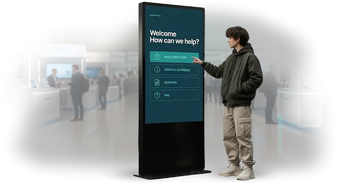
| Floor-standing information kiosk | Lobby, reception, entrance area | Greets guests, shows news, routes, and answers to frequently asked questions without an administrator's involvement |
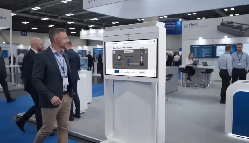
| Touch panel on a counter | Exhibitions, expo zones, showrooms | Quickly introduces products, saves consultant time |
| Wall-mounted navigation panel | Offices, business centers, medical centers | Helps find rooms and departments, reduces the flow of questions to the secretary |
| Interactive table | Meeting rooms, waiting areas | Lets customers explore the catalog, configure a product, and run presentations |
Each format is not just a screen with a menu but a well-designed scenario from the first touch to the target action. We develop the design in your corporate style: your logos, brand colors, and fonts, so the kiosk looks like part of the brand rather than a separate device.
After choosing a format, we design the interface, assemble a prototype, and test it against real scenarios — eliminating any situation where a guest might get confused. We deliver the solution with staff instructions and technical support, so the kiosk works from day one.
How the project works: from brief to kiosk launch
To make sure the kiosk interface design truly solves business problems, we follow a clear process. You always know what stage the project is at, what you will get, and when you can launch the kiosk. Below are the key steps.
-
Brief and task immersion. We discuss the kiosk's goals, audience, and usage scenarios. We collect brand information so the interface is recognizable and aligned with the corporate style from the start.
-
Analysis and prototype. We map out the screen structure, navigation logic, and texts. We show you a clickable prototype, so you see the future scenario before design development begins.
-
Design approval. We offer 2–3 visual concepts in the corporate style and refine the details. At this stage, the client makes edits and approves mockups without unnecessary iterations.
-
Touchscreen adaptation. We account for touch characteristics, button sizes, and finger reach zones so visitors act intuitively. We check text readability and interface responsiveness.
-
Handoff to developers. We prepare a complete set of mockups and guidelines for kiosk development. The developer receives clear documentation, which speeds up launch and reduces errors.
-
Testing and kiosk launch. We help test the interface on a real screen and make final adjustments. We make sure the kiosk launches on time and runs stably.
-
Post-launch support. We stay in touch, answer questions, and help update content and add new features. This is a separate stage because you'll be able to evolve the kiosk without having to find a new team.
What's included in the delivery: a complete package for your kiosk
After the project is completed, you receive not just ready-made screens but a complete set of materials you can immediately use on the kiosk and easily update with your own team. We put together the delivery so you have everything you need — from design mockups to instructions.
- Corporate-style interface design — all screens, icons, and controls are created in a single brand style, so the kiosk looks like part of the company rather than a separate device.
- Interactive prototypes — clickable mockups of key scenarios you can test before launch: navigation, feedback, service selection. This simplifies approval and resolves questions upfront.
- Adaptation for any touchscreen — the same mockups work correctly on compact and large panels, in both portrait and landscape orientation. Button sizes and touch zones are taken into account so visitors of all heights and ages are comfortable.
- Operation and content update guide — a clear instruction for your staff: how to change a promotion, add a new service, or restart the kiosk. You won't need to contact developers for simple edits.
- Source files and ready-to-use assets — you receive editable mockups (for a designer) and final images that can be loaded onto the kiosk. The entire package is delivered after the work is complete and remains your property.
This package covers the full cycle: from design approval to daily operation. You don't depend on the contractor for small details, and if questions come up — we're available and help throughout the warranty period.
Case study: how we increased kiosk conversion for a retail chain
Retail chain Malinka approached us with a pain typical of retail: the kiosk worked, but visitors couldn't quickly find the product they needed, and some left without completing the scenario.
Analytics showed that the interface was overloaded with a menu of dozens of items, and the touch navigation didn't account for how ordinary shoppers behave — they expect guidance, not instructions.
We reworked the screen structure around common requests: "where is the product," "is it in stock," "how do I get there." We removed unnecessary steps and added large touch zones and clear icons.
Visually, we brought the kiosk in line with the chain's corporate style — it became part of the interior rather than a separate device.
What changed after launch
Average service time decreased by one third — from two minutes to one minute and twenty seconds. As a result, visitor flow through the kiosk increased, and conversion to the completed scenario "found the product and moved to the shelf" rose by 24%. The number of repeat kiosk visits also grew: people remembered they got quick help here.
For the chain, this means direct benefits: fewer crowds around the screen, satisfied shoppers, and a larger share of orders that customers complete themselves in a minute.
The head of Malinka's marketing department noted after the project: "The kiosk is no longer just a reference — it's now a full-fledged sales tool, and our customers can feel it."
Why this works
We rely not on guesswork but on real data from touch sensors and session recordings. Every screen was tested on a focus group of visitors, and after launch we spent two more weeks fine-tuning scenarios based on statistics. That's why the result was predictable and measurable.
The case shows that even a small project with few screens can deliver measurable conversion growth and reduce staff workload. If your kiosk isn't delivering the expected value, the problem is most likely the interface, not the hardware. We already know how to fix it.
How to choose a kiosk format for your business specifics
Choosing a kiosk starts not with the screen and enclosure but with the task it needs to solve. For a hotel, it's navigation; for a store, a catalog and special offers; for a clinic, appointment scheduling and wayfinding.
The specifics of your business determine which kiosk formats work best: a floor-standing kiosk suits a spacious lobby, a wall-mounted one suits a narrow corridor, and a compact tabletop model suits a reception area where space is at a premium.
The interaction scenario also affects the choice. If visitors are in a hurry, you need large buttons and a fast flow. If someone is willing to spend a few minutes at the screen, you can offer a catalog, a learning mode, or a detailed map.
It's important to consider who will use the kiosk: a shopping mall needs an intuitive interface with no instructions, while a corporate office may need personalized access and greetings.
Separately, you should consider how the kiosk will fit into the space and the brand identity. When a kiosk looks like part of the brand, it doesn't just inform — it strengthens the image.
That's why you should look not only at dimensions but also at materials, color, and lighting — all of which can be adapted to the company's corporate style.
The right kiosk choice is a balance between business goals, installation location, interaction scenario, and the brand's visual language. We analyze your business specifics, select a format, design the interface in the corporate style, and support the launch.
Such a kiosk becomes a working tool that solves business tasks rather than something installed just for show.
What if the kiosk breaks or customers stop liking it?
When a business invests in something as visible as a touchscreen kiosk, reasonable questions arise: what happens if the device fails, the interface becomes outdated, or visitors lose interest?
We hear these concerns on every other project — which is why we've built protection against them into our working model.
The main principle: you get not just a kiosk but a working service that will deliver value in one year and in three. Below are direct answers to the most common concerns.
What if the kiosk breaks down?
The hardware is covered by warranty, and we provide service support for the entire term of our cooperation. Something else matters more: our kiosks use professional equipment that rarely fails, and key components can be easily replaced without expensive repairs.
If a problem does occur, you solve it with one call rather than searching for a contractor through ads.
What if customers stop liking the design?
Design isn't static. We make the interface modular so you can change promotions, menus, banners, and even the overall look without a complete project remake.
Updating on request is part of the service: we'll prepare a new version and implement it carefully without stopping the kiosk.
What if visitors don't understand the interface?
That's why the interface is tested with a real audience before launch. We see where people hesitate, which buttons cause confusion, and we simplify the flow. User convenience is exactly what makes a kiosk a favorite tool rather than a dusty stand.
We don't abandon the project after launch: we stay in touch, monitor stability, and suggest improvements. That way, you pay not for hardware but for peace of mind — the kiosk works, looks current, and your customers like it.Ready to get a kiosk that boosts loyalty? Leave a request
Leave a request for a kiosk, and within 1 business day we'll prepare a project estimate and cost calculation. You'll get not an abstract commercial proposal but a concrete plan: what we'll do, in what timeframe, and what result it will bring to your business.
After reaching out, you'll immediately understand how the kiosk will fit into your corporate style and start working toward customer loyalty.
Here's what you get after submitting your request:
- Estimation of costs and timelines for your task — no hidden fees or "surprise" stages.
- A business-oriented project assessment: how many visitors the kiosk can handle, and how it will affect traffic and guest satisfaction.
- An interface prototype in your corporate style — you see the design before development starts and can make changes at no extra cost.
- Recommendations on placement and usage scenarios: what value the kiosk will bring specifically to your location, exhibition, or company lobby.
- A clear launch plan: who is responsible for what, what data we need from you, and when the kiosk will go live.
- Support at every stage — from brief to commissioning and staff training.
This is free and comes with no obligation. You get a transparent assessment and an understanding of the next steps, even if you're not ready to order development yet.
Leave a request — and within a day you'll have a project estimate and cost calculation in hand. This saves you time and lets you make a decision based on facts rather than guesswork.