


Patients Get Lost Without Medical-Style Information Kiosks
A patient in a clinic is already under stress: an unfamiliar space, queues, anxiety about test results. Add confusing signs and unclear wayfinding to that, and people start getting lost even before their appointment.
They waste time looking for the right office, ask the same questions at the reception desk, and show up late for procedures. All of this adds up to a negative impression of the healthcare facility, even if the doctors are doing an impeccable job.
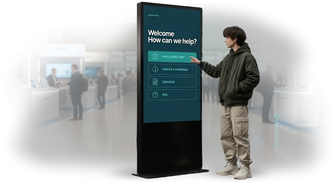
That is why modern clinics are deploying medical-style information kiosks. These are not just electronic schedules by the entrance, but a well-thought-out navigation system that guides patients from the reception desk to the right office without extra questions.
Restrained design, calm colors, clear pictograms and large fonts—everything works to make people feel confident and safe.
A medical-style kiosk solves three problems at once. First, it relieves the staff: receptionists no longer have to explain directions ten times, and they can focus on their actual duties.
Second, it speeds up patient flow: less time spent finding the way means shorter queues in corridors and at registration counters. Third, it creates the image of a tech-savvy clinic that people trust.
When patients manage their own visit through an easy-to-use screen, loyalty grows and negative reviews decrease.
We design kiosk interfaces that are easy for people of any age and level of digital skills to use. We take into account the specifics of the medical facility: visitor flows, the layout of offices, and typical patient questions. The result is navigation that actually works, not just a pretty screen on the wall.
We fully solve the problem of lost patients: from interface structuring to kiosk launch and staff training. You get clear navigation, calm visitors, and a less loaded reception desk—which means you can spend more time on the quality of medical care.
What a Kiosk Gives Patients and Your Clinic
Modern clinics face the same problem: the flow of patients keeps growing while the reception desk cannot keep up. People stand in line, get nervous even before their appointment, and administrators spend time repeating the same questions.
An interactive kiosk relieves this load—patients can register themselves, take a place in the electronic queue, or find the needed information with a couple of screen touches.
Our specialists develop interfaces that are clear to anyone, from younger visitors to older ones. An intuitive interface in a calm medical style is not intimidating, and soft colors and large buttons reduce stress.
Everything runs on professional hardware, so the system does not freeze and responds instantly even at peak hours.
For patients, the kiosk means predictability: no need to figure out which office is free, where to go, or how long the wait will be. People manage their own visit, which increases satisfaction and reduces negative reviews.
For the clinic, it relieves the reception desk: administrators stop doing mechanical work and focus on personal communication with those who really need help.
An indirect but important effect is the clinic's image. Modern digital equipment in the lobby shows that the medical facility keeps up with the times. Patients trust such a clinic more: technological sophistication is perceived as care for service quality.
And when the registration process takes a minute instead of ten, people gladly come back and recommend the clinic to their friends—this drives loyalty growth without extra advertising costs.
Formats of Medical-Style Information Kiosks
The choice of kiosk format directly affects how visitors interact with information. A freestanding floor kiosk by the entrance or a wall-mounted panel in a corridor is not just about placement—it is a tool that relieves staff and speeds up navigation.
A medical style in the design helps patients feel calmer: strict lines, a restrained palette, and clear icons do not cause anxiety, and the interface does not overload attention.
We think through the configuration for each clinic's specific tasks rather than offering a template solution. What matters is exactly where the kiosk will be placed and who will use it—patients at the entrance, staff in the corridor, or visitors in the waiting area. Below are the main formats most commonly used in medical facilities.
| Format | Suitable for | Benefit for the client |
|---|---|---|
| Floor-standing kiosk | Clinics with a lobby and high visitor flow in the waiting area | Navigation, doctor appointment booking, ticket dispensing without standing in line at the reception desk |
| Wall-mounted kiosk | Narrow corridors, offices, spaces with limited room | Saves space and provides quick access to reference information anywhere in the clinic |
| Universal configuration | Chains of clinics or premises with changing layouts | Flexible mounting options: one model adapts to both floor-standing and wall-mounted installation |
In every option, the medical style is refined down to the smallest detail, from the rounded corners of the housing to the calm colors of the interface. Nothing looks accidental—every detail serves the feeling of cleanliness and order that matters to patients.
When needed, we add ticket printing, card readers, a help call button, as well as a special coating resistant to disinfectants. All of this works within a single visual language and requires no separate setup—the clinic gets equipment that looks appropriate and lasts for years.
How the Kiosk Interface Development Process Works
We have built the process so that you see intermediate results at every stage. From the brief to the launch, you understand what is happening and can make edits. This way the interface becomes convenient for clinic visitors and solves your tasks.
-
Brief and scenario analysis. We immerse ourselves in the clinic's tasks, study visitor behavior, and record all requirements for the kiosk. This is the foundation we stick to throughout the project.
-
Screen prototype. We draw an interface diagram: sections, buttons, transitions. You see the logic before the design and can adjust it, saving time on revisions.
-
Medical-style design. Calm colors, large elements, clear icons. We fit the style into the clinic's brand so that the interface inspires trust and is understandable even for older visitors.
-
Approval and revisions. We present the mockups, collect feedback, and make corrections. After your approval, we move to implementation without drawing anything extra.
-
Implementation and testing. We bring the mockups to life, connect them to the kiosk, and test scenarios—appointment booking, payment, navigation. We test on a real device to eliminate any glitches.
-
Launch and support. We install the kiosk, train the staff, and hand over instructions. We stay in touch and quickly update content when services or schedules change.
What You Get After the Project Is Completed
When a project is finished, it is important to receive not just a completed deliverable, but working tools. We have put together a delivery package so that you have everything for a successful launch and further development of the kiosk: from visual mockups to usage rights.
After the project is completed, you get not just "a working kiosk," but a full set of materials to launch, manage the contractor, and continue developing the interface.
Everything is handed over in a clear form, without "secret" files or being tied to us.
Here is what the package includes:
- Mockups of all screens in the medical style — you know exactly what each visitor step looks like, from greeting to booking a doctor's appointment or finding the right office.
- An interactive prototype — you can "walk through" the kiosk, check customer scenarios, and show management or investors in advance how everything works.
- A design guideline — rules for using colors, icons, and fonts, so that future banners and notices do not clash with the clinic's style.
- The source files of all screens — you are not dependent on us: your in-house designer or another studio can quickly make edits.
- Usage rights — intellectual property is fully transferred to you, including all mockups and prototypes.
- Clear scenario documentation — shows which buttons lead where and how to change the schedule or news without contacting developers.
This package addresses the customer's biggest fears: "what if the contractor disappears" and "how will we update content." You get not a "black box," but a manageable system that continues to work for you after the project is handed over.
Case Study: How a Kiosk Reduced the Queue at the Reception Desk
In a large city polyclinic, the flow of patients during peak hours caused real congestion: the line at the reception desk stretched to 20–30 minutes, people were late for their doctors, and administrators could not keep up with questions.
We saw this as a typical problem that could be solved not by adding staff, but through smart digitalization.
Instead of an extra window, we suggested placing touchscreen kiosks next to the reception desk. We designed the interface in a medical style—large buttons, clear pictograms, minimalist screens, no unnecessary steps.
Patients choose their specialist and a convenient time themselves, and get their ticket in 30–40 seconds. No training was needed: even older people managed on the first try, because every step was accompanied by prompts.
The effect was noticeable within two weeks. The queue at the reception desk decreased by 40%, and the average waiting time dropped to 7–8 minutes. Administrators stopped working in an endless flow and could focus on complex requests that required their personal involvement.
Most importantly, patient satisfaction grew: according to the survey, the number of positive reviews about visits almost doubled.
The client confirmed the result: "The kiosk has become not just a piece of equipment for us, but part of how we care for patients. People no longer get irritated in line, the reception area is calm, and our staff finally work without constant firefighting. After a month, we realized we can no longer imagine the clinic without it."
For any medical organization, this means not only visitor comfort, but also a tangible saving of resources. Shorter queues relieve staff, increase throughput, and build a modern image for the facility.
It is this approach—not just "put up a screen," but a well-designed interface tailored to the specific flow—that delivers measurable results in a short time.
How to Choose a Kiosk Format for Your Clinic's Tasks
Choosing a kiosk format starts not with the model, but with the clinic's tasks: what the kiosk should do—book patients for appointments, issue tickets, help pay for services, or navigate through the building.
The configuration depends on this: where to place it, what screen size to use, and what interface logic to build in. There is no universal solution, but there is a proven selection algorithm—and we apply it to every project.
First, we assess the physical space. A freestanding kiosk with a separate waiting zone works well for a high-traffic lobby, while a compact wall-mounted kiosk suits a narrow reception area.
It is important that at peak load, in the morning before appointments begin, people do not block the passage or create a crush. That is why we ask for a floor plan or visit the site to choose dimensions and placement that are comfortable for both patients and staff.
Next, we determine the required functionality. If the main goal is to reduce the line at the reception desk, the kiosk must quickly guide the patient through card scanning, service selection, and ticket printing.
If you need to relieve administrators, we add booking with a specific doctor and time slot. For private clinics, a payment module and pre-filling of documents are often relevant, as this shortens the visit and increases loyalty. We help choose a combination of modules without overloading the interface with unnecessary actions.
We also take medical specifics into account. The kiosk should look calm, inspire trust, and fit the clinic's design code: soft colors, large icons, clear labels, a font without unnecessary details.
For many patients, a touchscreen kiosk is their first experience with technology in a medical context, so we design the interface so that a person can get from "Hello" to the desired service without any prompts.
If you are unsure which format suits your clinic, send us the floor plan and describe your patient flow—we will suggest the optimal configuration within one business day.
This is a free pre-project stage where we recommend a solution that will actually work for you, rather than selling you something unnecessary.
Answers to Common Questions About Kiosk Development
A touchscreen kiosk in a medical facility is the patient's first point of contact with the clinic. But this is exactly where many people have doubts: will an older person be able to use the interface, will data be lost, will the equipment "freeze" on the busiest day.
These questions are a normal concern for any manager. We have gathered typical answers to help you make a decision with confidence.
How long does kiosk development take?
A standard project takes 4 to 6 weeks. First, we define the tasks and scenarios at the brief stage, then prepare the mockups and interface. After the design is approved, we build a demo version that can be tested with your staff. Deadlines are fixed in the contract, and you can always see what stage the work is at.
Will the kiosk work with our appointment system?
Yes. We design the kiosk so that it exchanges data with your existing system: doctor schedules, patient database, electronic health records. The integration runs over a secure channel and is tested against your real scenarios. No manual re-entry of data—information goes into the right system automatically.
Is it convenient for older people and those not used to touchscreens?
The interface is built on large buttons, contrasting colors, and clear icons. We avoid small elements and overloaded menus: one action per screen. We test such interfaces with real users, including older people. In the end, patients just follow simple prompts instead of reading a manual.
What about reliability and support after launch?
We ensure stable operation on proven software solutions, and we also build in crash protection and backup. After launch, you receive a warranty on the hardware and software, as well as technical support—a specialist responds to your request within one business day. If anything needs to be improved, we are already on call.
Prepare your questions about your project—we will discuss them during a free consultation and offer a solution that fits your timeline and budget.Order a Turnkey Kiosk Development
Ordering a turnkey kiosk means getting a ready-made solution rather than a list of tasks. You state the goal; we handle the whole chain: from the idea and medical-style design to production, installation, and launch. This saves you time, effort, and money on coordinating contractors.
To start the project, simply leave a request. After that, everything follows a clear scenario where you make decisions as a client, not as a technical specialist:
- Consultation — we discuss your tasks, visitor flow, and kiosk usage scenarios for free, so we can offer the right solution.
- Cost calculation — we fix the estimate before the work begins. You see the budget in advance, and it does not change without your approval.
- Adaptation to your tasks — we customize the interface to fit the medical style, your services, working hours, and target actions: appointment booking, navigation, information.
- Launch and support — we test, install, train staff, hand over instructions, and stay in touch after opening.
- Guaranteed result — you accept the work against a checklist and see that the kiosk works exactly as agreed.
"Turnkey" means we do not hand the project over halfway. You do not need to find a designer, programmer, and installers separately—the entire responsibility lies with one team.
This is especially important when you have several kiosks and deadlines must be met in a medical center, clinic, or administrative institution.
Let us know how many kiosks you need and where they will be installed—we will offer the best option for your task. Leave a request through the form, by phone, or in a messenger—we will contact you during business hours and suggest a convenient time for a consultation.
This is not binding in any way, but it will help you understand how quickly the kiosk can start working for your visitors.