


An Inconvenient Kiosk Drives Customers Away and Reduces Profit
Every day your kiosk greets customers: at the entrance to the sales floor, in the lobby, at the reception desk. If the first contact with the brand causes irritation, the person leaves and does not return.
An inconvenient interface, long prompts, a confusing menu — all of this works against you: the visitor wastes time, gets frustrated, and ultimately simply abandons the task.
An outdated kiosk with a cluttered screen means lost orders and less profit. You pay for the equipment and the space, and in return you get dissatisfied customers and lower revenue.
A guest who could not figure out the menu in a few seconds will not buy a ticket, will not place an order, and will not get the needed information. They will go to those who think about their convenience.
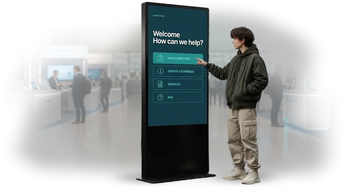
Many people think minimalism is just “pretty and trendy.” But in touch interfaces, minimalism solves a specific business problem: fewer elements means fewer obstacles. A minimalist functional style removes the barriers between a person and the action.
Large buttons, clear wording, a fast path to the desired option — this is what makes a customer complete a purchase instead of leaving the kiosk.
A bad interface also hits your team: employees get distracted from their work to help visitors figure out the screen. These are hidden losses of time and resources. Information kiosks should relieve staff, not create extra workload.
We design interfaces that remove these barriers. We create touch scenarios where every step is clear and raises no questions. The client gets a kiosk that works for results — and turns a visitor into a buyer.
Benefits of Functional Design for Your Kiosk
A minimalist functional style is not just aesthetics but a tool that directly affects your business results.
A clean interface without unnecessary details helps a visitor quickly understand the kiosk and focus on the main thing: ordering, paying, or getting the needed information. This design solves practical tasks — from revenue growth to repeat visits.
Increasing Kiosk Conversion
The simpler the interface, the faster a guest completes the target action: ordering, paying, booking. In minimalist design, there are no random buttons or distracting banners — all key elements are in their places.
This reduces session time, lowers the number of errors, and increases the share of successfully completed orders. A visitor does not leave halfway because everything is clear from the very first screen.
Visitor Loyalty
A neat, well-thought-out kiosk interface builds trust from the first seconds. A person sees that the company cares about their convenience and is more willing to return — such a kiosk is something you want to recommend to colleagues and friends.
Ease of interaction becomes part of your service, and customers are ready to come back again and again for it.
Order Growth
Functional design gently encourages larger purchases: prompts about popular items and additional services appear at the right moment and do not annoy. As a result, the average ticket grows without aggressive sales, and the kiosk’s total revenue increases. A clean interface is a way to earn more with the same customer acquisition costs.
Kiosk Formats in a Minimalist Functional Style
Minimalism in touch kiosk interfaces is not just a visual style but a way to shorten the customer’s path from touch to result. The fewer elements on the screen, the faster a visitor performs the needed action: ordering, finding the way, or paying.
A clean interface reduces the number of errors and increases conversion, which is why business owners choose exactly this solution.
We design kiosks for a specific task, so screens remain clean and intuitively understandable without losing functionality. Below are the three main formats that most often bring measurable results to a business.
| Format | For whom | What it gives the customer |
|---|---|---|
| Interactive ordering kiosk | Restaurants, cafes, fast food, retail stores | Higher average ticket due to additional items and reduced staff workload |
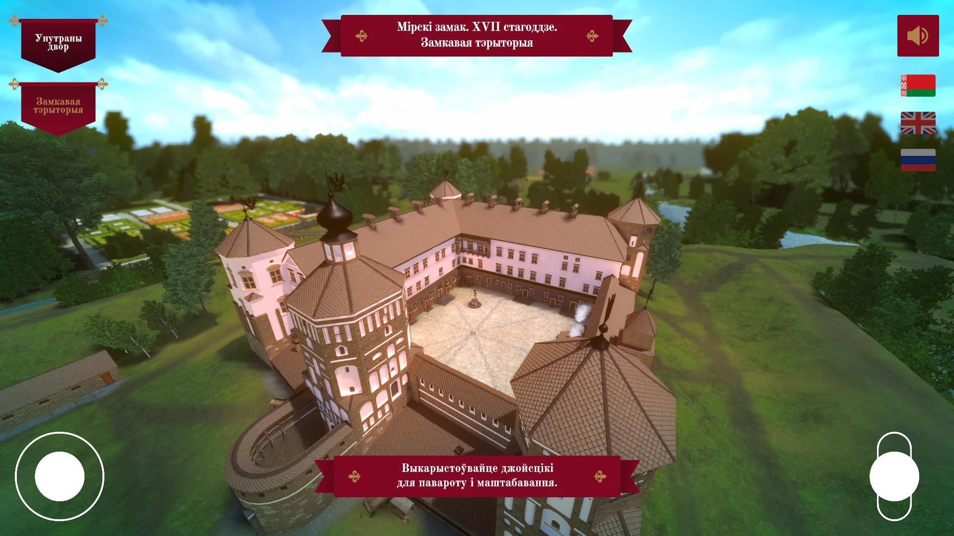
| Information terminal | Shopping malls, clinics, offices, museums | Navigation and information without an administrator desk, fewer queues at the information counter |
| Payment kiosk | Salons, fitness clubs, parking lots, services | Payment without waiting for a cashier, shorter service time, and fewer losses due to human error |
In any of these formats, a minimalist interface makes using the kiosk obvious for a person of any age. The visitor understands what to do from the very first second — this lowers the entry barrier and increases satisfaction.
In addition, clean screens are easier to update: new content fits into the design without reworking the entire structure, which saves the maintenance budget.
When designing kiosks, we think through a scenario for each format: large target zones, short labels, logical transitions. This approach provides the speed of interaction that matters to the client and leaves the visitor with a pleasant impression of the technology.
As a result, the kiosk works like a full-fledged employee that does not get tired, does not make mistakes, and is always friendly.
How We Design the Interface for Your Kiosk: Stages of Work
We structure our work so that you can see at every step exactly what you are getting and how long it will take. No “black boxes”: from the first brief to launch, you participate in key decisions, and the result meets expectations.
-
Brief and immersion in your task. Interviews with you and your employees, defining visitor scenarios and key functions. You receive a clear work plan so that nothing is lost in the later stages.
-
Scenario prototype. A screen map and transition logic — how a guest will go from greeting to result: product search, navigation, or consultation. You adjust the scenario before the design work begins.
-
Layout approval in a minimalist functional style. Design options with large elements, clear icons, and calm colors. You make edits and approve the final version before programming.
-
Touchscreen adaptation. We take into account lighting, viewing angle, and tap comfort — so that the interface remains readable and responsive in the real conditions of your facility.
-
Testing on the device. We check all scenarios, response speed, and behavior during failures. In advance, you see how the system will behave during peak hours and avoid visitor dissatisfaction.
-
Launch and staff training. We install the application, set up updates, and show administrators how to manage content. The launch happens without stopping your facility’s operations.
-
Support and development after launch. We monitor stability and refine the interface based on real user requests. You can order new features or content updates at any time.
What You Get in the End: Delivery Package for the Kiosk
You receive not just files but a ready-to-work package: all artifacts are delivered at once and in an understandable form. We have designed the kiosk deliverables so that your team can launch the project without a long learning curve and without losing quality.
- Layouts of all screens — from the main menu to service windows, all in a minimalist functional style. Nothing extra, every element in its place.
- Interactive prototype — a working sample of the interface that allows you to test guest scenarios before launch. This resolves most questions at the approval stage.
- Interface source files — editable files with a clear layer structure. You can independently change texts, images, promotions, and other elements without involving developers.
- Delivery of layouts and assets — neatly packed materials, labeled by screens and states. No confusion when handing off to contractors or an internal team.
- Content update instructions — a short document that even a new employee can use to figure out how to replace a banner, add a menu item, or change contact details.
- Post-launch kiosk support — we stay in touch: we consult, make targeted edits, and help adapt the interface to new business tasks.
This is not “pictures in an archive” but a full working package. You get control over the interface, speed of changes, and confidence that the kiosk will look and work exactly as intended.
If new questions arise or refinements are needed, support is already included in the cooperation format.
Case Study: A Simple Interface Doubled Kiosk Orders in a Month
A coffee shop chain approached us with a task: make a self-service touch kiosk bring more revenue instead of creating queues.
On the old screen, guests got lost — choosing the cup size, syrup, and additional items took many steps, and not everyone managed to complete the purchase.
What Was Not Working
Before the redesign, the average order completion time exceeded three minutes. Some guests abandoned their cart halfway, and those who reached payment rarely took more than one item because the interface did not encourage add-ons.
What We Changed
We studied recordings of real sessions and developed a new interaction scenario in a minimalist functional style: large dish cards, clear prompts, and a path from start to payment in three short steps. We removed everything extra that confused the guest and kept only quick actions.
Results and Client Feedback
The redesign results showed up within the first month: the number of orders through the kiosk doubled, and the average ticket increased by 18%. Add-on prompts — dessert, a second drink, syrup — appealed to guests, and the chain saw a direct increase in revenue.
The operations director assessed the results this way: “Svezhaya Bulochka — finally, guests understand the kiosk. Queues have disappeared, orders are growing, and we plan to install the same kiosks in ten more locations across the chain.”
How to Tell That Your Kiosk Interface Needs an Update?
The first thing to pay attention to is visitor behavior. If guests approach the kiosk but leave without finding what they need, if they linger too long on one screen, or if they ask staff about things the kiosk should answer itself, the interface is not coping with its task.
This is not about visitor discipline but about outdated navigation logic: the user has to think instead of act.
The second sign is a visual disconnect from the brand. When the kiosk interface differs noticeably from your website, mobile app, or advertising materials, it undermines the impression of the company.
Visitors subconsciously read: “everything here is old, so the business may be outdated too.” A solution in a minimalist functional style looks fresh and clear without unnecessary details — this is the level to aim for.
The third signal is the absence of measurable results. If you cannot see how many people reached the desired section, at which step they abandoned the scenario, and which queries repeat most often, the system is not providing data for decisions.
An interface update is not just about appearance but also about honest analytics that you can use to improve service every quarter.
Finally, check how content is updated and how the kiosk works. If changes are made through developers and publishing a news item takes days, if the screen lags or cannot handle new scenarios, the interface is technically outdated too.
A modern kiosk should be updatable without a programmer, and its architecture should allow quick addition of sections and promotions.
Have you noticed at least two signs? It is worth conducting an interface audit: we will walk through key scenarios together with your visitors free of charge, show where attention is lost, and propose an update plan in a minimalist functional style.
This will take a few days, and you will get a clear picture: what to change, in what order, and what effect it will have on the kiosk’s reach and conversion.
Frequently Asked Questions and Answers: Guarantees and Project Support
Any project related to equipment raises reasonable questions: what will happen if the hardware fails at the most critical moment?
We have been working with interactive kiosks for more than 10 years and understand that predictability matters to you: the kiosk must work without failures, and any problems must be solved quickly, without losing revenue or reputation.
Below are the answers to the questions we hear most often. If your scenario is not on the list, ask us directly: we will offer a solution for your task.
What guarantees do you provide for kiosk development and launch?
We are responsible for the result at every stage: from interface design to the physical launch of the device. An official warranty applies to all work — if you find errors in the interface operation during the acceptance stage, we fix them free of charge.
The interface is developed in a minimalist functional style, so finding and eliminating a flaw is not difficult.
What happens if the kiosk breaks after launch?
Equipment failure is not a verdict. For most projects, we select reliable industrial components designed for round-the-clock operation in public places. If a problem does occur, you get our support: we diagnose the system remotely and, if necessary, visit the site.
The average response time starts from a few hours, but the exact time depends on your city and the complexity of the situation.
Can changes be made to the interface after the kiosk is already running?
Yes, this is normal practice. Business changes, new promotions, services, or points of contact appear. We design the interface with future development in mind: adding or replacing sections, updating content and images is possible without a complete redesign.
This is cost-effective and fast — you do not pay for a “new project” every time you need to change a couple of screens.
Who is responsible for kiosk stability: you or the equipment supplier?
We act as a single point of responsibility. You do not need to figure out whose fault it is: the developer, the hardware, or the network settings. We coordinate all contractors and are responsible for ensuring the kiosk works stably in your space. We handle communication with suppliers — you focus on business, not technical details.
Do you help with content for the kiosk or only make the interface?
We help, and this is important. A minimalist functional style requires not only proper layout but also clear texts, understandable navigation, and correct scenarios for the visitor.
We can prepare texts and structure recommendations, as well as train your employees to update information in the kiosk independently. This way, you do not depend on us for day-to-day details — support is only needed for strategic changes.
Contact Us — We Will Design an Interface That Pays Off
We understand that a kiosk interface is not a picture but a tool that must generate profit. That is why we start with a free consultation: we will review your tasks, visitor flow, and usage scenarios, and offer a solution for your business.
After the brief, we will prepare a transparent commercial proposal — without hidden payments or vague deadlines. You will know exactly what you are getting for your money and when you can launch the project.
- Order turnkey interface development: from screen structure to ready-to-hand design for developers.
- Get a kiosk consultation: we will help you choose scenarios that reduce queues and increase the average ticket.
- Get a clear cost for kiosk design: we calculate the estimate on the first day after the brief and fix it in the contract.
- Minimalist functional style — the interface looks modern and requires no visitor training.
- Fast launch: we show the first options within a few days so you can evaluate the direction.
- Post-delivery support: we bring the project to a stable state and stay in touch.
Leave a request for a consultation — tell us about your kiosk, and we will come back with a proposal that pays off. We work remotely worldwide.