


Minimalism in Kiosks: Why You Lose Customers Without It
A visitor approaches an interactive kiosk to quickly get the information or service they need, but sees an overloaded screen: dozens of buttons, small fonts, cluttered banners.
Instead of figuring it out, the person gets confused, frustrated, and leaves—often to a competitor or abandons the service altogether. Each such case is a lost customer, and it happens not because of poor hardware, but because of a poorly designed kiosk interface.
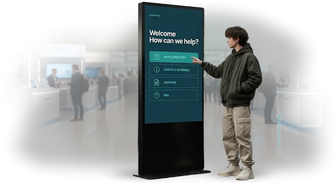
Minimalism in touchscreen design solves this problem at its root. When the screen contains only one main scenario, large clear elements, and a minimum of distracting details, the visitor does not need to think or search.
They immediately see where to tap—and this is especially important for people of different ages and levels of digital literacy. Interface simplicity directly affects service speed: fewer mistakes, fewer requests for staff assistance, and shorter queues.
From a business perspective, minimalism pays off twice. First, a customer who completes their task quickly and without stress is highly likely to return and recommend your service to friends.
Second, a touchscreen kiosk with a clean interface looks modern and builds trust in the brand—which is an additional argument in favor of a purchase.
Negative kiosk experiences, on the other hand, spread instantly: an unhappy visitor will tell more people about it than a satisfied one.
Minimalism in kiosks is not a passing trend or a designer's subjective preference, but a proven customer retention tool.
That is why we start designing interfaces by analyzing your visitors' scenarios, removing everything unnecessary and keeping only what helps them complete the desired action. The result is kiosks that work for your business, not against it.
What Benefits a Well-Designed Kiosk Interface Delivers
A well-designed touchscreen kiosk interface is not just a nice-looking picture, but a working tool that directly impacts revenue. When a guest instinctively understands where to tap and what to do, they make decisions faster.
The short path from “screen” to “needed service or product” is precisely the conversion increase you get without extra marketing investment.
Minimalism in design plays a key role here: no visual noise and no unnecessary actions. The simpler the screen, the fewer errors and accidental taps. Visitors do not waste time studying instructions—they immediately engage with your service. It is service speed that becomes the competitive advantage customers notice and appreciate.
A convenient kiosk builds guest loyalty. A person who quickly got what they needed and did not spend a minute on confusion will remember your business as modern and caring. This works for your reputation: next time they will come back to you rather than to a competitor.
One customer's positive experience often turns into recommendations for two or three of their acquaintances.
An additional benefit is savings on support and staff. A clear interface reduces the number of inquiries to customer care and frees employees from repeating the same instructions. The kiosk handles routine questions, while your team focuses on more valuable tasks. For the business, this means lower staff workload and stable operation during peak hours.
In the end, a well-designed interface works on three key business metrics at once: conversion, speed, and loyalty. You get a tool that pays off every day, not just at the moment of installation. Proper UX is an investment in your customers' comfort and the efficiency of your processes.
Kiosk Formats: From Minimalism to Feature-Rich Solutions
Kiosk types differ by construction, screen size, and usage scenarios. No single format is universal: a floor-standing kiosk in a shopping mall and a wall-mounted interactive panel in an office lobby solve different tasks—from attracting attention to quick service.
That is why, before designing the interface, we select the type of equipment to fit your space, scenario, and budget.
| Format | Who It's For | What It Gives the Customer |
|---|---|---|
| Floor-standing kiosk | Stores, shopping malls, exhibition halls | Maximum visibility: noticeable from afar, convenient for queues, withstands high loads |
| Touch counter | Restaurants, registration desks, museums | Compact, fits interior design, speeds up menu or exhibit navigation |
| Interactive panel | Offices, meeting rooms, information zones | Saves wall space, suitable for presentations and corporate navigation |
| Tabletop kiosk | Small stores, self-checkout stations | Low entry cost, quick launch, easy integration with cash register systems |
For each kiosk model, we design a minimalistic interface: large typography, clear icons, and logical scenarios in 1–2 taps.
If you need a feature-rich kiosk with complex actions—appointments, payments, forms—the same minimalism remains the foundation so customers do not get lost even in a longer process.
We help you choose a model that fits your tasks and budget, and design a layout that looks equally good across any of the listed formats. Send us a description of your scenario—we will suggest the optimal option.
How Kiosk Development Works: From Brief to Launch
Stages of Working on Your Kiosk
You don't need to understand technical details—we manage the project and answer questions at every step. The kiosk development stages are structured so you stay in control of the process and get the result without surprises.
- Brief and task analysis. We discuss where the kiosk will be placed, who your audience is, and what actions the visitor should take. We also set realistic kiosk development timelines.
- Scenario and prototype. We propose the screen structure and interaction logic—how a person will choose, search, and receive information. You can “feel” the prototype even before design begins.
- Design mockups. We create a minimalistic interface that fits your style and does not overload the screen. Design approval is iterative: you leave comments, we implement them.
- Finalizing mockups. We show all states: normal screen, active buttons, errors, empty fields. After your “yes”, we hand the project over to development.
- Development and testing. We program the logic, connect content, and test scenarios on professional equipment as close to the real kiosk as possible.
- Launch and support. We install the software, train staff, and provide instructions. We stay in touch after launch as well.
Timelines You Control
Kiosk development timelines depend on the number of screens and the complexity of scenarios—a typical project takes from two to six weeks. Thanks to stage-by-stage approval, you always know where the project stands, what has been approved, and what comes next.
This approach eliminates lengthy rework and unexpected delays, and you get a kiosk that solves your task: it helps visitors, relieves staff, and works for your business.
What's Included in Delivery: A Complete Package for Your Project
After development is complete, you receive not “pictures for a presentation”, but a working package that lets you launch the touchscreen kiosk as early as the following week.
We deliver everything your team and staff need in an organized form—without “ask the developer” and lost files.
- Kiosk interface in minimalism—all screens, states, and behavior scenarios, built for touch control. Guests figure it out without prompts, and your brand looks modern and clean.
- Design mockups and source materials—you remain the owner of the project: if needed, your specialists can quickly make edits or adapt screens for a new campaign.
- Content management system—marketing can change banners, menus, and news on their own, without contacting developers or spending extra budgets on modifications.
- Staff training—a practical session for your team: from turning on the kiosk to replacing materials. Employees work confidently from day one and don't create a queue of support requests.
- Documentation—a clear administrator guide and a short reference for staff: setup, daily maintenance, and typical work scenarios.
- Warranty and technical support—we support the launch and help promptly during business hours. You are never left alone with malfunctions and downtime.
This package covers the needs of the whole team: marketing updates content, staff services the kiosk, and management gets a reliably working tool. All you have to do is launch the project and collect the results.
Case Study: How a Minimalistic Interface Increased Kiosk Conversion
For the self-service coffee chain “Pyatnitsa”, low kiosk conversion was a point of profit leakage. Out of every hundred customers who started an order, only sixty reached payment—the rest abandoned their cart because of confusing screens and an overloaded menu. This happened daily at every location, and the losses became noticeable by the end of the month.
The client asked us to rework the interface. We conducted a UX audit and saw the main issue: visitors get lost when a single screen contains too many actions and every step requires reading a large amount of text.
Minimalism became not an aesthetic choice, but a way to simplify the decision down to a couple of clear actions.
What We Changed
We shortened the order flow from five steps to three. We removed secondary options from the main screen, leaving large drink cards and one prominent “cart” path.
Buttons became bigger, and contrast increased—even in a hurry, guests no longer need to squint or search for where to tap.
We also reworked the visuals: instead of small icons, we used product photos. Guests choose based on images rather than descriptions, which speeds up selection threefold.
For development, we used Flutter—a single codebase for all terminals in the chain. This made it possible to roll out interface updates quickly without equipment downtime and with consistent quality across different kiosk models.
Project Results
One month after launching the new interface, kiosk conversion increased by 23%. Average order time dropped from 90 to 45 seconds, and abandoned carts decreased by a third. The metrics were taken from real payment statistics across the entire chain.
According to the chain's calculations, one in five guests who previously walked away from the kiosk now completes a purchase.
An additional effect: the counter staff was relieved—employees are less distracted by giving instructions, freeing up time for service quality and guest conversations.
The chain is now rolling out the interface to new locations. Minimalism paid for itself within the first month, and this is a repeatable result we are already reproducing for other clients with similar tasks.
How to Choose a Kiosk Format for Your Task and Budget?
The criteria for choosing a kiosk are scenario, placement location, and budget. Start with the goal: does the visitor need to quickly find a department, submit a request, or explore a product?
The format depends on this: a floor-standing unit, a wall-mounted panel, or a compact tabletop kiosk.
If a person spends less than a minute at the screen, the interface should be laconic. Minimalism is appropriate here: minimum text, large buttons, one scenario. Longer sessions require more screen space and well-thought-out navigation. Minimalistic design helps here too: fewer mistakes and faster results.
The placement location clarifies the format: a narrow lobby calls for a wall-mounted kiosk, a spacious waiting area for an island stand, and outdoor use for a protected enclosure.
Think about accessibility from the start: the height and angle of the screen should suit adults, children, and visitors with limited mobility.
The kiosk budget includes not only equipment but also interface development and content updates. With a limited estimate, choose a basic model with a single function—navigation or scheduling. Don't skimp on design: a clear interface determines whether visitors will return.
We recommend starting with a mini-audit: write down 2–3 scenarios, assess visitor flow, and identify the space for the device. We will help you choose the format and create a minimalistic interface that fits your task and budget—without overpaying for unnecessary features.
Common Doubts: Addressing Fears Before Placing an Order
Before ordering an interactive kiosk, many clients have the same concerns: will the equipment break down in the middle of an event, how often will information need to be updated, and will the project drag on. This is normal—any responsible manager wants to understand risks and backup plans.
We work in a way that eliminates these risks. Below, we address the most common fears—just as we answer them for our clients during negotiations.
What if the kiosk fails during an event?
We provide a warranty on the equipment and interface for the entire period of use. If something goes wrong, our support team responds quickly: resolving the issue remotely or, if necessary, sending a specialist to the site.
Over years of work, we have learned to anticipate weak points and configure the kiosk so it runs without failures even under high load.
Is it difficult to update content on your own?
No. We design the interface so that an employee without special skills can change information: uploading new materials, replacing a banner, or adding a poster takes minutes. In the basic package, we provide clear instructions and, if needed, conduct brief training.
If you prefer not to do it yourself, we can take care of maintenance for you—you simply send the files, and we publish them.
How long will development and launch take?
A standard project takes from two weeks to a month, depending on the number of screens and scenario complexity. Timelines are fixed in the contract and we stick to them: by the required date, you receive a finished kiosk with a configured program. If an event is approaching, we offer an accelerated development format.
Order Kiosk Development—Get a Ready-Made Solution
What You Receive After Ordering
When you order kiosk development from us, you get not just a mockup or prototype, but a fully functional solution ready for work.
We accompany the project from brief to launch: we design a minimalistic interface, approve every stage with you, configure the equipment, test it, and hand over a working kiosk.
You don't need to dig into technical details, search for contractors, or coordinate processes. That's our job. Your task is to define the goals—after that, we manage the turnkey project and take responsibility for the result.
What's Included in the Ready-Made Solution
- UX/UI design in minimalism—a clean interface without overload, which visitors understand within seconds
- Touchscreen adaptation—large elements, convenient navigation, accidental taps eliminated
- Customization for your tasks—catalog, presentation, building navigation, lead collection—whatever you specifically need
- Testing on real equipment—the kiosk works stably from day one
- Launch and staff training—your team knows how to manage content
- Technical support—we stay in touch after launch and help with updates
How to Start
Leave a request on the website—we will call you back within one business day and clarify your task. Then we will prepare a commercial proposal with timelines, finalize the cost, and get to work.
You get a predictable result without surprises: a clear interface, stable operation, and a kiosk that solves your business tasks. Tell us about your project—we will offer a solution for your budget and deadlines.