

Template kiosks lose guests: you need an interface in a personal style
When a guest approaches an information kiosk, they expect a quick answer, but they also subconsciously evaluate the design. A standard interface with generic buttons and faceless icons feels foreign: the visitor doesn't feel cared for, and the brand looks sparing on details.
A template kiosk handles the function, but loses the most important thing — the emotional connection with the audience.
For business, this turns into measurable losses: guests return less often, trust information less, and remember the company worse. In an era of overwhelming impressions, people choose places where they feel an individual approach.
That is why the kiosk interface should be an extension of your style — with brand colors, smooth scenarios, and texts that speak the language of your clients.
Personal style in touchscreen kiosk design is not a decorative detail, but a tool for managing perception. It helps visitors orient faster through familiar images, reduces tension at the first touch, and increases trust in the presented information. The kiosk becomes a natural part of the space, not a temporary technical device.
We design interfaces that reflect the character of your business: we plan the structure, select visual accents, and adapt the logic to a specific audience.
The result is a recognizable kiosk that reinforces the brand and holds the guest's attention until the very end of the interaction. This approach solves the problem that template solutions cannot handle.
What you get: from the guest's first reaction to revenue growth
Personal style — memorable design
A custom kiosk interface cannot be confused with a competitor's template. It is built around your brand identity — from the color palette to animations and information presentation.
Guests remember such a screen, photograph it, and talk about it, which means your business stays in their memory even after they leave the venue.
Memorable design solves not only an aesthetic task. It turns an ordinary kiosk interaction into part of the impression of your company, highlighting its character and level.
This is especially important when you need to stand out among the standard touchscreen panels that competitors have.
Increasing guest loyalty
An interface that understands your client from the first touch reduces frustration and makes interacting with the kiosk pleasant. Clear navigation, large controls, and quick answers to the main questions — all of this creates a feeling of care for the person.
Loyalty starts with the little things: if a guest easily found the information they needed or placed an order without staff assistance, they will come back to you again.
We design the interface so that visitors feel confident from the first second. This reduces the workload for employees, because they don't have to take time to explain things, and guests get a positive experience interacting with your brand.
Brand recognition at every touch
Every kiosk screen is a mini advertisement for your company. When the design stays consistent with your signage, website, and advertising materials, it strengthens brand recognition.
The guest gets a cohesive picture, and associations with your company become brighter and more durable.
A personal approach to the interface lets you neatly integrate the kiosk into the overall concept of the space. It doesn't look like an alien element, but becomes a natural part of your business, working for its image.
Sales growth and a higher average order value
A well-designed interface guides the guest to the desired action: it suggests additional items, highlights promotions, and simplifies the ordering process. The fewer steps between desire and purchase, the higher the conversion.
As a result, the kiosk starts delivering measurable results in the form of revenue growth and an increased number of repeat orders.
We build logic into the design that saves time and increases the average order value without aggressive, pushy tactics. This is not just a beautiful screen, but a tool that pays for itself through the more efficient operation of your location.
Kiosk formats for any task — in a personal style
Interactive kiosk formats differ not by enclosure, but by usage scenario: the same device can become a product catalog, a building navigator, or an attention-grabbing point.
That is why we first define your task, and only then choose the format — from a compact info kiosk to a premium solution with custom design.
Below are the typical scenarios we work with most often. This is a reference point: within a project, formats can be combined and adapted to the specifics of your business.
| Format | For whom | What it gives the client |
|---|---|---|
| Shopping mall kiosk | Shopping malls, boutiques, showrooms | Fast navigation, catalog of promotions and events; increases dwell time and repeat visits |
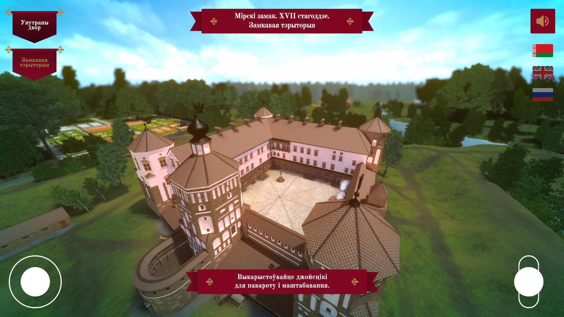
| Museum info kiosk | Museums, galleries, exhibition spaces | Interactive presentation of exhibits, audio guide without headphones, reduced staff workload, and higher visitor engagement |
| Premium kiosk | Business centers, hotels, premium brand showrooms | An expensive look in a personal style, emphasizes status, creates a memorable company image |
| Outdoor kiosk | Urban spaces, train stations, stadiums | Protection from weather and vandals, fast information delivery in high-traffic areas |
Personal style shows in the details: brand colors, enclosure materials, fonts, and on-screen animation. We make sure the kiosk becomes part of your space, not a random technical device.
We also build the interface logic around the audience: for malls — speed, for museums — immersion, for the premium segment — aesthetics.
How the project goes: from briefing to launch and support
We understand that ordering kiosk development is not about technology, but about peace of mind regarding the result and deadlines. That is why we have structured the process so that at every stage you understand what is happening, what is already done, and what comes next.
You get transparent support from the first brief to the moment the kiosk is up and running at your venue, and after that — support to keep the system stable.
-
Briefing and task immersion. We discuss where the kiosk will be placed, who your audience is, and what task it should solve. We capture the goals, design expectations, and functionality — you get a clear technical specification without "fluff".
-
Prototype and scenario approval. We show how a visitor will interact with the screen: menu structure, navigation logic, texts, and buttons. You see the future product before programming and can make edits without extra costs.
-
Personal interface design. We develop the visual style for your brand: colors, fonts, icons, and screen layouts. You approve the mockups — we move to implementation when the design fully matches expectations.
-
Development and content assembly. We fill the kiosk with your materials, connect the necessary services, and configure the operation logic. You get test access and see how everything works before installation on site.
-
Testing and launch. We test performance on real equipment, eliminate possible failures, and install the kiosk at your venue. The launch follows an agreed schedule with minimal impact on your visitors.
-
Training and document handover. We provide clear instructions for your employees and all materials: access credentials, source files, and mockups. You can update content yourself or contact us for changes.
-
Project support. After launch, we stay in touch: we update information, add sections, and monitor stable operation. If anything needs refinement, you simply contact us, without hunting for new contractors.
This approach helps avoid typical problems: dragged-out timelines, unexpected edits, and "a kiosk no one can update." You get a working tool that delivers value from day one and remains manageable in the future.
What's included in delivery: a complete kit for your kiosk
The kiosk does not arrive as "raw hardware", but as a ready-made tool for your business. We assemble the complete delivery kit in advance so you don't have to look for an outside programmer or dig into technical details. Everything you and your employees need is already in the box and in electronic form.
Below is a checklist. It makes it easy to verify completeness upon acceptance and confirm that the kiosk is ready to work from day one.
Kiosk delivery package
- Interface in your brand's personal style — logo, brand colors, fonts, and tone of voice, recognizable to your clients.
- Interface installation and kiosk setup — autostart, stable operation of all screens, protection against failures and accidental touches.
- Methodological materials — clear instructions for staff: how to turn it on, restart it, change a banner, or update content.
- Staff training — a short hands-on session after which administrators manage the kiosk on their own without technical support.
- Technical documentation — a description of all components, access credentials, and procedures for your team or the contractor maintaining the equipment.
- Warranty obligations and support — fixed response times, contacts of the responsible people, and a procedure for handling emergency situations.
After the kiosk is handed over, you are not left one-on-one with the device. Employees already know what to do in standard situations, you have instructions, and the warranty formalizes our responsibility.
And most importantly: you are not tied to us for every little thing. The methodological materials allow your marketers to update promotions and menus themselves, while for serious refinements you always know who is responsible for what.
Case study: how we doubled engagement for a mobile phone store
The mobile phone store's challenge
The retail chain Telecom-City came to us with a typical pain point: consultants were overloaded with repetitive questions, and visitors left without waiting for help.
They needed a tool that would take away the routine and suggest the optimal plan or service to a customer without staff involvement.
We proposed developing an interactive kiosk with an interface in the client's brand style. The main goal was for anyone, regardless of digital skill level, to be able to choose a plan, compare options, and submit a connection request in just a couple of touches.
Results and numbers
A month after launch, we measured the effect. Consultation wait time was cut in half, and engagement — the number of completed scenarios on the kiosk — grew by 2 times. Conversion from visitor to request increased by a third, while managers gained time for complex sales.
The head of the retail chain said this about the project: "The kiosk became a full-fledged employee. Clients choose their own plan and immediately see the benefit, and we freed up staff for live communication and additional sales. This is the best kiosk development case in our network."
Why it worked
The secret is in an interface that speaks the language of a mobile phone store customer: large buttons, clear icons, and personalized recommendations based on visit history.
We adapted the scenarios to real questions from the CRM, so the kiosk answers what visitors are actually looking for.
The client was satisfied — after the pilot, we received customer feedback and a request to roll out the solution to 15 more locations. For us, that is the main indicator: the project works, delivers measurable results, and strengthens the brand. If you want the same numbers — let's discuss your tasks in a free consultation.
How to choose a kiosk format for a specific task?
The right kiosk format is determined by two things: what task it solves and where it will be located.
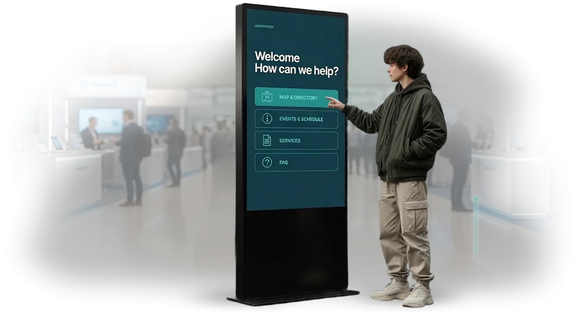
For navigation, appointment booking, or quick reference in a pass-through area, a vertical touchscreen kiosk is suitable — it takes little space, is clearly visible, and does not require long interaction from the visitor.
For a catalog, order placement, or loyalty program, where a person spends minutes, a horizontal screen with a comfortable stand is more convenient: less fatigue and a higher chance of completing the action.
The location dictates the type of enclosure and the level of protection. In a high-traffic lobby, durability and vandal resistance are important; in a cramped room, a wall-mounted or compact option is better; outdoors, protection from dust and moisture is required.
Start from the scenario: the kiosk should be visible where the visitor makes a decision and should not create queues. If more than five people approach the kiosk at once, provide a quick 30–60 second scenario.
When choosing a format, look at three criteria: interaction speed, the number of possible tasks, and integration with your system. If the kiosk is only needed to display information, a simple interface and minimal steps are enough.
If it must book, sell, or collect contacts, you will need well-thought-out logic and integration with your operational processes. Who will use it also matters: visitors won't read instructions, so the interface must be intuitive from the first touch.
We help you choose a format for your business processes and location, and then design an interface in your company's personal style — with your colors, fonts, and tone of voice.
Such a kiosk does not look like a faceless template; it becomes part of the brand and works for recognition. In the end, you get a device that solves exactly your task: it increases service speed, boosts conversion, and reduces staff workload.
We answer common questions about interactive kiosks
Anyone ordering an interactive kiosk faces the same questions: how long until launch, who is responsible for keeping it working, and how to make changes. We have collected answers to the main concerns so that you can see the entire process before the project starts and after it.
We work as a single contractor: we design the interface in your company's personal style, assemble the kiosk, and continue to support it. So all kiosk-related questions are handled through one window, without switching between vendors.
How long does interactive kiosk development take?
A typical project takes 3 to 6 weeks: from briefing to launch. At the start, we fix the stages and dates, and show progress every week.
What warranty service do you provide?
We provide a warranty on work and equipment — usually 12 months. We fix failures free of charge and keep the basic elements up to date.
Can the interface be updated after launch?
Yes. We build the interface in the company's personal style and make content management simple. You change texts, promotions, and images yourself. For new sections and features, we step in on request.
What does technical support include?
Monitoring of kiosk operation, remote interface updates, and employee consultations. We assign a dedicated manager who knows your project.
Ready to discuss your project? Get a consultation and a detailed estimate
Every kiosk we make is created for the needs of a specific business, not from a template.
That is why it is important to start with a conversation: you tell us about your audience and goals, and we tell you about how to turn a touchscreen into a recognizable point of contact with the brand.
A personal interface style here is not an option, but a way to stand out among competitors and hold the user's attention.
Leave a development request — it is free and places no obligation on you. Then you receive a consultation, a preliminary plan, and a detailed project cost estimate. You immediately see what the work will look like, the timelines, and what the final result includes.
Why you should start with this step:
- Consultation on your scenario: we will advise how to shorten the user's path and increase conversion to the target action.
- Detailed cost estimate — no hidden line items or surprise surcharges midway through the project.
- A kiosk launch plan: from the first version of the interface to equipment installation and setup.
- Examples of solutions in your niche — we will show what a well-working interface looks like.
- Clear timelines and stages: you always know where the project stands and when you will receive the finished result.
- Support after launch: we stay in touch, help update content, and refine functionality.
No obligations — only expert help at the start. Send a request, and within a day you will receive personalized recommendations and an estimate for your project.