


Industrial-style kiosk interface: why customers leave
A touchscreen kiosk is an employee that works for you 24/7. But only if the customer understands how to interact with it. An inconvenient interface, small buttons, a confusing menu—and the visitor leaves to competitors, without even completing their order. Each such departure is lost revenue and a damaged impression of the brand.
Industrial style is often associated with ruggedness and technical complexity. In reality, however, it is the ideal language for a touchscreen kiosk: reliability, brevity, straight angles, clear hierarchy.
The problem is that many implement it formally—for the sake of appearance—forgetting about customer convenience. As a result, the kiosk looks stylish but doesn’t function as a sales tool.
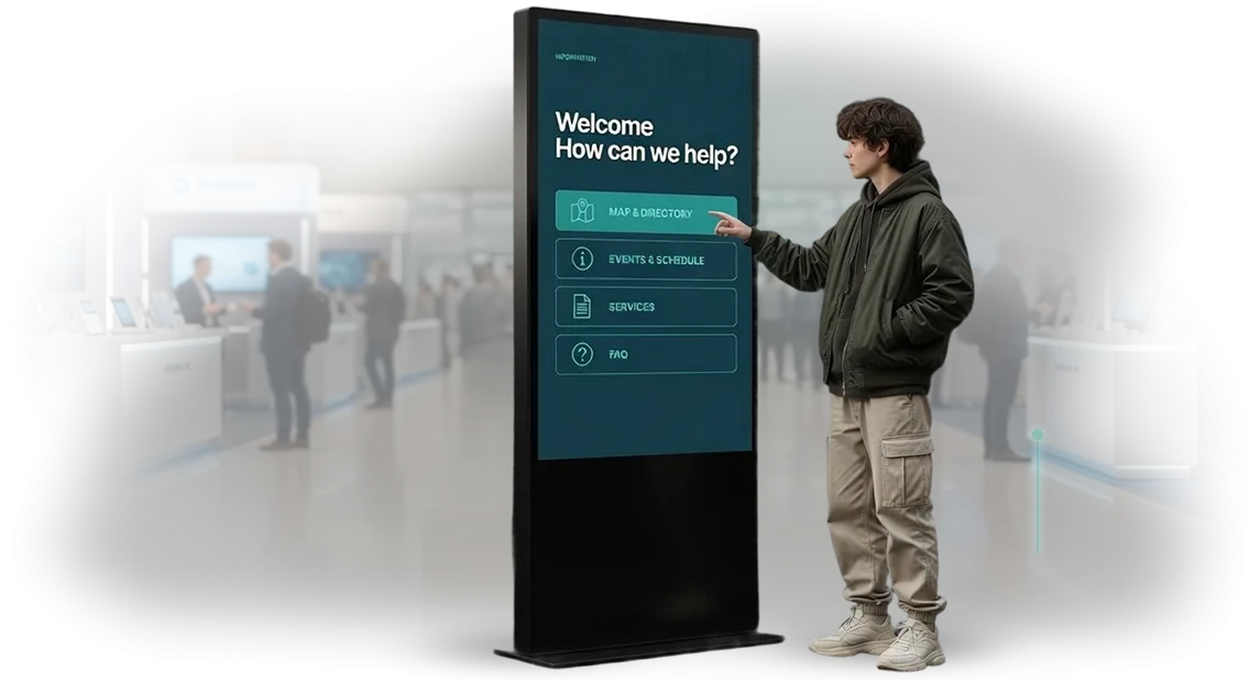
We design kiosk interfaces in industrial style with a priority on action logic. Large touch targets, contrasting labels, minimum steps to the needed function. The guest doesn’t think, they act: selected an item, confirmed, received an order or a certificate.
Every extra click is a risk that the customer will leave. That’s why we remove anything that gets in the way.
A properly designed touchscreen kiosk interface pays for itself from the first weeks: the number of self-service transactions grows, queues shrink, staff focuses on live customers rather than giving prompts at the screen. Visually strict and technical, it inspires trust—like a good machine tool or an instrument panel.
This is exactly the case where industrial style becomes a sales advantage. We combine the characteristic aesthetic with familiar touch scenarios so that the kiosk is perceived not as a “smart terminal” but as a simple assistant.
If your business is losing customers at the self-service stage, the problem is often in the interface, not the equipment. We close this problem: we design the logic down to the last touch.
What a well-thought-out touchscreen kiosk interface delivers
An intuitive touchscreen kiosk interface directly affects revenue: a visitor who figures out the menu in half a minute completes an application or order faster. An inconvenient screen drives customers away—they go to competitors, even if the product is excellent. We design scenarios that guide, direct, and reduce abandoned sessions to a minimum.
Industrial-style design reinforces brand recognition. Concise panels, strict lines, brand colors—all of this creates the image of a reliable, technology-driven partner, which is especially important in B2B and industrial environments. Every touch on the screen works for the company’s image, not just performing a navigation function.
Thoughtful design captures leads even without staff involvement. Built-in scenarios gently nudge toward action: leave a contact, choose a rate plan, request a quote. This way, the kiosk becomes an automated manager that works 24/7, takes no vacation, and never loses applications.
Visitor loyalty grows when interacting with the kiosk brings satisfaction and results. A convenient interface is remembered, people tell colleagues about it, and they return again. Repeat visits create a steady flow of orders without additional advertising investment.
By investing in interface design once, you get a long-term effect: order growth, stronger brand positioning, and a permanent base of loyal customers.
We take your business specifics into account and turn the kiosk from a technical device into a sales tool that delivers measurable value every day.
Kiosk formats with industrial-style design: what to choose
For a client, choosing a touchscreen kiosk is usually not about a specific model but about a task: take payments, guide visitors, or accelerate sales.
Industrial-style design adds character to a space and pairs well with modern interiors—but it’s important that the kiosk format matches the use case. Guest convenience, operating speed, and how quickly the investment pays off all depend on this.
Below is a comparison of the main formats we implement. All options are executed in a unified style: metal, dark tones, minimal forms.
| Format | For whom | What it gives the customer |
|---|---|---|
| Retail kiosk | Stores, cafes, showrooms | Speeds up order processing, reduces queues, increases average check through upsells |
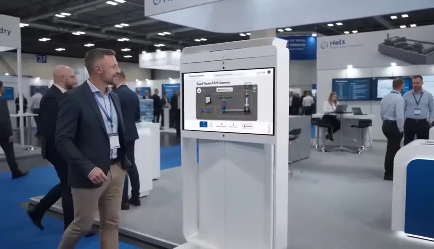
| Wayfinding kiosk | Shopping malls, business centers, exhibitions | Helps visitors quickly find departments, offices, or booths, reduces staff workload |
| Payment kiosk | Sports clubs, gas stations, parking lots | Accepts cashless payments without a cashier, increases throughput, and provides clear reporting |
If the task is complex, scenarios can be combined—for example, a payment kiosk with wayfinding, or a retail kiosk with a catalog. The enclosure and interface are designed for a specific location, taking into account visitor flow and space characteristics.
our team engineers have been designing touchscreen kiosks for business needs for over 10 years: from standalone systems to network solutions. We select the format for your space, guarantee the operation of all modules, and handle the technical side. You get a clear result—a kiosk that works for recognition and revenue.
Kiosk interface development stages: from brief to launch
Kiosk interface development is not about “drawing a picture”; it is a structured process where each stage brings you closer to launch without disruptions or unnecessary revisions.
We consistently move from brief to support so that you always understand what is happening with the project and can control the timeline.
Over the years, we have refined a process that saves on average a third of the time spent on approvals. Below are the stages every project goes through.
-
Brief and task immersion. We capture business goals, user profile, and the tasks the kiosk must solve: sales, wayfinding, information. The output is a document with clear success criteria.
-
Scenario design. We describe the screen logic: how the customer will interact with the kiosk, in how many steps they will get the result. We identify bottlenecks right away to avoid rework later.
-
Interactive prototype. We build a working mockup that can be “touched.” You see interface behavior before money is invested in visual design and programming.
-
Industrial-style design project. We create a visual language for your brand: strict geometry, accent colors, readable typography. The design not only looks appropriate in a workshop or sales floor but also increases trust in the system.
-
Approval and revisions. We work in iterations: you receive ready blocks, comment, and we make changes. A transparent process with no “black box” and no unexpected final surprises.
-
Handoff to development and launch. We prepare a complete package for programmers: mockups, button states, error scenarios. We support the integration and testing stage so that launch goes smoothly.
-
Support and evolution. We stay in touch after launch: we help update content, add screens, or adapt the interface to new business tasks.
The result is an interface that increases touch-to-target-action conversion and does not require constant rework. You get a predictable project with a clear budget and timeline, not a “creative search” at your expense. Shall we start with a brief?
What is included in the kiosk interface design deliverable
You get not just a set of screens, but a ready-to-use package. Everything is thought through: from the first touch to error messages. Below is the deliverable composition so you understand what you are paying for and what you will hand over to developers.
- Interactive mockups of all screens. These are working scenarios: taps, transitions, pop-ups. You see how the kiosk will behave in a visitor’s hands before development even starts.
- User scenarios and navigation logic. We describe the visitor journey: what they see first, where they stop, how they find what they need. This reduces errors and increases conversion to the target action.
- Identity guideline. We fix fonts, colors, and element sizes. The interface looks the same on any screen and in any part of the menu—the brand is recognizable.
- Animation and micro-interactions. Smooth transitions, touch feedback, loading indicators—turn a “mere screen” into a living product.
- Unified industrial style. All screens, icons, and elements are in the chosen style: strict lines, functional forms, no visual noise. The kiosk fits appropriately in a workshop, warehouse, or exhibition pavilion.
- Files for developer handoff. Prepared mockups, resources, and comments for each screen. Developers don’t need to guess details—launch speed increases, revisions decrease.
- Development recommendations. A short document: what to improve in six months, which scenarios to add, which data to collect for analytics.
The package answers the “what’s next?” question at all stages. You accept the work stage by stage, and all mockups remain with you—they can be handed to any development team.
Case study: how a new kiosk interface increased orders
For the coffee shop chain “Kofe-Pik”, we redesigned the touchscreen kiosk interface that handled orders at three locations. The problem was familiar: guests stood at the screen for a long time, got confused in the menu, and eventually went to the register. The kiosk was used only during peak hours, and its contribution to revenue remained minimal.
We audited the scenarios, reviewed camera footage, and talked to the staff. It turned out that the interface was overloaded with categories, and the “Order” and “Checkout” buttons got lost among other elements.
Instead of local fixes, we proposed a new industrial-style interface: large typography, contrasting tiles, minimum steps to payment—from selecting an item to receiving a receipt, it now takes four touches instead of seven.
We measured the results after two months of operation. The average check increased by 18%—guests began adding drinks and desserts more often. The number of orders through the kiosk increased by 27%, and time at the screen dropped from 45 to 28 seconds. This means fewer people in line and higher kiosk throughput without additional costs.
The chain’s manager noted that after the update, guests stopped calling staff for help, and cashiers could focus on handing out orders instead of processing them. “The interface finally became clear, and we saw it in our sales numbers,” she wrote in a review. Six months later, we received an order to update kiosks at four more locations.
This case shows that even a small kiosk can become a significant sales channel if the interface responds to the customer’s request quickly and without unnecessary steps. That is how task-oriented design turns into measurable value for a business.
How to choose the right kiosk design format for your task?
Choosing a kiosk design format is not a question of aesthetics but of effectiveness. A kiosk should not simply fit into the interior; it should help visitors quickly solve a task: find a product, get a consultation, place an order.
When business requirements are non-standard—a kiosk in a workshop, in a showroom with industrial style, or performing an unusual function—the right solution is a custom interface rather than a standard template. Our team select the format for the specific task, not the other way around.
A non-standard kiosk often has an unusual shape, is built into a wall or existing equipment.
In such cases, it is important to think through not only the visual design but also the screen flow: how a person will interact with the device in a limited space, how quickly they will get the information they need, and what happens after the session ends.
We create interfaces that account for the enclosure geometry, installation environment, and real user behavior.
| Design format | For which task | What it gives the customer |
|---|---|---|
| Industrial style | Kiosks for manufacturing, car washes, loft spaces | Visually stable image of a technology-driven company, visitor trust |
| Classic informational | Navigation, product catalog, information area | Clear interface without training, quick onboarding for any user |
| Non-standard kiosk | Interactive displays, special projects, installations | Attracts attention, highlights the area, enhances the impression of the space |
When choosing a format, we take into account specific business requirements: expected number of users, touch frequency, average time at the kiosk, and the need for integration with your accounting systems.
Together with you, we move from task description to a working interface, and already at the prototype stage you can see how the kiosk will behave in real conditions. This avoids costly rework after launch and delivers a result that works for your business.
Answering common questions about interface development
Clients often ask about timelines, risks, and ongoing support when it comes to an industrial-style touchscreen kiosk interface. We answer directly: most concerns are related to uncertainty, and we remove it before the project even starts.
We document requirements, show intermediate versions, and test on real equipment—you always understand what you will get. Below are answers to the questions we hear most often.
What are the risks in developing a kiosk interface?
The main risk is a mismatch between expectations and the result. We reduce it by approving mockups before development begins and testing on target screens.
If integration with your system is needed, we define the data format and checkpoints in advance—this eliminates surprises at launch.
How long does development take?
Usually from two to four weeks, depending on the number of screens and the complexity of integration. We give an exact timeframe after a short brief. At each stage, you see progress and can make changes without losing momentum.
What about technical support after launch?
We stay in touch after project delivery: we help update content, refine scenarios, and support kiosks in operation. This means you always have a contractor who knows your project and resolves issues quickly.
If you still have a question, ask it during a free consultation. We’ll explain how the work will proceed for your specific task and show examples of industrial-style interfaces.Ready to discuss your kiosk project? Get a quote within two days
Let’s discuss the project without unnecessary bureaucracy: you tell us about your tasks and audience, and we propose a kiosk concept that suits your brand’s industrial style and is clear to visitors. Within two days, we’ll prepare an estimate—with solution options, timelines, and scope of work.
After contacting us, you will receive:
- An analysis of your task and user profile—we’ll suggest which interaction scenarios you actually need.
- An industrial-style design concept—from the overall look to the screen logic.
- An implementation plan with stages and timelines—so you understand when the kiosk will go live.
- A transparent cost estimate—with no hidden items or additional charges along the way.
- Integration recommendations for your systems—we’ll take into account how the kiosk will be updated and managed.
- Guarantees on the result and post-launch support—we’ll help with improvements and development.
We work with kiosk manufacturers and suppliers, so we’ll propose a solution that can actually be implemented, not just nice pictures.
We have over ten years of experience in industrial and B2B projects—we know how to make an interface convenient for employees, customers, and partners.
Leave a request with a few words about your project—we’ll give you guidance on timelines and budget within two days. Contact us in any convenient way: we’ll start with a short call and record the requirements in a document so we don’t waste your time.