


Losing tourists due to kiosks that are not in a tourist style
Here is the paradox: tourists come for the atmosphere, and what greets them is a metal box with a menu like a bank terminal.
If the interactive kiosk has a generic design and the interface is cluttered with tiny buttons and confusing sections, guests walk past it even when they desperately need information.
An awkward interface destroys trust in the first seconds: a tired traveler is not ready to figure out navigation — they want to orient themselves quickly and move on.
Now count the losses. The kiosk takes up space, consumes electricity, and requires investment, and if the tourist never used it, you have not shown them routes, events, or special offers.
In the worst case, the guest leaves with the impression that “everything here is just for show” and carries that impression into reviews on maps and social media. That is how you lose not only today’s customers but also future visitors who read reviews before their trip.
The problem is not the hardware — modern touch screens have been reliable for a long time. The problem is that the kiosk feels like an alien object.
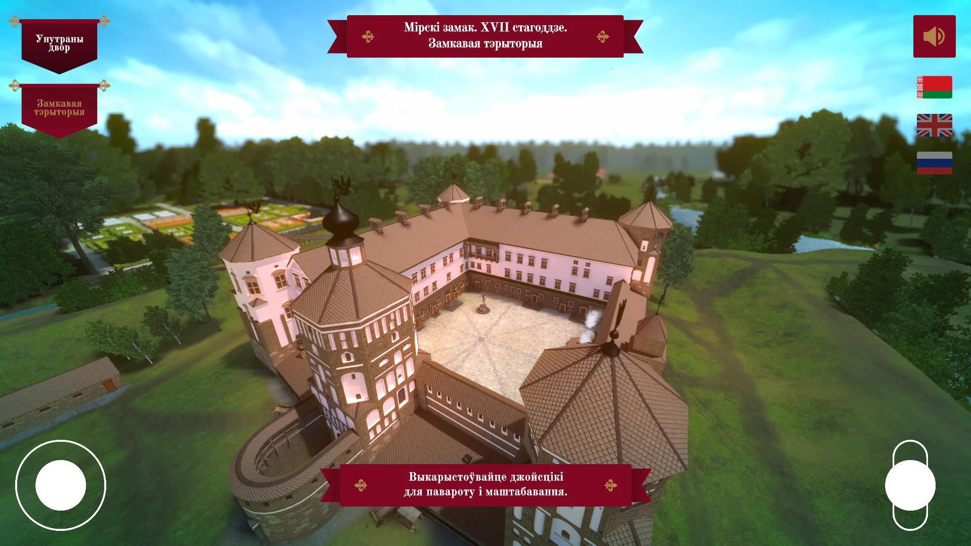
The solution is a well-thought-out tourist style: the design continues the architecture, nature, and character of the location, and the interface is intuitive for people of any age and any level of digital skills.
When the kiosk looks like part of the place, the barrier disappears — the guest approaches, touches the screen, and gets value within a second.
These are exactly the kinds of projects we have been doing for many years. We combine design inspired by the location with the logic of real tourist scenarios — and the result is a tool that increases the reach of attractions and pays back the investment in equipment.
What you get after a redesign of touch screen kiosks
Guests remember not the kiosk itself but the impression of the trip. After the redesign, the interface guides a person like a personal concierge: it suggests where to go, what to see, and where to take a photo.
The guest does not get stuck in menus or hunt for “that button over there” — they immediately get the information they need and return to enjoying their stay. This kind of interaction turns an ordinary terminal into part of the experience people want to share.
Fewer questions for the staff means less load on administrators and cashiers. Guests find routes on their own, check schedules, and learn about tours and promotions.
The time staff saves is spent on live communication and solving non-standard tasks instead of repeating the same answers ten times. That is a direct saving on payroll with the same visitor flow.
A well-thought-out screen scenario increases sales of additional services. When options are shown logically and visually, guests are more likely to book tours, reserve tables, and buy souvenirs — simply because they saw the offer at the right moment.
An interface in a tourist style adds trust: familiar imagery and calm navigation lower the barrier before an expensive purchase.
Updated kiosks work to build brand recognition. A single visual language shared with other tourist materials — maps, booklets, banners — is remembered and cited on social media.
Every touch of the screen becomes a mini-ad for your destination, and this ad does not require an advertising budget.
In the end, the redesign pays for itself within the first weeks: higher guest engagement, less routine work for staff, and more upsells per square meter around the kiosk. You get not just screens but a ready-made tool that increases the profitability of every point of presence.
Formats of interactive kiosks in a tourist style
Interactive kiosks in a tourist style are not just screens — they are navigation points that help guests orient themselves within a minute and give you data about popular destinations.
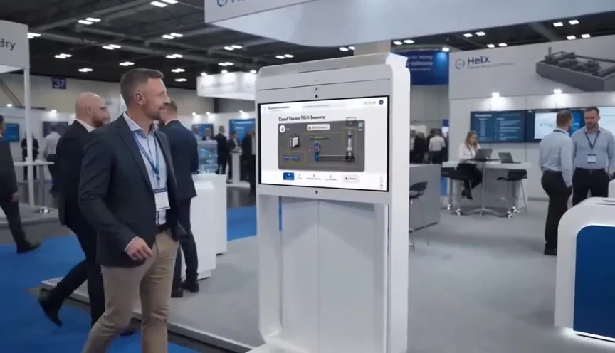
The kiosk format determines where and how it will work: a floor-standing model attracts attention in spacious lobbies, a wall-mounted model saves space in narrow passages, and a compact tourist model works well outdoors or in waiting areas.
| Format | Who it is for | What it provides |
|---|---|---|
| Floor-standing kiosk | Train stations, museums, shopping malls | Replaces a live information desk, handles high foot traffic, visible from afar |
| Wall-mounted kiosk | Hotels, cafes, info zones | Takes up no floor space, available around the clock, easy for a quick reference |
| Tourist kiosk | Tourist centers, embankments, airports | Shows routes and attractions, lets visitors get a map on their phone |
For every format, we design an interface with large buttons and clear pictograms — it is convenient even in bright sunlight or when people are in a hurry.
All scenarios are planned in advance: from the start screen to the actions after a touch, so visitors always see where to press and what will happen next.
Using the kiosk, tourists can mark their favorite places themselves, and you can see what is in demand. This helps you plan tours and improve service.
The technical side stays “under the hood”: industrial touch panels and polished software work without failures even at peak hours.
Our expertise in interface design allows us to adapt the design to the corporate style of your facility — and you get a kiosk that fits organically into the architecture and works for brand recognition.
How the turnkey kiosk development works from brief to launch
Turnkey kiosk development is built on clear stages. You always know where the project stands, take part in approvals, and keep track of deadlines.
We take into account the specifics of your location — a tourist route, museum, hotel, or city center — and integrate the style into the interface.
The kiosk development stages look like this:
- Kiosk brief — you tell us about your goals, visitors, and installation site. We clarify the details and gather interface requirements.
- Plan and prototype — the screen structure and navigation logic are created. A draft layout can be easily adjusted before the design phase begins.
- Design approval — we develop a visual style in a tourist aesthetic: colors, fonts, iconography. You receive a mockup for approval.
- Implementation — we bring the interface to life: we connect maps, directories, videos, and quizzes. All information is structured for convenient touch control.
- Testing and debugging — we check operation on real hardware and adapt it to touch screens and different usage scenarios.
- Kiosk launch — we install the equipment, configure it, and train your team. The kiosk is ready to work on opening day or for the event.
- Support — we stay in touch, update content, and refine the interface according to your tasks.
In the end, you get a working kiosk that fits harmoniously into the tourist space and helps visitors quickly find the information they need.
What is included in the delivery of an interactive kiosk for a hotel
When a hotel orders an interactive kiosk, it is important to receive a ready-made “turnkey” solution rather than separate components that have to be assembled and configured on your own.
We deliver a complete package: the touch panel, an interface in a tourist style, installation, and ongoing support. No hidden stages — only the result, which guests start using on the day of installation.
The standard delivery includes:
- Touch panel — a reliable screen with a vandal-resistant enclosure designed for long-term operation in the hotel’s public areas.
- Kiosk interface in a tourist style — a map of the surrounding area, attractions, routes, and photo gallery; the design is adapted to the hotel’s brand identity.
- Content management system — administrators can change texts, prices, and promotions on their own without involving developers.
- Kiosk installation — setup in the lobby or near the front desk, cable routing, network connection, and verification of all operating scenarios.
- Staff training — a short briefing for administrators and housekeeping staff, plus printed guides for daily use.
- Warranty support — free maintenance during the warranty period, remote diagnostics, and an engineer visit when needed.
Thanks to this package, the hotel solves three tasks at once: guests orient themselves faster, staff are less distracted by repetitive questions, and additional services receive more orders.
You launch the kiosk without involving your own IT department — everything is already configured, tested, and ready to work.
Case study: information kiosk in a resort city
Let us share a case study of a kiosk for the info center in a resort’s main hotel. During the season, the front desk accumulated a 15–20 minute queue, and tourists left without a map, frustrated.
The problem was not the staff: the same questions over and over were eating up the time needed for live sales.
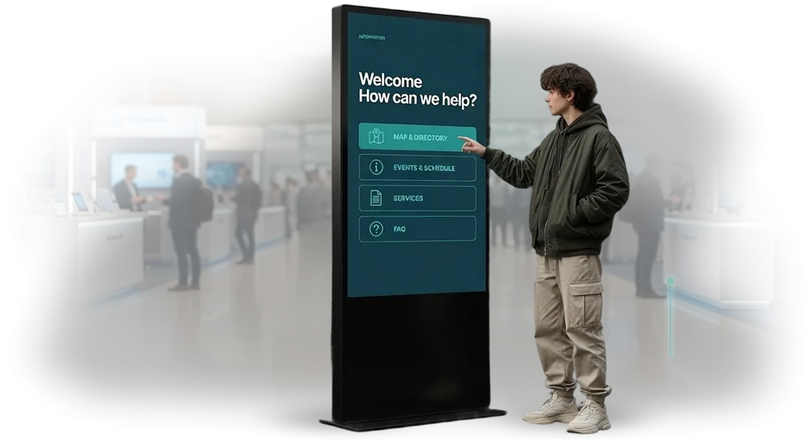
We proposed an information kiosk for the hotel that would work like a personal consultant. The solution was made in a tourist style: the screen welcomed guests with photos of the city, large tiles for attractions, and ready-made routes for 1, 3, or 5 hours. With just a few touches, guests received a map, museum opening hours, or dinner recommendations.
We designed the interface with different generations in mind: large fonts for older tourists, clear icons for children, and an English version for international visitors. The staff kept the harder part — ticket sales and individual consultations.
The development results were measured in the first season: the wait time at the front desk dropped threefold, and 70% of guests resolved basic questions through the kiosk. The queue disappeared, tourists began asking more often about paid tours — revenue grew.
Over two seasons, the kiosk paid for itself: the need for temporary front desk staff disappeared, and the cost of printed maps fell by almost half. The client was satisfied, added an event poster to the kiosk, and ordered a second one for a neighboring resort town.
How to avoid mistakes when developing a kiosk interface?
Mistakes begin long before launch — when a kiosk is chosen based on a formal criterion like “the bigger the screen, the better,” rather than the installation conditions and visitor behavior.
An outdoor kiosk in direct sunlight with a glossy surface will produce glare, the touch sensor will react with a delay, and guests will decide the technology is broken.
We select the screen type, enclosure, and touch panel according to your task: where the kiosk stands, who approaches it, at what pace, and with what purpose.
The second common mistake is navigation copied from a website. On a website, there is scrolling; on a kiosk, there are only touches and limited time at the screen. If users have to go through three menu levels to find a tour schedule, half of the visitors will leave.
We design a flat structure: the main screen answers the main question, transitions take one touch, buttons are large, and labels sit next to actions.
The third mistake is content that is too long or not adapted for reading on a screen. No one reads paragraphs at a kiosk. What is needed is short phrasing, visual cues, and neat iconography.
In a tourist style, this is especially noticeable: if the interface shouts with bright colors and cluttered photos, it distracts from the real point — how to help a person orient quickly.
These three decisions — screen, navigation, content — determine whether the next visitor will return to the kiosk and recommend it. We test scenarios on real users before launch, so you receive an interface that works without instructions and does not require constant support.
By choosing us, you protect your budget from typical failures and get a kiosk that solves the task from the very first touch.
Answers to frequently asked questions about touch screen kiosks
When ordering a touch screen kiosk, business owners have the same doubts: what if the equipment breaks down, how often will content need to be updated, and will the kiosk look out of place. That is normal — any new tool requires confidence.
Below we answer the questions that come up most often, so you can make your decision with peace of mind.
What if the kiosk breaks down? Who will fix it?
We use professional equipment designed for round-the-clock operation and provide a warranty on all components. During the operating period, you can take out technical maintenance: in case of a failure, we respond quickly and restore the kiosk without long downtime.
For you, this means guests do not lose access to information, and you do not lose incoming inquiries.
Is it difficult to update the information on the kiosk?
Content management is designed so that any employee can handle it. You upload new texts, photos, and special offers through the admin panel — without knowing code or programming.
Updates appear on the screen instantly, so the information always reflects your current promotions and events.
Won’t the kiosk clash with our interior or tourist style?
We design the kiosk around your concept: we choose the enclosure shape, color solutions, and materials, and we build the interface in the same style.
For tourist facilities, this can be styling inspired by maps, navigation, or natural motifs — anything that supports the atmosphere of the place. Before production, you receive a mockup and can make changes.
Leave a request for kiosk development — we will start with a brief
When you need an information kiosk, the solution is not just about choosing an enclosure and a screen. What matters is getting a tool that really helps visitors orient themselves and improves the impression of the place.
We start with a brief — a short interview about your goals, audience, installation point, and expected style. Based on it, you receive a clear work plan and a transparent cost calculation — with no hidden stages or unexpected surcharges.
Here is what our starting stage includes — check it yourself:
- Consultation on kiosks — we will recommend the right format for your space: floor-standing, wall-mounted, or a touch panel.
- Kiosk cost calculation — an estimate broken down by stages: interface design, development, delivery, and installation.
- Brief and work plan — we will define goals, deadlines, and responsible parties, so you always understand what is happening and when the result will be ready.
- Interface prototype — before the main development begins, we show the screen structure and navigation logic so you can make changes at an early stage.
- Design in a tourist style — we adapt the look to your brand and the atmosphere of the location: maps, routes, photo galleries, and convenient hints for guests.
- Technical recommendations — we will advise which equipment will last longer and require less maintenance in high-traffic areas.
- Guarantees and support — we will document the terms and conditions of post-launch support, so the kiosk runs reliably during peak hours.
Leave a request for kiosk development — during the consultation you will receive concrete solution options and a budget estimate. That way you can make a well-considered decision without risk or unnecessary expenses.